
Humphries, C. (2010). “The Sweet Smell of Morality.” Boston Globe Online, Boston.com. Retrieved on 23 June 2010: http://www.boston.com/bostonglobe/ideas/articles/2010/02/14/the_sweet_smell_of_morality/ Summary: Scientist and Marketers are paying closer attention to the sense of smell. It appears that while once believed subpar to other human senses, the power of smell is being reevaluated. Some studies suggest smell has the power to influence social and moral behavior. Recent findings have found that clean smells perpetuate favorable behavior in instances where someone is in need of help or assistance. This suggests that smells, known for their influence on emotion and memory, might also have an effect on thought. Additional studies have shown that consumers shopping habits, such as where to shop and how much to buy, are influenced by smell, having more to do with choice than mood. Using smell as a lure might sound manipulative, yet some researchers claim we are aware of scents and are not deceived by them. Marketers are currently looking into ways to incorporate smells into brand recognition. It’s possible for humans to undergo training to perfect their sense of smell. As more knowledge comes about regarding smell, and the complexities of this sense are realized, consumers can expect to be…
Users
Attention, Conceptual Design, Contributor, Interaction Design, Interface Design, Personality, Product Design Strategy, Users
Ch-ch-ch-ch-changes: Interview with David Bowie
by AnneMalhotra •
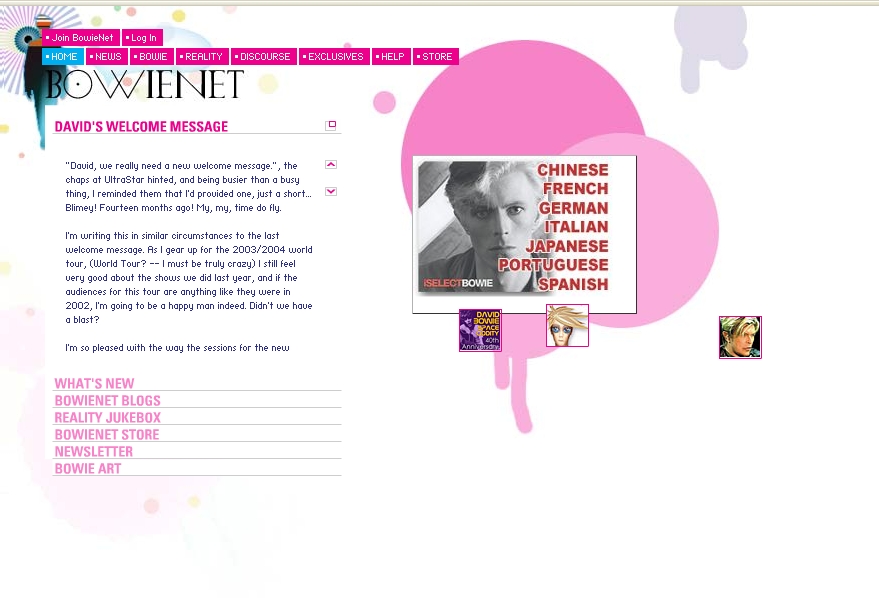
Nash, K. (1999). “Ch-ch-ch-ch-changes: Interview with David Bowie.” ComputerWorld. Retrieved August 1, 2001: http://www.computerworld.com/cwi/story/0,1199,NAV47-STO39387,00.html The is a screen shot of David Bowie’s Home Page as it appeared on June 24th, 2010. In this interview, David Bowie, a musician and philosopher, shares his view of the Internet and how it may evolve and influence society but also the music industry over time. His depiction of his website serves as a starting point to his argument. The individualized portal, BowieNet – where he chats with fans on daily basis and keeps a personal journal – is telltale when it comes to his approach to the net. As a matter of fact, Internet is a huge decentralized village in Bowie’s point of view. The portal – by enabling the creation of online personas and by providing links to all the fan blogs on him – offers the opportunity to foster a village-like facet of internet with a free circulation of information and a sense of community built around him and his music. In fact, such interaction enables, according to Bowie, a new way of knowing people. He confesses that he likes to take on other names to simply observe what happens in the…
Conceptual Design, Contributor, Cultural Differences, Interaction Design, Interface Design, Product Design Strategy, Users
Can Design Change the World?
by Andrea Carroll •
Tanneeru, M. (2009). “Can Design Change the World?” CNN online. Retrieved June 23, 2010. http://edition.cnn.com/2009/TECH/11/06/berger.qanda/index.html Summary: CNN talks to Warren Berger, who wrote the book “Glimmer: How Design Can Transform Your Life and Maybe Even the World” about how greater communication through design can change the world. He shies away from speaking of this change in grandiose terms, seeking to differentiate his idea as one that stems from design’s problem-solving capabilities on a case-by-case basis. Berger asserts that design, at its core, is more than making products or spaces look good, but rather, it seeks to identify a problem or an unaddressed need and solve it through a trial-and-error process. It involves studying people and the way that they live to pinpoint ways in which their lives could be made better. This is done through much brainstorming, prototyping, and audience testing. The Internet has drastically changed the ways in which designers work, collaborate, and even identify themselves as designers. Widespread access to information has meant that knowledge can be passed on from one person to another at a quicker rate—meaning that one person’s mistakes can be learned from and not repeated. Social networking groups allow designers to connect to share…
Background Knowledge, Background Knowledge Errors, Diagnostic Errors, Perception, Pipsqueak Articles, Users
Distilling Information
by Olga Werby •
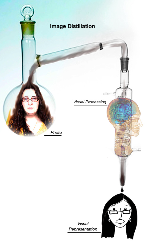
When it comes to my students’ participation in this blog, it’s all about distilling information found in the news to something product designers in our midst would find useful, on a practical level. Consider the illustration below. We see a person’s face (mine in this case). We can describe some of the features. But what do we actually remember? Remembering complex visual information is hard—too many details. Recalling a drawing is easier. That’s because an artist already distilled the complexity into its essential parts—only those details that are required to remind us of a particular individual are included in the rendering. We are all pretty good at judging wether a portrait looks like the person it was intended to represent. We can quickly say if it does or if it doesn’t. But it would be difficult to explain what details in the illustration make the likeness or what’s missing from the drawing that didn’t hit its mark. Distillation of information is hard. Some people are good at it, some are not. It’s an acquired skill. And each category (e.g. sensory like visual, audio, tactile or knowledge-based like physics, economics, biology) requires its own training and its own set of talents.…
Cognitive Blindness, Errors, Ethnographic & User Data, Pipsqueak Articles, Users
Cognitive Blindness: Super-recognizers
by Olga Werby •

Health Check, the BBC World Service’s weekly round up of global health stories, did an audio broadcast on super-recognizers—people with extraordinary abilities to recognize faces. You can listen to the entire story by Claudia Hammond at http://news.bbc.co.uk/2/hi/health/8665805.stm This story deals with differences in ability to recognize faces. There are people who are so bad at it that it is a pathology—when a mother can’t recognize her child among the pupils in the day care center, it’s more than inconvenient. Then there are all those embarrassing moments when you meet someone at a party for what you think is the first time only to have that person insist that you’ve met before. And the far end of the continuum, there are the super-recognizers—individuals that never forget a face even after a very brief interaction. We only now recognize the fact of super-recognizer, because most of us are not too bad and not too good at facial recognition—we are mostly average. And our average ability to recognize faces limits our ability to spot people who could do better. We were experiencing cognitive blindness—inability to perceive cognitive differences in abilities of others. And super-recognizers, similarly, didn’t know that they were somehow different from…
Cognitive Blindness, Conceptual Design, Errors, Interaction Design, Interface Design, Pipsqueak Articles, Scaffolding, Users
Error Opportunity Space
by Olga Werby •
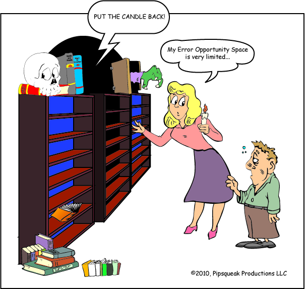
Confronted with one “True or False” question, an individual has a very small error opportunity space: three. There are three possible responses: true, false, or no answer. “No answer” will always be wrong, a betting man should choose one of the possible answers. But unfortunately situations where the error opportunity space is so narrow are rare. And in the real world, dealing with real problems, these spaces tend to be very large. Note that the size of the error opportunity space, EOS, makes no representations about the consequences of getting the problem right or wrong (or partially right or wrong). When the stock market tanked on May 7th, people involved in that process had a very large EOS. A week out, experts and participants are trying to figure out what went wrong and how to limit similar incidents in the future—they are trying, in effect, to drastically reduce the error opportunity space. This is a job of product designers. By analyzing the goals of the users and the system’s constraining variables, we can come up with conceptual design, interaction design, and interface design that would address the problems that were exposed on May 7th. Coming up with a solution is…
Cognitive Blindness, Conceptual Design, Contributor, Ethnographic & User Data, Interaction Design, Interface Design, Users
Before you cast that vote on the ballot this November…
by Annie •
Article: McGrath, M (2008). “Political views ‘all in the mind’.” BBC World Service. Visited on 18 September 2008 http://news.bbc.co.uk/2/hi/science/nature/7623256.stm Conceptual Design — to investigate the level of connection between a person’s political views and her/his physiological makeup, e.g. that person’s sensitivity to fear or threat. Interaction Design — small study targeting potential voters, exposing them to various sights & sounds that may provoke fear, and checking their responses against their political views on multiple issues. Subjects were first asked a series of questions regarding their political views on multiple issues (like gun control, capital punishment, abortion, etc.). Then, using electrical conductance to measure subjects’ skin & blink responses, they were exposed to a series of intentionally frightful images & sounds. This is used to determine their levels of sensitivity to fears & threats Interface Design — creepy images like a scared man with a tarantula on his face, and an open wound with maggots in it, and loud, unexpectedly intrusive noises Summary — while this study is geographically limited (conducted only in Nebraska) and statistically insignificant (n=46), it does offer an interesting hypothesis that people who are highly sensitive to threats & fears tend to support a right-wing agenda. From…