Vance, A., (2010). “3-D Printing Spurs a Manufacturing Revolution.“ New York Times Online. Retrieved on October 6, 2010: http://www.nytimes.com/2010/09/14/technology/14print.html Summary: Vance highlights the remarkable impact and wide application 3-D printing has on a wide range of traditional and non-traditional manufacturing industries. While traditional printers print on one dimensional paper, 3-D printers create a 3-dimensional physical object, usually from plastic or metal, by stacking layers one on top of another. The application of 3-D printers spans a wide variety of applications: from custom made prosthetic casings to building houses, and literally anything in-between. It may very well hold the promise of a game-changing technology for the US manufacturing industry in that the cheap labor may no longer be the “be-all” important factor it is today. User Groups While the application of technology in design and manufacturing hardly is a new phenomenon, the scale, ease of use and its wide application do provide something of a paradigm shift in a cross-section of manufacturing industries. In tomorrow’s 3-D printing world, yesteryears chasm between conceptual design and manufacturing is a non-existing obstacle. In this new 3-D printing world the virtual product concept conceived by the product creator and the material manifestation of her/his creation…
Product Design Strategy
Conceptual Design, Contributor, Interface Design, Language, Product Design Strategy, Users
Using Menu Psychology to Entice Diners
by Mallika •
Kershaw, S., (2009). “Using Menu Psychology to Entice Diners.” New York Times Online. Visited on October 02, 2010: http://www.nytimes.com/2009/12/23/dining/23menus.html. This article discusses how an understanding of human psychology is being applied to sculpt a restaurant menu into a lucrative tool for the restaurateur. Restaurateurs play down the importance of the cost figure by eliminating the dollar sign and decimals. Adding a personal touch to an item (‘Grandma Mary’s cake’) or a descriptive menu label (‘buttery pasta’) draws more attention to the dish. Other decoys include using a description that glorifies a more profitable dish compared to others. During the tough economic times in the last year, some restaurants were reinventing their restaurants through such menu design techniques, and were hoping that would make the difference they needed. Conceptual design: When you go to a restaurant, good food is not the only thing you seek; you are looking for a good experience. Of course sometimes, great food can make us turn a blind eye to any other inadequacy and draw us back into the restaurant. Nevertheless, a good experience overall manifests itself as a stronger loyalty. If your overall experience has made a lasting positive impression, you may recommend the restaurant…
Anchoring Errors, Background Knowledge, Background Knowledge Errors, Causal Net Problems, Diagnostic Errors, Featured, Mental Model Traps, Metaphor Mistakes, Misapplication of Problem Solving Strategies, Pipsqueak Articles, Product Design Strategy, Scaffolding
What is a p-prim?
by Olga Werby •

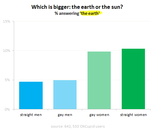
I’ve been using the p-prim ever since I’ve learned of them, back in my graduate school days at UC Berkeley. P-prims stand for phenomenological primitives and were “invented” by Andrea diSeesa, a UC Berkeley professor in the School of Education who also happens to be a physicist (diSessa, 1983). Visit his Wikipedia page and check out some of the cool projects he’s working at now. Before I give a definition of a p-prim, I think it would be good to give a few examples. Here’s a graph published by OkTrends on beliefs of various groups (in this case as defined by their sexual orientation) about the relative size of our sun versus the Earth (our planet). Even disregarding the differences in percentages due to sexual preference, an awesome 5 % to 10 % of our population believes that the planet we live on is larger than the star it orbits. Would this qualify as a p-prim? Yes: it’s not a formally learned concept; it describes a phenomenon; it’s a bit of knowledge based on personal observations: the sun looks like a small round disk in the sky; it’s a useful problem-solving tool when one has to draw a picture with…
Ethnographic & User Data, Featured, Interface Design, Pipsqueak Articles, Product Design Strategy
Emotional Design
by Olga Werby •

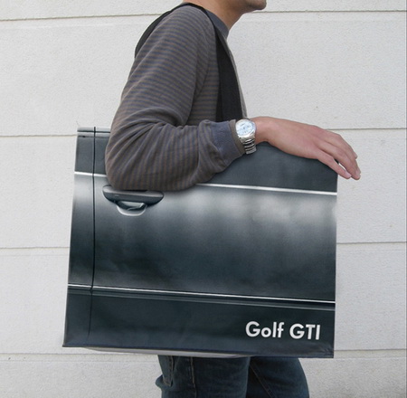
Product design is not just about usability. How we feel about a product makes a lot of difference. The research shows that two identical applications—with similar failure rate, but with a different take on dialogue box writing—result in very different perceptions of usability by its audience. The application with polite dialogue text always wins. Emotional design deals with how we feel about the product. Interfaces design is all about the look and feel and is responsible for a large portion of generated user emotions. Here are some examples of bag designs. If you want to encourage recycling, this is a great way of making these bags valuable—the users won’t throw them out after one use. Enjoy!
Errors, Ethnographic & User Data, Interface Design, Perception, Pipsqueak Articles, Product Design Strategy, Scaffolding, Users
Accidentally Supergluing an Eye Shut
by Olga Werby •

I hope the mere reading of the title made you queasy—it makes me shudder every time. On October 6th, CNN posted a story about a woman from Phoenix, Arizona, who accidentally put drops of super glue into her eye instead of the eye medication. She called 911, and in the emergency room the doctors had to cut open her eye and peel the hardened layer of super glue from her eye ball. If this doesn’t make you sick, then… One may ask: how stupid does one have to be to glue their eye shut? But, as with many other product-use errors, the woman made a very common mistake. The hospital wasn’t surprised—apparently these accidents happen all the time. Because of poor vision, she couldn’t distinguish between the bottles of her eye medicine and the package of super glue. Take a look at this: If you are relying purely on feel, the woman’s error no longer feels so outlandish. Here’s what she probably could see with her poor vision: And here is what we, the well-sighted, could see: So upon a close examination, the woman’s error is a natural mistake. (Yeah, I know, I know: Why would she keep the bottle…
Autopilot Errors, Background Knowledge Errors, Conceptual Design, Diagnostic Errors, Errors, Interaction Design, Interface Design, Interruptus Errors, Misapplication of Problem Solving Strategies, Mode Errors, Perceptual Blindness, Perceptual Focus Errors, Pipsqueak Articles, Product Design Strategy, Scaffolding, Users, Working Memory
The History of Usability
by Olga Werby •

When did we start being concerned with usability? Some will say that such concern is part of being human: cavemen worked their stone tools to get them just right. Interaction design mattered even then. But the field of usability research really came into being when the tools we used started to run up against our cognitive and physical limitations. And to avoid hitting literal, as well as psychological, walls, it was the aviation engineers who started to think about usability seriously. While cars were becoming ever more sophisticated and trains ever faster, it was the airplanes that were the cause of most usability problems around WWI. Cars were big, but didn’t go very fast or had a lot of roads to travel on at the turn of the century. In the first decade of the 20th century, there were only 8,000 cars total in the U.S. traveling on 10 miles of paved roads. In 1900, there were only 96 deaths caused by the automobile accidents. Planes were more problematic. For one thing, the missing roads weren’t a problem. And a plane falling out of the sky in an urban area caused far more damage than a car ever could. Planes…
Background Knowledge, Background Knowledge Errors, Cognitive Blindness, Pipsqueak Articles, Product Design Strategy, ZPD
Science vs. Media: Degree of Public Involvement
by Olga Werby •

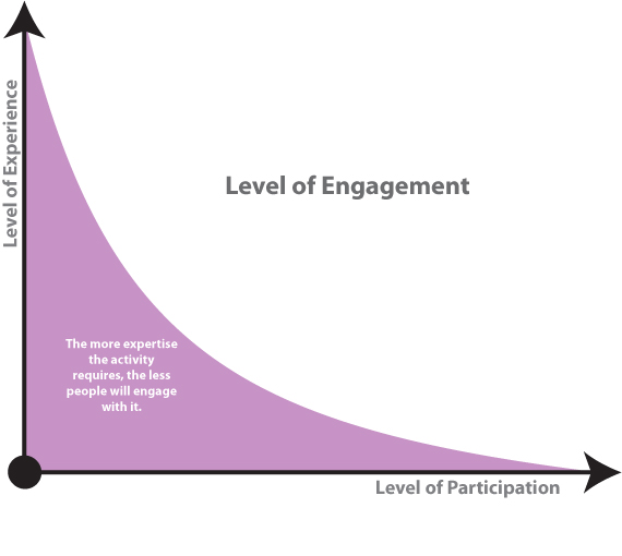
Recently, there has been an explosion of public discourse (fueled by the media) on whether we should do away with tenure in our institutions of higher learning. The basic argument boils down to “tenured teachers can do as they please due to job security and education suffers as the result.” Tenured professors, we are told, focus on research and publishing incomprehensible articles aimed at a few individuals in the world who could even understand them. What’s the use in that, people ask? My son/daughter/neighbor’s kid are being taught by a TA (with poor language skills) while we pay thousands of dollars for the privilege of these children attending universities with all those lazy good-for-nothing tenured professors! You might say that my summary of this world-view is extreme and simplifies the ideas to their comic representation. But that’s the point: the articles (and the readers’ comments they inspire) are written to get an emotional response. The issues of tenure, of the research that these tenured professors are engaged in and the articles they publish, and of teaching styles are complex. To evaluate the contribution of a scientist to his field, one needs to have a certain amount of expertise in that…
