The Road to Hell is Paved with Good Intentions. This year, the Metropolitan Transpiration Commission introduced the new Clipper Smart Card. Public transit riders all over the Bay Area can now use a convent piece of plastic to pay for their BART trains, buses, MUNIs, etc. Just swipe the Clipper Card past one of the little readers, and the gates open to let you in and out of the station or pay for the bus. The cards could be purchased in stores and vending machines all over the area—$2 cards are the minimum value cards. More money can be easily added to these cards at all BART train stations. The designers of Clipper Card envisioned happy riders and happy transpiration authority. “We’ll make it easy,” the designers said. “Easy to use, easy to fill up. And if the passengers accidently run out of money on their cards, we’ll allow them some small negative balance so they can leave the train station and pay for their rides later.” In the Bay Area, the cost of public transportation is pretty high and it’s highly dependent on how far you want to go: travel from City Hall to Airport, pay $8.10 for a…
Product Design Strategy
Background Knowledge, Background Knowledge Errors, Causal Net Problems, Diagnostic Errors, Group Decision Errors, Mental Model Traps, Pipsqueak Articles, Product Design Strategy
e-Waste & Product Design
by Olga Werby •
I just came across a very interesting video by Annie Leonard. She’s been making little, approachable documentaries that explain difficult to understand issues—e-waste being one of those. Here’s her latest: The Story of Stuff. This is the story about how stuff gets designed, made, distributed, and then trashed. The Story of Bottled Water. This is the story about drinking water and the marketing of bottled water.
Cognitive Blindness, Conceptual Design, Contributor, Cultural Bias, Cultural Differences, Ethnographic & User Data, Interaction Design, Interface Design, Product Design Strategy, Users
Japanese Playing a New Video Game: Catch-Up
by Van Nga •
Tabuchi, H., “Japanese Playing a New Video Game: Catch-Up.” New York Times Online. Visited on October 4, 2010: http://www.nytimes.com/2010/09/20/technology/20game.html?_r=1 This article discuss how Japan is partnering with Westerns in the gaming industry. In the mid 1980s’ through 1990s most game franchises were developed from Japan. Some of Nintendo’s Mario, Pokemon, Sonic the Hedgehog from Sean and Gran Turismo from Sony. Japan is now at least five years behind in the industry. The best selling game was Call of Duty: Modern Warfare 2 which was developed in the United States. Concept Design: Japan use to define the gaming industry. Part of it’s problem is that they need to appeal to players that are located overseas. Interaction Design: Developers want to try and reach out to the West and collaborate. Collaboration in trying to make games have a more global appeal can possibly generate a bigger target audience. Capcom for example developed Take Shadow of Rome. This 2005 action game was made for European and American markets. Instead of designing over sized samurai swordsmen they designed over sized gladiators. Interface Design: The interface design are collaborating with people from overseas and learn their culture in order to appeal in the market. They…
Background Knowledge, Background Knowledge Errors, Contributor, Errors, Interaction Design, Interface Design, Mental Model Traps, Product Design Strategy, Scaffolding, Users
More is always better – Or so most think!
by Mallika •
Tugend, A., (2010). “For the Dishwasher’s Sake, Go Easy on the Detergent.” NY Times Online. Visited on November 04, 2010: http://www.nytimes.com/2010/03/13/your-money/13shortcuts.html If dishwashers do not seem to be doing their job or if your clothes are not coming out as soft as you’d like them to, or if these machines break down easily, it is most likely due to “user error.” We throw in multiple fabric softener sheets because more is better. More isn’t better in this case! The excess sheets liquefy when the dryer gets hot and gum up the dryer. Most people use ten to fifteen times the amount of soap they need. This excess soap is detrimental to the life of the machines. This article has some clear implications for interaction and interface design. User errors are likely to happen. Even if you have a manual with detailed instructions, the chances of somebody reading that manual are very slim. Even if they read it, they are still likely to err. How can design inculcate the right usage in the user? In this case, what can design do to prevent errors resulting from the ‘More is better’ p-prim? Possible Interaction Design Solutions: Solutions could be…
Cognitive Blindness, Conceptual Design, Cultural Bias, Ethnographic & User Data, Featured, Flow, Interaction Design, Interface Design, Mental Model Traps, Mirroring Errors, Pipsqueak Articles, Product Design Strategy, Scaffolding, Users
Thinking About the Future of Reading
by Olga Werby •
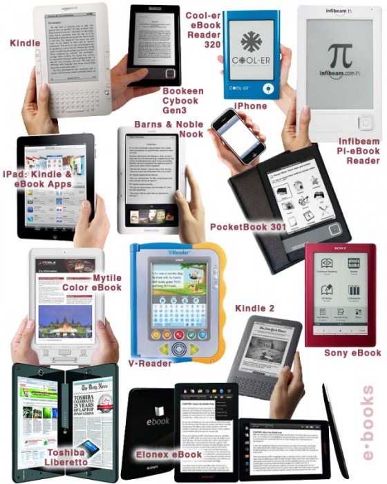
The Taxonomy of Usefulness We are a family with two Kindles, three iPads, two iPods, and an iPhone. We also have a few thousand old-fashioned paper books stored on bookshelves in every nook and cranny of our home: bedrooms, bathrooms, kitchen, stairs, garage, closets, family room, and any other space and surface that might hold a book or two or ten. We are into reading! And we use our Kindles, iPads/Pods/Phone, and computers to read as well. And while statistically speaking, we make just four data points for four family members, I feel we have something interesting to say about using technology to read. To help me understand my own relationship with reading and technology, I’ve come up with a little Taxonomy of Usefulness. If you’ve been reading this blog (or my books and papers), you’d have noticed that I like to slice up the world into groups sorted by a set of variables that I find useful at the time. Forming categories helps me think—the Cognitive Wheel is a prime example. Taxonomy of Usefulness These variables help derive the value of the electronic reading devices. Ergonomics There are many attributes to consider when describing the ergonomics of a device,…
Cultural Bias, Interface Design, Pipsqueak Articles, Product Design Strategy
Type & Brand
by Olga Werby •
Helvetica: Period. Cultural shifts as expressed in type: the story of Helvetica. Trajan is the Movie Font. Some fonts are in vogue for certain industries only.
Contributor, Cultural Bias, Cultural Differences, Ethnographic & User Data, Language, Metaphor Mistakes, Product Design Strategy
Language and thought in user-centered design
by mabelev •
Deutscher, G. (2010). “Does language shape the way you think?” New York Times Online Edition. Retrieved on October 4, 2010. http://www.nytimes.com/2010/08/29/magazine/29language-t.html This article summarizes the history and the current status of the linguistic relativity hypothesis or the idea that “language shapes thought.” This idea comes in several different formulations. The version on which Deutscher’s review focuses is a cross-linguistic claim that speakers of different languages use different mental representations or processes as a result of having learned different languages as children. A particularly strong version of the cross-linguistic hypothesis suggests that our native language provides us with a basic toolbox of conceptual representation, so if a concept or a mode of thought is not encoded in a given language, its monolingual speakers would be incapable of thinking about such a concept or thinking in such a mode. For instance, linguistic relativity led to the prediction that people’s perception of differences in color should reflect the way their language encodes color. This prediction was spectacularly disproven by the discovery that people whose language only has two color terms in its vocabulary perceive and categorize colors similarly to speakers of English, which has 11 basic color terms, plus many non-basic ones (Berlin…