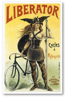
Good product design—design that solves a real need; design that considers the strengths and weaknesses of the user; design that stands the test of time and cultural fads—always incorporates the the 3 F’s: Fun, Functionality, and Flow. It’s easy to talk about the 3 F’s in abstract, but I thought taking a concrete example of a bicycle would be more productive. A bicycle is a designed object that satisfies a real need, does so in way that brings joy to its users, and the act of riding results in flow experience for many. The old “Liberator” poster tries to communicate all 3 F’s to the potential buyers of its products: liberator means freedom to move, real functionality; the woman warrior communicates power and fun—you will feel the way she looks! It’s exhilarating! Notice the high heels and the beautiful vista (with a rough terrain) and a kid pointing at the riders with envy. These posters, old advertising ads for bicycles, try to communicate the same: it’s fun, functional, and exciting to ride a bike. Ride, and look good. Ride, and be the center of attention. Design for Fun So what makes a particular design fun? It seems that one of…
Featured
Cognitive Blindness, Conceptual Design, Diagnostic Errors, Errors, Featured, Mirroring Errors, Pipsqueak Articles, Product Design Strategy, Scaffolding
Empathy on the Brain
by Olga Werby •
Empathy is a necessary component of product design. To design and make something that is comfortable to use for someone else, requires the maker of the product to imagine how another human being would feel while using it. This is a hard thing to do. Medical students have to take “bed side manners” classes that explicitly teach empathy for the patient. Some design schools do the same (check out this video in Product Design Resources). Fortunately, humans come equipped with a special region in the brain whose job it is to help us see the world from another’s point of view. Here’s a short introduction by Rebecca Saxe, “How we read each other’s minds.” So when we go to the movies, we relate to the characters and feel what they feel, and cry when they are sad, and laugh when they are happy, and cringe when things get awkward, because we have the Right TPJ (or RTPJ) region in our brain just behind and above our right ear. We aren’t born ready to use this part of our brain, as the experiments described by Dr. Saxe in the video show. It takes a long time for this social problem solving…
Cognitive Blindness, Featured, Mental Model Traps, Pipsqueak Articles, Product Design Strategy
The Value of Trust in Search
by Olga Werby •
There was an interesting article published on the New York Times the other day: “The Dirty Little Secrets of Search.” The article documented the use of Black Hat SEO strategies on behalf of J. C. Penny, leading J. C. Penny to be at the top of multiple Google search results for months. While J. C. Penny didn’t disclose the boost in revenues that the number one placement on Google search produced during the 2010 Christmas shopping season, we can assume it was substantial. The article raises several alarms: How prevalent is the use of “Black Hat” CEO techniques among large commercial companies selling their services online? Since J. C. Penny is a customer worth several million of ad dollars to Google, did Google (for a time) look the other way? [30-11-2010, BBC News: “EU launches antitrust probe into alleged Google abuses,” last visited on 02-14-2011.] Google administers “Google Hell” punishment to the companies that use “Black Hat” strategies to beat its search ranking algorithms. There’s no court, no arbitration, no negotiation. The company simply vanishes from Google search results. These are all about trust. We—the average online citizens—rely on search results for so many needs now. We research our medical…
Attention, Attention Controls Errors, Cognitive Blindness, Conceptual Design, Cultural Bias, Featured, Flow, Interaction Design, Interface Design, Mental Model Traps, Perceptual Focus Errors, Pipsqueak Articles, Product Design Strategy, Users, Working Memory
Multitasking Myth
by Olga Werby •
I’ve been noticing a lot of praise and demand for mutlitaskers: “We are looking for a talented individual who is [insert a laundry list of qualifications here] and is also a great multitasker!” or “Women are naturally better at multitasking.” or “Not only is he gifted, but he is able to work on all these projects simultaneously. If only we had a dozen more just like him!” (—probably just to get anything done!) The interesting aspect of this increased demand for multitasking is the rise of ADHD diagnosis. So I thought it would be an interesting exercise to pin down what exactly is being praised and diagnosed. A Curious Case of ADHD Let’s start with formal diagnostic criteria for ADHD (attention deficit hyperactivity disorder). What are the symptoms of ADHD? Below is a list of attributes that is adapted from the Diagnostic and Statistical Manual of Mental Disorders 4th ed. (DSM-IV). When you read this list the first time, imagine an eight year old boy trapped in an elementary classroom. On the second reading, consider an 80-year-old woman in a nursing home. On the third, visualize a soldier just back from Afghanistan. And finally, when you read the list for…
Cognitive Blindness, Conceptual Design, Cultural Bias, Ethnographic & User Data, Featured, Flow, Interaction Design, Interface Design, Mental Model Traps, Mirroring Errors, Pipsqueak Articles, Product Design Strategy, Scaffolding, Users
Thinking About the Future of Reading
by Olga Werby •
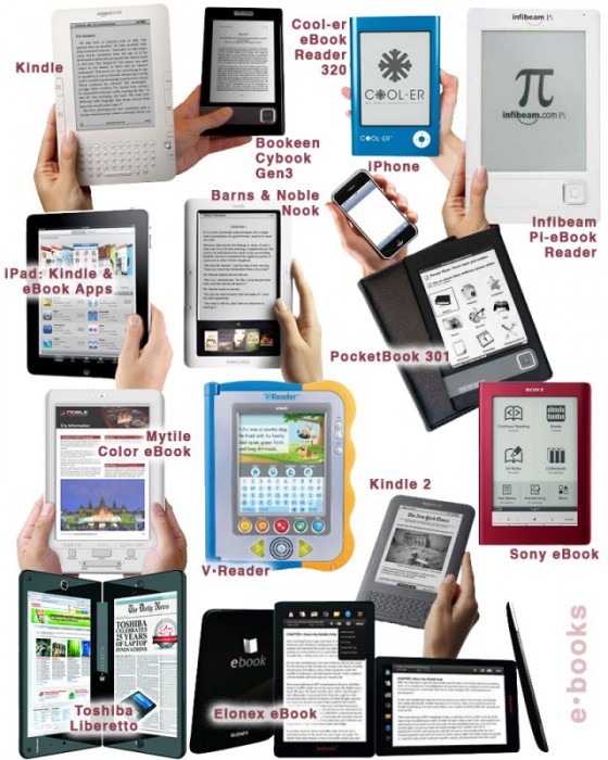
The Taxonomy of Usefulness We are a family with two Kindles, three iPads, two iPods, and an iPhone. We also have a few thousand old-fashioned paper books stored on bookshelves in every nook and cranny of our home: bedrooms, bathrooms, kitchen, stairs, garage, closets, family room, and any other space and surface that might hold a book or two or ten. We are into reading! And we use our Kindles, iPads/Pods/Phone, and computers to read as well. And while statistically speaking, we make just four data points for four family members, I feel we have something interesting to say about using technology to read. To help me understand my own relationship with reading and technology, I’ve come up with a little Taxonomy of Usefulness. If you’ve been reading this blog (or my books and papers), you’d have noticed that I like to slice up the world into groups sorted by a set of variables that I find useful at the time. Forming categories helps me think—the Cognitive Wheel is a prime example. Taxonomy of Usefulness These variables help derive the value of the electronic reading devices. Ergonomics There are many attributes to consider when describing the ergonomics of a device,…
Anchoring Errors, Background Knowledge, Background Knowledge Errors, Causal Net Problems, Diagnostic Errors, Featured, Mental Model Traps, Metaphor Mistakes, Misapplication of Problem Solving Strategies, Pipsqueak Articles, Product Design Strategy, Scaffolding
What is a p-prim?
by Olga Werby •
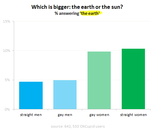
I’ve been using the p-prim ever since I’ve learned of them, back in my graduate school days at UC Berkeley. P-prims stand for phenomenological primitives and were “invented” by Andrea diSeesa, a UC Berkeley professor in the School of Education who also happens to be a physicist (diSessa, 1983). Visit his Wikipedia page and check out some of the cool projects he’s working at now. Before I give a definition of a p-prim, I think it would be good to give a few examples. Here’s a graph published by OkTrends on beliefs of various groups (in this case as defined by their sexual orientation) about the relative size of our sun versus the Earth (our planet). Even disregarding the differences in percentages due to sexual preference, an awesome 5 % to 10 % of our population believes that the planet we live on is larger than the star it orbits. Would this qualify as a p-prim? Yes: it’s not a formally learned concept; it describes a phenomenon; it’s a bit of knowledge based on personal observations: the sun looks like a small round disk in the sky; it’s a useful problem-solving tool when one has to draw a picture with…
Ethnographic & User Data, Featured, Interface Design, Pipsqueak Articles, Product Design Strategy
Emotional Design
by Olga Werby •
Product design is not just about usability. How we feel about a product makes a lot of difference. The research shows that two identical applications—with similar failure rate, but with a different take on dialogue box writing—result in very different perceptions of usability by its audience. The application with polite dialogue text always wins. Emotional design deals with how we feel about the product. Interfaces design is all about the look and feel and is responsible for a large portion of generated user emotions. Here are some examples of bag designs. If you want to encourage recycling, this is a great way of making these bags valuable—the users won’t throw them out after one use. Enjoy!