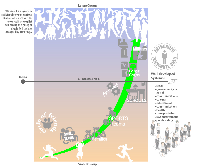
One of the areas of discussion at the NIH Citizen Science Engagement Think Tank meeting last month was how to categorize the roles (and thus rules of engagement) for citizen scientists. There was a continuous pressure to call individuals who “donate” their medical data to scientific research patients. Let me start by saying that I find that unacceptable — aside from the fact that every human being on Earth has been or will be a patient at some point in their lives; the label patient implies a lower level on the hierarchy than doctor or scientist. The whole point of citizen science initiative is to break down the barriers to entry — we are ALL scientists! Being a scientist is not measured by the number of years in school or diplomas on the wall. It is the willingness to do science that is key. Thus we can all be scientists. With that said, what follows is the discussion on group dynamics — how do people work in groups and how we can support productive scientific endeavors through good design and social engineering. Think Different Collective Groups of people are not made up of homogeneous people — we are all idiosyncratically…
Featured
Conceptual Design, Featured, Pipsqueak Articles, Product Design Strategy
2013 Think Tank Presentation on Socio-Technical System Design
by Olga Werby •
I’m about to leave for Washington D.C. for a Think Tank on Citizen Engagement in Biomedical Research. I have only five minutes to talk during the introductory speed geeking event, where all of us get to know about each other and each other’s projects. I’m going there to talk about our lessons learned from designing complex socio-technical systems that required intense participation from their users. I’ve been working on designing such systems for many years now. Some projects were/are very successful, some not so much. I’m not sure I will be able to give a full account of what we’ve learned, so I’m putting up a long(ish) version of my presentation here — if I had 15 minutes, this is what I would say to our very interesting group of participants. I chose these four complex socio-technical systems because all of them were in some measure educational ventures and all required outside users to contribute large amounts of data. I will start with Ushahidi. Ushahidi was born during the 2007 Kenyan election. That election was bloody and the violence, in many cases perpetrated by the government, was not being reported. Ushahidi was a grass-roots effort to tell their countrymen and…
Background Knowledge, Conceptual Design, Cultural Bias, Featured, Pipsqueak Articles, Product Design Strategy
Forgetting by Design
by Olga Werby •
I get a lot of email forwards…don’t we all? And just the other day I got one that I have seen many times already over the past few years… Usually, you look, you smirk, you move on. But this time, the photo got me thinking: that poor kid — he has no memory of this shot, but he will be remembered for it for the rest of his life! The shot has long ago slipped from the close circle of sharing that his parents intended it for and has been widely distributed through out the world. Someday, this kid might even get it as mail forward himself: an adult man looking at a silly embarrassing moment that got away… Information with Expiration Date Somehow, I don’t imagine that getting “an image that got away” of oneself would be a source of continuous pleasure. One might want to forget the whole thing… And it is not just images — although having images with expiration dates would be very valuable — there are loads of information that should be forgotten by design. When my generation was growing up, the silly and stupid things we did didn’t end up as data for public…
Conceptual Design, Errors, Featured, Interaction Design, Interface Design, Perception, Perceptual Blindness, Perceptual Focus Errors, Pipsqueak Articles, Product Design Strategy
Where to post the “OK” Button on the Screen?
by Olga Werby •
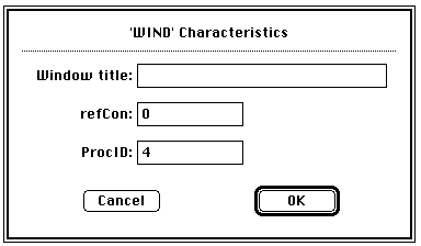
I have very strong opinions about where on the screen the OK or NEXT or SUBMIT buttons go in relation to CANCEL. Without giving it away, I’m going to walk through the design decision tree and provide a lot of references for both sides of the issue — yes, there are strong feelings about the right versus the left position choice. I’m not alone! Passive versus Active Buttons Active Buttons are the ones that advance the action to the next level. Passive ones return the users to previous state, negate the action sequence. OKAY, OK, NEXT, SUBMIT, ACCEPT, GO are all active buttons. CANCEL, BACK, PREVIOUS are action that reverse forward momentum and push the user to places they’ve been before. HELP and INFO sidetrack the user and distract from forward thrust of activity. In general, product designers want to move the users toward their goals — thus we want the perceptual focus to be on the action buttons. We want to make sure that users fist see the way forward, and then click on the right button that propels them forward to completion of the task. All distractions and side movements should be downplayed with Interface Design with the…
Conceptual Design, Cultural Bias, Cultural Differences, Featured, Pipsqueak Articles, Product Design Strategy
30,000 Years of Logo Evolution
by Olga Werby •
Logos have undergone an amazing amount of visual change in the last 30,000 years — obvious statement, isn’t it? But if you look at the change, all grouped together, what we are seeing is the evolution of visual language. The way we relate to icons and what we want them to be is changing continuously. From “I was here” hand print on the wall of an ancient cave to the modern version of Apple logo, we are just trying to make a brand that the current generation of users finds visually appealing.
Featured, Interface Design, Perception, Pipsqueak Articles
Creativity, Perception, and Public Art
by Olga Werby •
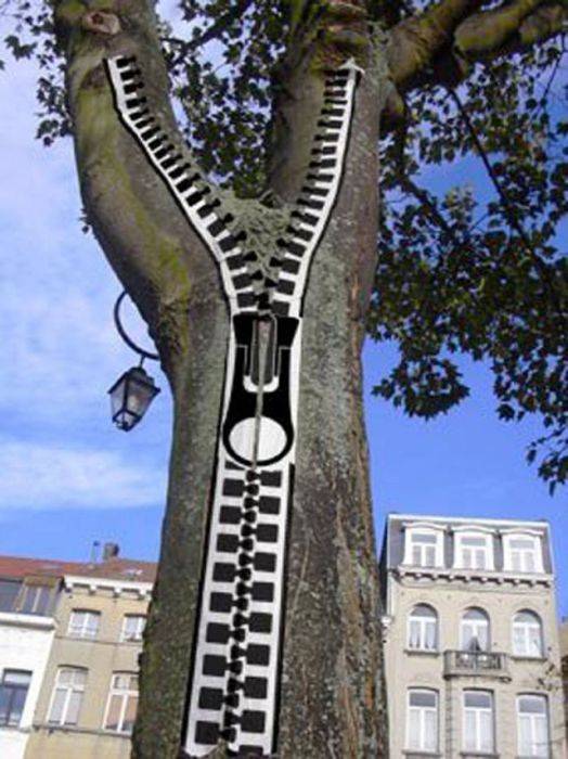
Art or craft? Creativity or public nuisance? Sometimes, the line between these is so fine, so complex, so fractal, that it’s simply doesn’t matter. The images below span thousands of years in dates of creation. The artists used light and shadow, perspective, and clever geometry of space to add meaning to their work. All showed an amazing amount of imagination, all provide commentary on current events or a point of view. Happy holidays to all! Enjoy! [flagallery gid=3 name=”Gallery”]
Background Knowledge, Background Knowledge Errors, Causal Net Problems, Cognitive Blindness, Conceptual Design, Cultural Bias, Cultural Differences, Ethnographic & User Data, Featured, Group Decision Errors, Mental Model Traps, Mirroring Errors, Pipsqueak Articles, Product Design Strategy
Community of Practice and Knowledge Propagation Circle
by Olga Werby •
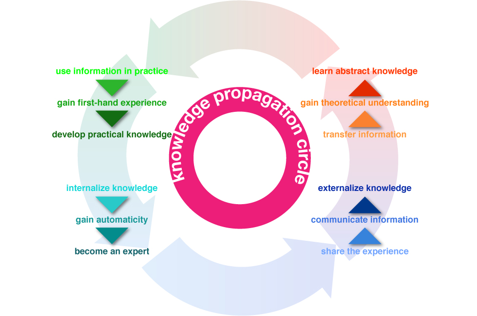
This summer my family and I travelled to Rome. While the temperatures didn’t reach the usual astronomic heights, it was rather warm. But we, and other visitors, didn’t have to worry about thirst. Rome has the best network of public drinking fountains that I have ever seen. Every few blocks, there’s a beautifully-designed basin with a spigot of continuously running water (I know, being from California, the never-ending stream made us very uncomfortable, too). There are two bits of information that have to be passed on to the first-time visitors of Rome: the water is potable—safe to drink, and how to use the fountain—there’s a bit of a trick to them. Above is my son demonstrating a little secret interaction. There’s a small hole on the top of the pipe that can serve as drinking fountain if the main hole at the end is plugged up (with a finger). While we learned about the great drinking water in Rome from many traveling guides (books, online sites, etc.), we obviously didn’t know about the trick until we watched a pro do it. Knowledge Propagation Circle Information propagates through communities. When we first encounter a novel bit of data, it tends to…