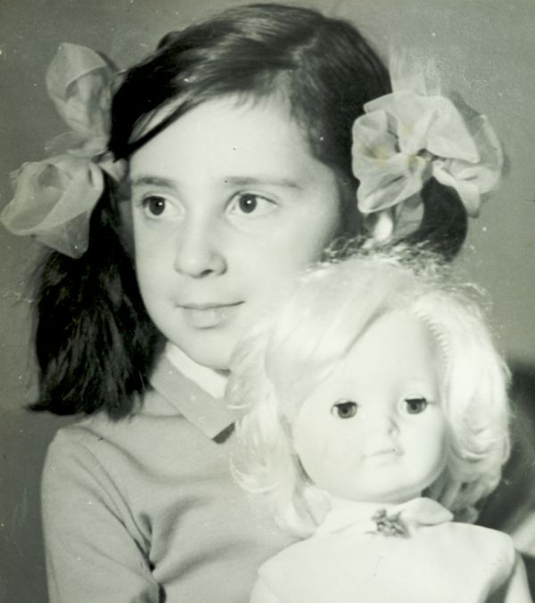
Pipsqueak Articles

Posts written by Olga Werby or Christopher Werby

Branding & Emotional Design: The Culture of Sneakers

How do we spend our money? Well, the first cut goes to survival: essential goods and services that are absolutely necessary to our survival. Food, housing, medical care are all part of the basic necessities of life. Some, of course, are more necessary than others (we might postpone going to a dentist…but not for long), but there’s a core of stuff that we need to live. The next tier up from survival is comfort. This is a very large tier—what’s comfort to some is a necessity to others and visa versa. People use their income to increase their general comfort level. This might mean a large house, more comfortable beds, larger selection of clothing. But generally, when we talk of comfort, we don’t include jet setting to Paris for a nice date out on the town. Comfort is about everyday life needs, but more comfortable. The top tier of our income is the disposable income and it is spent on luxury—the money we have left over from dealing with our needs and comforts; the money we can chose to spend in an extravagant and even wasteful manner. When economists make predictions about the average size of the available disposable income,…

Working with Clients

We once had a client who made his secretary drive to our studio with a piece of a carpet from his office to be used as a color swatch for his company’s new logo. And while the final logo looked okay (very logo-like), it did little to represent the company’s brand. The company is no longer around today. Having a client who opines on the color of the background, choice of typeface, thickness of line, or layout mars the design process. It’s easy to get lost in details and personal preferences—who is to say that green is better than orange? A good designer has to be able to manage the client, keep the conversation focused on business goals and user needs. But before we can delve into the design process, we have establish trust. Clients need to feel like they’ve been listened to, they have to know and understand that design is hard work, and they have to buy into our expertise. The First Date The initial group meeting between the design firm and their client tends to feel like a first date: this is a chance for everyone to declare their expertise and expectations of each other. And like a…

Perceptual Illusions

Our minds play tricks on us all the time. Once the information has entered our cognition via our senses, it still has to get processed to be understood. Like any other data, it’s all about context. For interesting examples of optical illusions, please visit http://www.lottolab.org/articles/illusionsoflight.asp. R. Beau Lotto has put together a few interesting examples of mis-processing! Or watch him deliver a talk at TED.

What is a p-prim?

Beliefs on the relative size of Earth versus the Sun.

I’ve been using the p-prim ever since I’ve learned of them, back in my graduate school days at UC Berkeley. P-prims stand for phenomenological primitives and were “invented” by Andrea diSeesa, a UC Berkeley professor in the School of Education who also happens to be a physicist (diSessa, 1983). Visit his Wikipedia page and check out some of the cool projects he’s working at now. Before I give a definition of a p-prim, I think it would be good to give a few examples. Here’s a graph published by OkTrends on beliefs of various groups (in this case as defined by their sexual orientation) about the relative size of our sun versus the Earth (our planet). Even disregarding the differences in percentages due to sexual preference, an awesome 5 % to 10 % of our population believes that the planet we live on is larger than the star it orbits. Would this qualify as a p-prim? Yes: it’s not a formally learned concept; it describes a phenomenon; it’s a bit of knowledge based on personal observations: the sun looks like a small round disk in the sky; it’s a useful problem-solving tool when one has to draw a picture with…

Emotional Design

Product design is not just about usability. How we feel about a product makes a lot of difference. The research shows that two identical applications—with similar failure rate, but with a different take on dialogue box writing—result in very different perceptions of usability by its audience. The application with polite dialogue text always wins. Emotional design deals with how we feel about the product. Interfaces design is all about the look and feel and is responsible for a large portion of generated user emotions. Here are some examples of bag designs. If you want to encourage recycling, this is a great way of making these bags valuable—the users won’t throw them out after one use. Enjoy!

Accidentally Supergluing an Eye Shut

I hope the mere reading of the title made you queasy—it makes me shudder every time. On October 6th, CNN posted a story about a woman from Phoenix, Arizona, who accidentally put drops of super glue into her eye instead of the eye medication. She called 911, and in the emergency room the doctors had to cut open her eye and peel the hardened layer of super glue from her eye ball. If this doesn’t make you sick, then… One may ask: how stupid does one have to be to glue their eye shut? But, as with many other product-use errors, the woman made a very common mistake. The hospital wasn’t surprised—apparently these accidents happen all the time. Because of poor vision, she couldn’t distinguish between the bottles of her eye medicine and the package of super glue. Take a look at this: If you are relying purely on feel, the woman’s error no longer feels so outlandish. Here’s what she probably could see with her poor vision: And here is what we, the well-sighted, could see: So upon a close examination, the woman’s error is a natural mistake. (Yeah, I know, I know: Why would she keep the bottle…