Group Decision Errors

Knowledge, Context, & Expectation

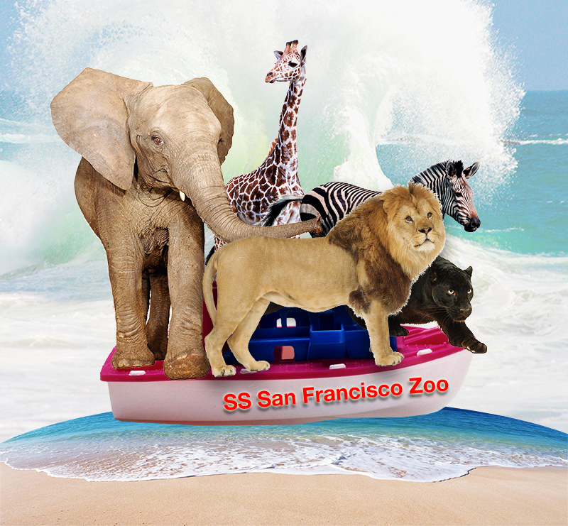
These are three necessary components of any product design: Knowledge: the background information that forms the foundation of product design Context: the ecosystem in which the product will be used Expectation: the alignment of goals between product creators and the users for which it was designed A failure to fully understand any of the above variables results in errors that propagate throughout the product system. But what if the product is disaster preparedness? Consider the design of an evacuation plan ahead of a disaster. You would need to understand the what kinds of damage the disaster is capable of wrecking; the probabilities for each outcome; the people and the ecosystem in which the disaster will occur; and expectations of all the participants in the evacuation plans. Tsunami and The Zoo A few years ago, I was teaching a fifth grade science class where we were discussing the possible damage from a tsunami in San Francisco (we just visited the Bay Model). The problem I posed to the students was to design a reasonable evacuation plan for The San Francisco Zoo animals. The Zoo lies on the tsunami flood plane, and as far as we knew there was no plan for…

TSA: the Good, the Bad, and the Ugly

There has been a lot of stories lately about the Transportation Security Administration (TSA), and most have been less than flattering (to say the least). How can an agency that was designed to “serve and protect” the citizens of the United States from harm evoke such wrath from ordinarily shy and non-vocal travelers? This blog is about product design, and so my analysis of the situation will treat this as a failure of product design. Where are the failures? Mistake #1 TSA Conceptual Design: Blocking There are bad guys out there that want to do us—citizen travelers from US—harm. There are the box-cutter carrying terrorists, the shoe-bombers, the liquid explosives bandits, the underwear-bombers, the printer cartridge explosives engineers. TSA installed airport security measures that would counteract each of these threats as they revealed themselves. The basic conceptual design strategy here is blocking: identify a threat and find an effective block. This is a strategy based on hindsight: if we knew that people could sneak bombs in their underwear, then we would have had a way to block it. We didn’t know, but now we do, and so we created systems to block this threat in the future. TSA Game Plan: Escalating…

Lessons to be Learned from the GAP Logo Debacle

Geoghegan, T. (2010). “Lessons to be learnt from the Gap logo debacle.” BBC News Magazine. Retrieved on October 12, 2010: http://www.bbc.co.uk/news/magazine-11517129 A new logo can brighten up a company’s image or enrage loyal customers. In the case of GAP, the latter was obvious. The release of the new logo led to a huge online backlash from customers on FB and twitter conveying how unhappy they were with the logo. Within a week of release, GAP chose to revert back to the original logo after a slew of criticism. GAP LOGO The importance of being an iconic brand has been severely undervalued. The association of the image and brand is overlaid in the minds of people for the last 20 years. Changing the visual must have pre empted GAP to have tested the logo with focus groups and understand the reactions of the audience.  The changed their visual imagery without upsetting customers. The logos below have retained their sense of familiarity which is refreshing and yet without really giving customers the need to process an all together new image to associate with the brand. Companies uniformly moved from serif font to a more elegant Helvetica. MSNBC LOGO GE LOGO Product Positioning:…

e-Waste & Product Design

I just came across a very interesting video by Annie Leonard. She’s been making little, approachable documentaries that explain difficult to understand issues—e-waste being one of those. Here’s her latest: The Story of Stuff. This is the story about how stuff gets designed, made, distributed, and then trashed. The Story of Bottled Water. This is the story about drinking water and the marketing of bottled water.

Working with Clients

We once had a client who made his secretary drive to our studio with a piece of a carpet from his office to be used as a color swatch for his company’s new logo. And while the final logo looked okay (very logo-like), it did little to represent the company’s brand. The company is no longer around today. Having a client who opines on the color of the background, choice of typeface, thickness of line, or layout mars the design process. It’s easy to get lost in details and personal preferences—who is to say that green is better than orange? A good designer has to be able to manage the client, keep the conversation focused on business goals and user needs. But before we can delve into the design process, we have establish trust. Clients need to feel like they’ve been listened to, they have to know and understand that design is hard work, and they have to buy into our expertise. The First Date The initial group meeting between the design firm and their client tends to feel like a first date: this is a chance for everyone to declare their expertise and expectations of each other. And like a…