We all want to go back to normal. We cry about it and complain: “Enough is enough. We want our lives back.” This need to “go back to normal” is always with us, although maybe on a different scale post-pandemic. But even before Covid, there were always things that disturbed our perception of normal: new teachers, new housing, new jobs, new routines, stores and restaurants closing, cars that break down, challenging illnesses, new bus routes. Towards the end of our vacations, we come to realize that, although adventures are fun, it is good to be home where things are as we expect them to be. This want of predictability, for having our expectations met, is at the crux of a deep-seated need for normalcy. We have a limited capacity for taking in and processing information — we have limited short-term memories. When there is a flood of unfamiliar data, we get overwhelmed. We end up not having enough cognitive and emotional capacity to handle the new stuff on top of all the other things we have to do. Sudden change makes life feel overwhelming. Anchoring Errors This brings me to anchoring errors, which are basically little cognitive traps our minds…
Tag Archive for user errors
Attention, Background Knowledge Errors, Errors, Language, Perceptual Blindness, Pipsqueak Articles
Inattention Errors in Extemporaneous Writing
by Olga Werby •
Automation provides many opportunities for inattention errors. Extemporaneous writing/typing is particularly prone to errors so egregious that they are funny… in retrospect. Here are a few examples of “scary” autocorrect mistakes as well as other problems caused by limited or spit [sorry, that was “split”] attention on the task of communication. 1. Everyone fails sometimes It is easy to fail when we are in a hurry, or are under pressure, or don’t proofread our work before it goes out. Some fails are the result of trying to be too clever and not getting a second opinion. Some fails are due to lack of process — a second pair of eyes on the copy would have noticed the “extra word” problem. Some fails are easily caught via a spellchecker… But in some cases, a spellchecker does help… And in many cases, spellcheck is the CAUSE of strange communications. I had a few of those myself… 2. Errors are different from mistakes Mistakes are things that we know are wrong the moment we notice them — the head-slappers! They are usually caused by inattention on the task. Errors are different. Errors result from true ignorance. But it doesn’t make the resulting fails…
Conceptual Design, Cultural Differences, Ethnographic & User Data, Language, Pipsqueak Articles
Language and Cultural Differences in Communication
by Olga Werby •
Above is an example of Interface Design — Kulula Airlines decorates its planes in a very playful manner. Does this choice make you feel safer or more reticent to fly their planes? Well, that depends… Consider the FAA Passenger Briefing Guidelines: 14 CFR 91.519. Below are a few examples: § 91.519 Passenger briefing. (a) Before each takeoff the pilot in command of an airplane carrying passengers shall ensure that all passengers have been orally briefed on: Smoking. Each passenger shall be briefed on when, where, and under what conditions smoking is prohibited. This briefing shall include a statement, as appropriate, that the Federal Aviation Regulations require passenger compliance with lighted passenger information signs and no smoking placards, prohibit smoking in lavatories, and require compliance with crewmember instructions with regard to these items; Use of safety belts and shoulder harnesses. Each passenger shall be briefed on when, where, and under what conditions it is necessary to have his or her safety belt and, if installed, his or her shoulder harness fastened about him or her. This briefing shall include a statement, as appropriate, that Federal Aviation Regulations require passenger compliance with the lighted passenger sign and/or crewmember instructions with regard to…
Featured, Perception, Pipsqueak Articles, Product Design Strategy, Reference
Colorblindness Test on iPhone Google Traffic Map
by Olga Werby •
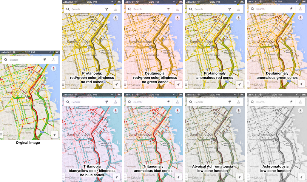
Google Traffic Map on an iPhone (or any other mobile device) is a great product… unless you are colorblind. Then, it’s a nightmare! 5% to 20% of the population has some kind of color processing disorder. Here is a simple test if you are one of those. Which of the following look the same to you? Click on the image above to enlarge. Red/green confusion — Protanopia: red/green color blindness, no red cones; Deutanopia: red/green color blindness, no green cones; Protanomaly: anomalous red cones; Deutanomaly: anomalous green cones — are the most common visual processing problems. But there is also blue blindness — Tritanopia: blue/yellow color blindness, no blue cones; and Tritanomaly: anomalous blue cones. The most rare cases are the monochrome colorblindness, the true loss of color — Achromatopsia: low cone function; and Atypical Achromatopsia: low cone function with some color. As designers, we have to be aware of our audiences’ limitations and strength. And visual processing and comprehension is no exception. In the past, I’ve written about colorblindness: . But unfortunately, the site that helped identify problems with design doesn’t seem to work. Here’s a new sit e for your reference: Colorblind Web Page Filter If you are…
Conceptual Design, Cultural Bias, Cultural Differences, Pipsqueak Articles
Same Desire, Cultural Shift in Solution
by Olga Werby •
Over time, some desires have stayed constant: an aversion to pain, a wish for health, a longing to be loved, and a craving for wealth, power, and youth. But desires are susceptible to cultural shifts, and so they shift with the whim of fashion: the need to be thin, the hope to fit the norms of current beauty, the yearning for popularity, an aspiration for fame. Each generation comes up with solutions for their desired that are based in the cultural soup that nourished them. What is a cultural soup? Well, it’s a heady mixture of the following: anxiety — each generation has their own issues that they loose sleep over. In addition to the ones that their parents experienced, each generation can choose and pick and invent their own worries. affordances — affordances are available actions that are mired in context and situation. As context changes, affordances evolve. Each generation sees a unique subset of problem solutions. emotional design — each generation is stirred by issues and fashion that are uniquely their own. Emotional design is by definition tied to a particular group of people, be they joined in time, cause, or geography. Social value, user satisfaction, and emotional…
Contributor, Interface Design, Perception, Product Design Strategy, Users
Haptics and the Uniformity of Gloss
by Natesh Daniel •
For an introduction into the science of haptics, the article, “Primal, Acute and Easily Duped: Our Sense of Touch,” provided great examples about the accuracy and fallibility of our sense of touch. However, the proliferation of touch-sensitive input devices over the past 4 years since it was written didn’t provide the author with any insight into their pending popularity, or the effect they would have on our fingertips. If our fingertips can feel a bump the thickness of one micron, imagine the sensitivity they have even as they slide over a touch-sensitive glass tablet, a glossy plastic mouse, or an anodized smooth track pad. The more our fingertips are required to touch, drag, swipe, and pinch, even over smooth surfaces, the more abrasive those surfaces become over time and the more those subtle abrasions wear on our skin. Glass becomes scratched, plastic becomes scuffed, and biological stains build up on anodized aluminum along with all other surfaces. The point being that these smooth surfaces end up hurting, if not annoying, our fingertips over time. If the fingertips are the equivalent of the fovea of our eyes, why subject ourselves to these increasingly painful disturbances and not return to using an…
Conceptual Design, Contributor, Interaction Design, Interface Design, Perception
RE: Deadline Pressure Distorts Our Sense of Time
by Daniel Hooks •
Article: Herbert, W. (2011). “Deadline Pressure Distorts Our Sense of Time.” scientificamerican.com. Visited on October 9th, 2012: http://www.scientificamerican.com/article.cfm?id=looming-deadlines Summary: The perceived difficulty and deadline pressure associated with a task alters our perception of time. In an initial study, subject were presented with a series of tasks of varying difficulty and asked how far away the day of completion felt to them. The tasks that were more complex and work intensive were perceived as being further in the future. To arrive at this result our brains are translating effort into time, assuming that the more difficult tasks must be further away since they will require more work to complete. An opposite effect is encountered when deadlines are associated with the tasks. If subjects are presented with either an easy or difficult task that they must complete by a set date in the future, those with the more complex and effortful task report that the date feels much closer to them than those with the simple task. This effect may sometimes cause us to feel overwhelmed as multiple complex tasks pile up on us, but our skewed perception of time also ensures that we typically complete necessary tasks within the actual amount of time…