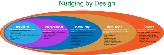
Social engineering is way of designing products and situations which actively encourage people to behave in a desired way — Nudging for Good. EDF Challenge “Sharing energy in the city, 2030” seems an ideal circumstance for social engineering for the greater social good. The basic question is how do we as designers find ways to incentivize individuals to save energy? How do we make a bit of personal sacrifice an attractive option for most? How do we “nudge” people to behave in a socially responsible ways when it comes to energy use? First, it makes sense to break up the problem into several user categories: personal energy sharing, family sharing, neighborhood or community sharing, city or village sharing. At each level we expand the circle to involve more and more individuals, and so we need a different approach for each category. Each category has a set of pressure points on which social engineers can apply pressure to achieve the desired changes. Once we identify the user groups targeted for “nudging”, game theory can be used to find the most attractive options. While there are numerous strategies that can be borrowed from game theory to incentivize the desired energy sharing behavior,…
Tag Archive for product design
Conceptual Design
Nudging Behavior for a Change
by Olga Werby •
Conceptual Design, Contributor, Personality, Product Design Strategy
Flat or 3D?
by Natesh Daniel •
Recently, on a LinkedIn discussion board, a designer asked if logo design was following the flat trend in UI design. The original post cited an article on DesignTaxi, “Top 10 Most-Talked-About Logo Redesigns Of 2013.” Most designers who responded to the discussion favored the idea that “All good logos can be written in sand with a stick.” The concept being: simplicity is better than complexity and one-color flat design is better than multi-colored three-dimensional design. I disagreed with a lot of the discussion. Though the UI design trend is flat and less skeuomorphic, logos are increasingly becoming three dimensional in look. This started with AT&T’s logo in 2005 and continues with Autodesk’s new logo from this year. Not many people favored this point of view and one comment indicated that the examples I shared were “exceptions, not the rule.” My point is that technology has changed and logos must be designed to look good in a variety of contexts and resolutions. Looking at the Autodesk logo, it has a three-dimensional color version, a flat color version, a black and white version like a stencil, and specs for literally reproducing it in three dimensions for signage. The key here is that logos are…
Conceptual Design, Product Design Strategy
Health Foo: Health and Human Rights
by Olga Werby •
“I want to live a healthy life!” For as long as humans have lived in groups, this meant a social covenant — conforming to rules set by many to insure mutual survival. One way or another, health and law have been intertwined for millennia: don’t poo in a public well — one of the first health edicts along with burial customs religious food-limiting laws — limiting food born illnesses from decimating communities mandatory immunization — the need for herd immunity Health and community are mutually entangled. The price of living in a community means giving up certain personal rights: “the needs of the many outweigh the needs of the few or the one” But this is a delicate balance. As a group, societies have done horrendous thing to individuals in a name of greater good: taking a right to privacy forced quarantines, treatment, and sterilization compulsory rehabilitation subjugation of women and minorities Starting about the mid of the last century, the awareness for the need to protect the rights of the few and the one from the many grew in its momentum. It was striking to me how the 1943 Abraham Maslow’s Pyramid of Human Needs became an echo for…
Contributor, Interface Design
Writing for App Development
by Natesh Daniel •
In the world of business, the writing process is often ignored. Complete thoughts are shortened to bullet points. Proofreading is considered a luxury, resulting in spelling errors or missing words. Content requirements go overlooked. This video for a large healthcare nonprofit started with a great vision and the outline of a several unique stories. The director created story boards with captions describing each scene but since there were no speaking parts in the video, a script was never written. The models in the video were merely supporting characters to the story’s real stars: the mobile apps. We used the app development process as a proxy for the writing process. The “script” was written into wireframes. However, the words that appeared on the mobile devices needed to be written as a separate document. But because a writing process was not followed, copywriting was done directly in the wireframes, resulting in overly complex wireframes in a format that was inaccessible to the producers. Too often, producers are more concerned with headlines and big pictures, not details. But just as in any app development process, each button needs a label, each alert needs a message, each form field needs a caption, each instruction needs…
Conceptual Design, Cultural Differences, Ethnographic & User Data, Language, Pipsqueak Articles
Language and Cultural Differences in Communication
by Olga Werby •
Above is an example of Interface Design — Kulula Airlines decorates its planes in a very playful manner. Does this choice make you feel safer or more reticent to fly their planes? Well, that depends… Consider the FAA Passenger Briefing Guidelines: 14 CFR 91.519. Below are a few examples: § 91.519 Passenger briefing. (a) Before each takeoff the pilot in command of an airplane carrying passengers shall ensure that all passengers have been orally briefed on: Smoking. Each passenger shall be briefed on when, where, and under what conditions smoking is prohibited. This briefing shall include a statement, as appropriate, that the Federal Aviation Regulations require passenger compliance with lighted passenger information signs and no smoking placards, prohibit smoking in lavatories, and require compliance with crewmember instructions with regard to these items; Use of safety belts and shoulder harnesses. Each passenger shall be briefed on when, where, and under what conditions it is necessary to have his or her safety belt and, if installed, his or her shoulder harness fastened about him or her. This briefing shall include a statement, as appropriate, that Federal Aviation Regulations require passenger compliance with the lighted passenger sign and/or crewmember instructions with regard to…
Anchoring Errors, Cognitive Blindness, Conceptual Design, Cultural Bias, Cultural Differences, Ethnographic & User Data, Featured, Mirroring Errors, Pipsqueak Articles, Product Design Strategy, Scaffolding, Users
Tools to Jump-start Product Design Process
by Olga Werby •
I often encounter the Blank Page Syndrome among our clients. They have an IDEA, but find it difficult to translate the nebulous desires into plans and actions that become a business. I hear a lot: “I know what I want, I just don’t know how that gets translated into something tangible.” The problem though is that most times, these individuals don’t know what they really want. And my job as a designer is to do product design therapy to uncover the real needs and separate them from vague desires. There are a few strategies for this (cognitive scaffolding for the design process). From the point of view of the final product, it is important that the client buys into the ideas and makes them their own. When I hear my words spoken back to me a few weeks into the process, I feel more confidant that the final result will be the practical manifestation of my client’s desires. Define the Categories of Product Users When one runs a business, selling products or providing services, it’s important to keep in mind that in most cases it’s not about you (typical mirroring error). The products and services have to appeal to end…