Tag Archive for halo effect

We Are the Magicians

Maximilien Luce, Morning, Interior, 1890, using pointillist technique

We all make magic every day. Don’t think so? Then consider this, we conjure up complete worlds of information with a mere suggestion, just a bit of outline, a stroke or two, a few words, a spatter of color, a dash of melody. We literally make grand visions from just a trickle of data. This is true for those who design and those who consume information. Let’s first explore our ability to comprehend very incomplete information. Take pointillism — an art movement (technique) that required artists to create images using points of pure color — why are we able to “see” the complete image from a mere collection of dots? With just a collection of colored dots, we are all able to imagine the mood, understand the story, visualize the universe behind this painting. You can say: “well, the artist was great at using dots.” But it is not just dots that we are good at. We reconstruct our reality from little bits of incomplete data all day every day of our lives. Consider the tone of voice of the person who answered the phone — you can easily tell the mood and even guess at the personality of that…

Matters of Trust

call center experience

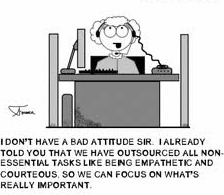
In the last few months I’ve started several new relationships. One was with BlueShiled of California — a relationship that was forced on me by the changing health insurance laws. The other came about from trying to find a place to stay in United Kingdom for our family vacation. I didn’t actively want these relationships, but here I am. And I am not very happy. The basic problem comes from the flow of trust. I’ve never heard of anyone else talk about the directionally of trust, but it is a very important concept to understand for any customer service oriented company. I will illustrate the idea using my new relationships. BlueShield Customer Service Failure! Let me start by saying that I wasn’t overly fond of my previous insurance company. In fact, that relationship was very much like this new one with BlueShield — antagonistic. My story begins in October of 2013, when I created a spreadsheet of all my family doctors versus possible new health insurance companies. I wanted to make sure that which ever insurance I picked, my family doctors would take it. I spent the afternoon making phones calls and ended up with BlueShield of California as my…

The Tone and the Interface

2013-03-21 Cheese from Farmers Market Amsterdam

I just returned from a brief visit to The Hague and Amsterdam. When in a foreign country encountering an unfamiliar language, it’s easy to focus on the visual presentation of content since the linguistic portion of the presentation is unavailable for processing. People who can read can’t help but do so when presented with text. But when one can’t process the linguistic content, all that is left are visual clues (and smells and sounds…). So I took a few snapshots to show how the tone of the interface impacts the emotional processing of content and attitude of the customer to the content. Selling Cheese in Amsterdam This is a farmers’ market stall in the middle of Amsterdam, selling home-made cheese. The woman in the photo is the actual cheese maker. Note the hand-lettered signs, the simple wooden boxes, the plain presentation — the overall effect is home made goods, care in production, quality product, even made with love. Fancy production values would just be off putting in this context, and probably result in lower sales of cheese. This NOT a museum, but rather a neighborhood cheese store in Amsterdam. (It is located next door to the flower museum…). What is…

Special Preview: Social Media by Thomas Erickson

Interfaces.com was given a free advanced preview of Thomas Erickson’s report and videos on social computing. The videos are very well produced and provide an interesting point of view and good insights on social media. Below are few of my notes based on the video content and ideas discussed on this blog in the past (my former students should find these familiar). Social Media Definitions & Ideas Social Computing: this is really about groups working together using ICT (Information Communication Technologies). I think this is a broader definition then the one offered by Thomas Erickson, as it includes all forms of ICT. Social Scaffolding: we all have a set of social scripts — culturally-specific, socially constructed norms of behavior — that help us navigate group interactions and allow for self-organization of crowds, at least shot-term and for a limited goal (like crossing the street). [Please watch Dr. Erickson’s example of street crossing in “Video 4.3: Social Computing video 3 – Face-to-face Interaction as Inspiration for Designing Social Computing Systems”.] Product design needs to create opportunities for social interaction — these scaffolds have to be built into the system: meeting spaces, places to sit down, well-lit areas, easy communication tools, games,…

Science vs. Media: Degree of Public Involvement

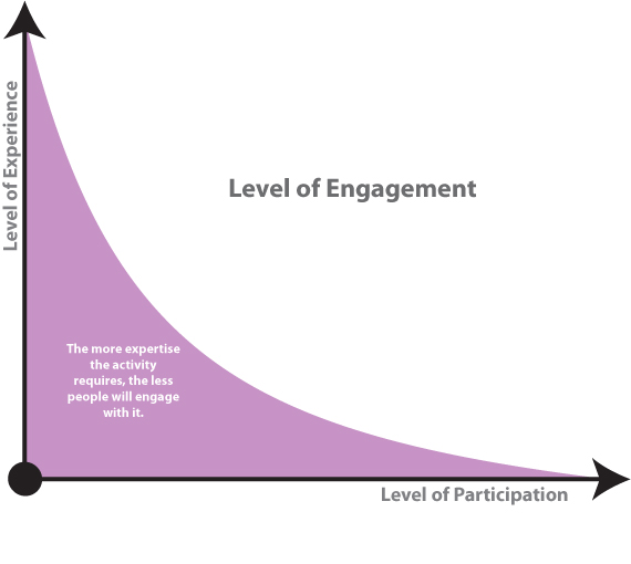
Recently, there has been an explosion of public discourse (fueled by the media) on whether we should do away with tenure in our institutions of higher learning. The basic argument boils down to “tenured teachers can do as they please due to job security and education suffers as the result.” Tenured professors, we are told, focus on research and publishing incomprehensible articles aimed at a few individuals in the world who could even understand them. What’s the use in that, people ask? My son/daughter/neighbor’s kid are being taught by a TA (with poor language skills) while we pay thousands of dollars for the privilege of these children attending universities with all those lazy good-for-nothing tenured professors! You might say that my summary of this world-view is extreme and simplifies the ideas to their comic representation. But that’s the point: the articles (and the readers’ comments they inspire) are written to get an emotional response. The issues of tenure, of the research that these tenured professors are engaged in and the articles they publish, and of teaching styles are complex. To evaluate the contribution of a scientist to his field, one needs to have a certain amount of expertise in that…

Web users judge sites in the blink of an eye

Article: Hopkin, M. (2006). “Web users judge sites in the blink of an eye.” Nature Publishing Group. Retrieved 13 January, 2006. http://www.nature.com/news/2006/060109/full/news060109-13.html Researchers in Canada discovered that most of the web users are able to make decisions about the websites within the first twenty seconds of their visit, and the impression they receive during this twenty seconds has a lasting effect on their opinions. This effect is known to psychologists as the ‘halo effect’ and if the users find the site to be attractive, they are more likely to ignore its minor flaws and speak favorably of it and its content. According to the article, this is due to ‘cognitive bias’ as people like to be right about their opinions so they continue to re-visit the site to prove that they had made the right initial decision. In order to come up with a website that gives a good long lasting impression, the researcher suggests using not more than one image and one that is eye-catching, and the information to be accessible to the visitors in the quickest way possible. This is especially important as the article mentions 60% of traffic is directed from search engines such as Google, where…