Tag Archive for attentional differences between newspapers versus websites

Decision Scaffolding and Crisis Mapping

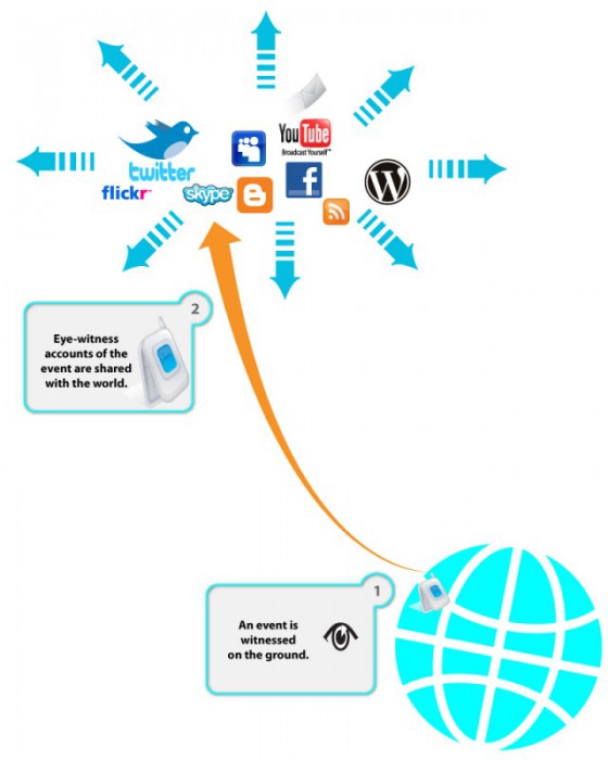
I’m working on a series of illustrations to highlight the need for decision scaffolding during an aide mission. The ideas are based on the Ushahidi deployment experience in Haiti after the 2009 earthquake. But the idea is to make this more general. I would love ideas and recommendations on how to make this visualization better and more communicative. (read more about crisis mapping here) Crisis: Smoke Signals from Eye-Witnesses Let’s start with a crisis—a natural disaster or a political upheaval leaves thousands of people in desperate need of help. The people on the ground witness the suffering and use ICT (Information Communication Technology) to send up the spoke signals. Please not that Internet services might be compromised (due to deliberate actions taken by the authorities; infrastructure failures; chaotic conditions on the ground), but people tend to be very creative and use phone lines, radios, satellite links, and just person to person communication to get the information out there. During the current Libyan crisis, people were very creative: “To avoid detection by Libyan secret police, who monitor Facebook and Twitter, Mahmoudi, the leader of the Ekhtalef (“Difference”) Movement, used what’s considered the Match.com of the Middle East to send coded love…

Web Site Design: Are We Doing It Right?

Article: Cliff, A. (2000). “Web Site Design: Are We Doing It Right?” Retrieved 23 May, 2000. http://www.clickz.com/cgi-bin/gt/en/pm/pm.html?article=1757 In order to understand how people see and obtain information from websites, the Poynter Institute conducted an eye-tracking study that measured in which order people see the elements on a page, how long the eyes stayed focused on each element and how text and graphics links were used to navigate through the site. The study was conducted using news websites and the results were surprising. The findings showed that the readers were more attracted to text than graphics, images and photos. This is contrary to the findings from the study conducted before on newspapers where the readers were first attracted to the photos on a page, then headlines, then text. Web designers have taken the approach to create sites that would look similar to print materials for brand consistency, however, this tells us that the process of obtaining information from the web is different than that of reading print materials, and applying the same techniques as creating print materials in creating websites should be reconsidered. The results also showed that since the graphics were not getting much attention, the banner ads would also…