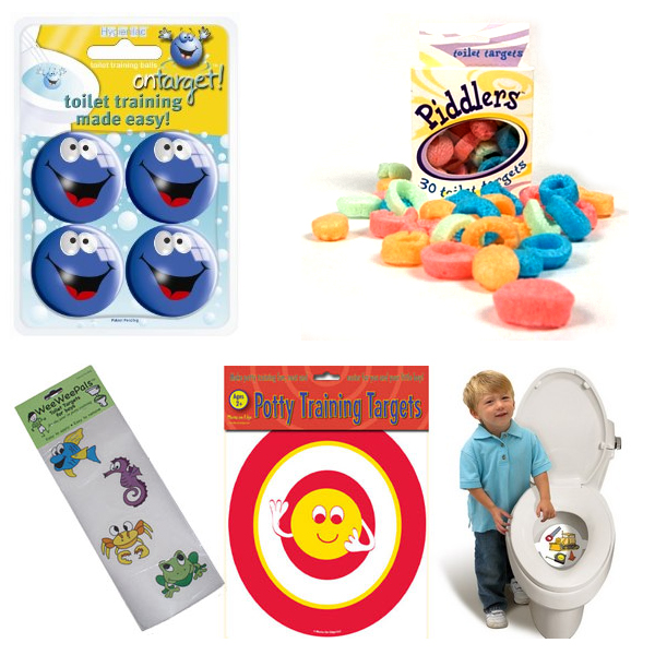
If you have small children…boys, you are undoubtably familiar with things like: “My Wee Friend”; “Piddlers Toilet Targets for Potty Training”; “Potty Training Targets – Look like real targets!”; “Tinkle Targets for Boys”; “Wee Wee Pals”; or “On Target Infant Toilet Training Balls” from Amazon. Problem: boys have to learn to aim; boys attention span is shorter than the time it takes to empty their bladder; Solution: make going to the bathroom fun; design an activity that extends the attention and improves aim; The conceptual design is pretty straightforward: align the goals of the parents (teaching bathroom skills) with the goals of a toddler (have fun) to improve the toilet experience for all concern–basic goal alignment! Unfortunately, the problem doesn’t seem to go away as these boys grow up. Product design to the rescue! The Urinal Lips design uses the same product design strategy: make aiming fun! What sign on the walls of the bar’s men’s room couldn’t achieve, a playful design did–these men’s room stay clean. One Step Farther… While attention controls might lag during a long bathroom break, video games seem to have a tighter control over attention. So welcome to the future of urinals: These are the…
Scaffolding
Anchoring Errors, Causal Net Problems, Cognitive Blindness, Conceptual Design, Cultural Bias, Cultural Differences, Errors, Group Decision Errors, Mental Model Traps, Mirroring Errors, Misapplication of Problem Solving Strategies, Pipsqueak Articles, Product Design Strategy, Scaffolding
TSA: the Good, the Bad, and the Ugly
by Olga Werby •
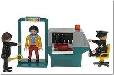
There has been a lot of stories lately about the Transportation Security Administration (TSA), and most have been less than flattering (to say the least). How can an agency that was designed to “serve and protect” the citizens of the United States from harm evoke such wrath from ordinarily shy and non-vocal travelers? This blog is about product design, and so my analysis of the situation will treat this as a failure of product design. Where are the failures? Mistake #1 TSA Conceptual Design: Blocking There are bad guys out there that want to do us—citizen travelers from US—harm. There are the box-cutter carrying terrorists, the shoe-bombers, the liquid explosives bandits, the underwear-bombers, the printer cartridge explosives engineers. TSA installed airport security measures that would counteract each of these threats as they revealed themselves. The basic conceptual design strategy here is blocking: identify a threat and find an effective block. This is a strategy based on hindsight: if we knew that people could sneak bombs in their underwear, then we would have had a way to block it. We didn’t know, but now we do, and so we created systems to block this threat in the future. TSA Game Plan: Escalating…
Conceptual Design, Ethnographic & User Data, Interaction Design, Pipsqueak Articles, Product Design Strategy, Scaffolding
Cheating by Design
by Olga Werby •
The Road to Hell is Paved with Good Intentions. This year, the Metropolitan Transpiration Commission introduced the new Clipper Smart Card. Public transit riders all over the Bay Area can now use a convent piece of plastic to pay for their BART trains, buses, MUNIs, etc. Just swipe the Clipper Card past one of the little readers, and the gates open to let you in and out of the station or pay for the bus. The cards could be purchased in stores and vending machines all over the area—$2 cards are the minimum value cards. More money can be easily added to these cards at all BART train stations. The designers of Clipper Card envisioned happy riders and happy transpiration authority. “We’ll make it easy,” the designers said. “Easy to use, easy to fill up. And if the passengers accidently run out of money on their cards, we’ll allow them some small negative balance so they can leave the train station and pay for their rides later.” In the Bay Area, the cost of public transportation is pretty high and it’s highly dependent on how far you want to go: travel from City Hall to Airport, pay $8.10 for a…
Contributor, Cultural Differences, Errors, Language, Personality, Scaffolding, Users
Language-learning expertise
by mabelev •
Landau, E. (2010). “From brain to language to accent.” CNN Online. Retrieved on October 4, 2010: http://pagingdrgupta.blogs.cnn.com/2010/09/23/from-brain-to-language-to-accent/?hpt=Sbin Becoming a proficient speaker of at least one language is a hallmark of the typical human psychological development. When it comes to learning more than one language, however, our abilities seem much more widely dispersed. Why might some people display a greater “talent” for learning a second language (or more) than others? By far the best known predictor of success at foreign language learning is the learner’s age. An increasing number of children who grow up in bilingual environments from early on may well grow up to be fluent speakers of both their native languages. But you don’t have to be natively bilingual in order to master multiple languages at the native-speaker level. In a classic study of second-language acquisition by Johnson & Newport (1989), immigrants to the USA were tested for high-level mastery of English (including phonetic and grammatical nuances), and the results were examined as a function of age at initial immersion in the English-speaking environment. People who started learning English before the age of 7 tended to achieve native-like proficiency. From there on, the older one was at arrival, the less native…
Background Knowledge, Background Knowledge Errors, Contributor, Errors, Interaction Design, Interface Design, Mental Model Traps, Product Design Strategy, Scaffolding, Users
More is always better – Or so most think!
by Mallika •
Tugend, A., (2010). “For the Dishwasher’s Sake, Go Easy on the Detergent.” NY Times Online. Visited on November 04, 2010: http://www.nytimes.com/2010/03/13/your-money/13shortcuts.html If dishwashers do not seem to be doing their job or if your clothes are not coming out as soft as you’d like them to, or if these machines break down easily, it is most likely due to “user error.” We throw in multiple fabric softener sheets because more is better. More isn’t better in this case! The excess sheets liquefy when the dryer gets hot and gum up the dryer. Most people use ten to fifteen times the amount of soap they need. This excess soap is detrimental to the life of the machines. This article has some clear implications for interaction and interface design. User errors are likely to happen. Even if you have a manual with detailed instructions, the chances of somebody reading that manual are very slim. Even if they read it, they are still likely to err. How can design inculcate the right usage in the user? In this case, what can design do to prevent errors resulting from the ‘More is better’ p-prim? Possible Interaction Design Solutions: Solutions could be…
Cognitive Blindness, Conceptual Design, Cultural Bias, Ethnographic & User Data, Featured, Flow, Interaction Design, Interface Design, Mental Model Traps, Mirroring Errors, Pipsqueak Articles, Product Design Strategy, Scaffolding, Users
Thinking About the Future of Reading
by Olga Werby •
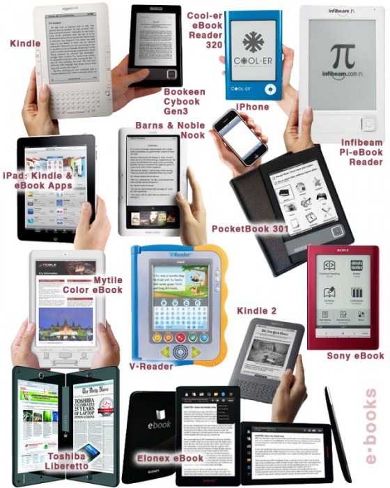
The Taxonomy of Usefulness We are a family with two Kindles, three iPads, two iPods, and an iPhone. We also have a few thousand old-fashioned paper books stored on bookshelves in every nook and cranny of our home: bedrooms, bathrooms, kitchen, stairs, garage, closets, family room, and any other space and surface that might hold a book or two or ten. We are into reading! And we use our Kindles, iPads/Pods/Phone, and computers to read as well. And while statistically speaking, we make just four data points for four family members, I feel we have something interesting to say about using technology to read. To help me understand my own relationship with reading and technology, I’ve come up with a little Taxonomy of Usefulness. If you’ve been reading this blog (or my books and papers), you’d have noticed that I like to slice up the world into groups sorted by a set of variables that I find useful at the time. Forming categories helps me think—the Cognitive Wheel is a prime example. Taxonomy of Usefulness These variables help derive the value of the electronic reading devices. Ergonomics There are many attributes to consider when describing the ergonomics of a device,…
Cognitive Blindness, Conceptual Design, Group Decision Errors, Interface Design, Mirroring Errors, Pipsqueak Articles, Product Design Strategy, Scaffolding
Working with Clients
by Olga Werby •
We once had a client who made his secretary drive to our studio with a piece of a carpet from his office to be used as a color swatch for his company’s new logo. And while the final logo looked okay (very logo-like), it did little to represent the company’s brand. The company is no longer around today. Having a client who opines on the color of the background, choice of typeface, thickness of line, or layout mars the design process. It’s easy to get lost in details and personal preferences—who is to say that green is better than orange? A good designer has to be able to manage the client, keep the conversation focused on business goals and user needs. But before we can delve into the design process, we have establish trust. Clients need to feel like they’ve been listened to, they have to know and understand that design is hard work, and they have to buy into our expertise. The First Date The initial group meeting between the design firm and their client tends to feel like a first date: this is a chance for everyone to declare their expertise and expectations of each other. And like a…