I’ve been noticing a lot of praise and demand for mutlitaskers: “We are looking for a talented individual who is [insert a laundry list of qualifications here] and is also a great multitasker!” or “Women are naturally better at multitasking.” or “Not only is he gifted, but he is able to work on all these projects simultaneously. If only we had a dozen more just like him!” (—probably just to get anything done!) The interesting aspect of this increased demand for multitasking is the rise of ADHD diagnosis. So I thought it would be an interesting exercise to pin down what exactly is being praised and diagnosed. A Curious Case of ADHD Let’s start with formal diagnostic criteria for ADHD (attention deficit hyperactivity disorder). What are the symptoms of ADHD? Below is a list of attributes that is adapted from the Diagnostic and Statistical Manual of Mental Disorders 4th ed. (DSM-IV). When you read this list the first time, imagine an eight year old boy trapped in an elementary classroom. On the second reading, consider an 80-year-old woman in a nursing home. On the third, visualize a soldier just back from Afghanistan. And finally, when you read the list for…
Product Design Strategy
Attention, Conceptual Design, Flow, Pipsqueak Articles, Product Design Strategy, Scaffolding
Toilet Games
by Olga Werby •
If you have small children…boys, you are undoubtably familiar with things like: “My Wee Friend”; “Piddlers Toilet Targets for Potty Training”; “Potty Training Targets – Look like real targets!”; “Tinkle Targets for Boys”; “Wee Wee Pals”; or “On Target Infant Toilet Training Balls” from Amazon. Problem: boys have to learn to aim; boys attention span is shorter than the time it takes to empty their bladder; Solution: make going to the bathroom fun; design an activity that extends the attention and improves aim; The conceptual design is pretty straightforward: align the goals of the parents (teaching bathroom skills) with the goals of a toddler (have fun) to improve the toilet experience for all concern–basic goal alignment! Unfortunately, the problem doesn’t seem to go away as these boys grow up. Product design to the rescue! The Urinal Lips design uses the same product design strategy: make aiming fun! What sign on the walls of the bar’s men’s room couldn’t achieve, a playful design did–these men’s room stay clean. One Step Farther… While attention controls might lag during a long bathroom break, video games seem to have a tighter control over attention. So welcome to the future of urinals: These are the…
Cognitive Blindness, Mental Model Traps, Pipsqueak Articles, Product Design Strategy, Users
How Users Really Feel…
by Olga Werby •
Sometimes during the design process, there’s a real tension between the audience needs and the client desires. As product designers, it’s our job to resolve this tension in favor of the user (as long as the client’s business needs are still being met by the design). But sometimes, we lose: Enjoy!
Flow, Pipsqueak Articles, Product Design Strategy
Emotional Design—Because Products Should Be Fun!
by Olga Werby •
“I want one!”—a reaction every designer wants! A good product design doesn’t only address the functional needs of its audience and the business needs of its developers. A good product goes father—it facilitates fun, it generates flow, it produces a visceral reaction even from people who are simply watching a demo video…
Conceptual Design, Cultural Differences, Pipsqueak Articles, Product Design Strategy
ICT & Human Rights: A Round Table Discussion at IADIS 2011 Conference
by Olga Werby •
IADIS conference on ICT, Society and Human Beings, Rome, July 24-26, 2011 Proposal for a Joint Multi-conference Session Title: ICT and Human Rights: A Round Table Chair/Organizer: Olga Werby Background and Purpose Information and Communication Technologies (ICT)—internet, web, and social media—are fast becoming a comprehensive repository and soon an archive of human knowledge. With access to ICT, an individual can become informed on everything from healthcare issues to civic problems to legal concerns. One hundred years ago, people were discussing the need for basic literacy and its impact on the human condition. Today, we should be discussing digital literacy and access in the same way. Digital literacy can be seen as a basic human right. Individuals can also impact society, react, and reach out. ICT is both a powerful tool for materializing human rights and is also challenging human rights. I propose a Round Table Session, which is open to all participants of IADIS multi-conferences, to be titled “ICT and Human Rights.” This session would provide a forum on cross-disciplinary research and development, and action, in the fields of what rights are important and can be better facilitated by ICT in: e-Democracy, ICT and Society, e-Culture, e-Health, e-Learning, human-computer interaction,…
Anchoring Errors, Causal Net Problems, Cognitive Blindness, Conceptual Design, Cultural Bias, Cultural Differences, Errors, Group Decision Errors, Mental Model Traps, Mirroring Errors, Misapplication of Problem Solving Strategies, Pipsqueak Articles, Product Design Strategy, Scaffolding
TSA: the Good, the Bad, and the Ugly
by Olga Werby •
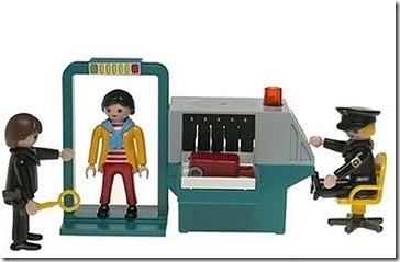
There has been a lot of stories lately about the Transportation Security Administration (TSA), and most have been less than flattering (to say the least). How can an agency that was designed to “serve and protect” the citizens of the United States from harm evoke such wrath from ordinarily shy and non-vocal travelers? This blog is about product design, and so my analysis of the situation will treat this as a failure of product design. Where are the failures? Mistake #1 TSA Conceptual Design: Blocking There are bad guys out there that want to do us—citizen travelers from US—harm. There are the box-cutter carrying terrorists, the shoe-bombers, the liquid explosives bandits, the underwear-bombers, the printer cartridge explosives engineers. TSA installed airport security measures that would counteract each of these threats as they revealed themselves. The basic conceptual design strategy here is blocking: identify a threat and find an effective block. This is a strategy based on hindsight: if we knew that people could sneak bombs in their underwear, then we would have had a way to block it. We didn’t know, but now we do, and so we created systems to block this threat in the future. TSA Game Plan: Escalating…
Cognitive Blindness, Conceptual Design, Contributor, Cultural Bias, Cultural Differences, Ethnographic & User Data, Group Decision Errors, Interaction Design, Interface Design, Product Design Strategy, Users
Lessons to be Learned from the GAP Logo Debacle
by Sheetal Elangovan •
Geoghegan, T. (2010). “Lessons to be learnt from the Gap logo debacle.” BBC News Magazine. Retrieved on October 12, 2010: http://www.bbc.co.uk/news/magazine-11517129 A new logo can brighten up a company’s image or enrage loyal customers. In the case of GAP, the latter was obvious. The release of the new logo led to a huge online backlash from customers on FB and twitter conveying how unhappy they were with the logo. Within a week of release, GAP chose to revert back to the original logo after a slew of criticism. GAP LOGO The importance of being an iconic brand has been severely undervalued. The association of the image and brand is overlaid in the minds of people for the last 20 years. Changing the visual must have pre empted GAP to have tested the logo with focus groups and understand the reactions of the audience. The changed their visual imagery without upsetting customers. The logos below have retained their sense of familiarity which is refreshing and yet without really giving customers the need to process an all together new image to associate with the brand. Companies uniformly moved from serif font to a more elegant Helvetica. MSNBC LOGO GE LOGO Product Positioning:…