Perceptual Focus Errors

Perceptual Focus Errors result when there’s not enough expertise to know what to to pay attention.

Where to post the “OK” Button on the Screen?

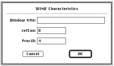
OK Button on Early Mac

I have very strong opinions about where on the screen the OK or NEXT or SUBMIT buttons go in relation to CANCEL. Without giving it away, I’m going to walk through the design decision tree and provide a lot of references for both sides of the issue — yes, there are strong feelings about the right versus the left position choice. I’m not alone! Passive versus Active Buttons Active Buttons are the ones that advance the action to the next level. Passive ones return the users to previous state, negate the action sequence. OKAY, OK, NEXT, SUBMIT, ACCEPT, GO are all active buttons. CANCEL, BACK, PREVIOUS are action that reverse forward momentum and push the user to places they’ve been before. HELP and INFO sidetrack the user and distract from forward thrust of activity. In general, product designers want to move the users toward their goals — thus we want the perceptual focus to be on the action buttons. We want to make sure that users fist see the way forward, and then click on the right button that propels them forward to completion of the task. All distractions and side movements should be downplayed with Interface Design with the…

Multitasking Myth

I’ve been noticing a lot of praise and demand for mutlitaskers: “We are looking for a talented individual who is [insert a laundry list of qualifications here] and is also a great multitasker!” or “Women are naturally better at multitasking.” or “Not only is he gifted, but he is able to work on all these projects simultaneously. If only we had a dozen more just like him!” (—probably just to get anything done!) The interesting aspect of this increased demand for multitasking is the rise of ADHD diagnosis. So I thought it would be an interesting exercise to pin down what exactly is being praised and diagnosed. A Curious Case of ADHD Let’s start with formal diagnostic criteria for ADHD (attention deficit hyperactivity disorder). What are the symptoms of ADHD? Below is a list of attributes that is adapted from the Diagnostic and Statistical Manual of Mental Disorders 4th ed. (DSM-IV). When you read this list the first time, imagine an eight year old boy trapped in an elementary classroom. On the second reading, consider an 80-year-old woman in a nursing home. On the third, visualize a soldier just back from Afghanistan. And finally, when you read the list for…

Perceptual Illusions

Our minds play tricks on us all the time. Once the information has entered our cognition via our senses, it still has to get processed to be understood. Like any other data, it’s all about context. For interesting examples of optical illusions, please visit http://www.lottolab.org/articles/illusionsoflight.asp. R. Beau Lotto has put together a few interesting examples of mis-processing! Or watch him deliver a talk at TED.

The History of Usability

NASA Space Shuttle SR-71 Blackbird U2 Cockpit Designs

When did we start being concerned with usability? Some will say that such concern is part of being human: cavemen worked their stone tools to get them just right. Interaction design mattered even then. But the field of usability research really came into being when the tools we used started to run up against our cognitive and physical limitations. And to avoid hitting literal, as well as psychological, walls, it was the aviation engineers who started to think about usability seriously. While cars were becoming ever more sophisticated and trains ever faster, it was the airplanes that were the cause of most usability problems around WWI. Cars were big, but didn’t go very fast or had a lot of roads to travel on at the turn of the century. In the first decade of the 20th century, there were only 8,000 cars total in the U.S. traveling on 10 miles of paved roads. In 1900, there were only 96 deaths caused by the automobile accidents. Planes were more problematic. For one thing, the missing roads weren’t a problem. And a plane falling out of the sky in an urban area caused far more damage than a car ever could. Planes…

Understanding Complex Visual Information…

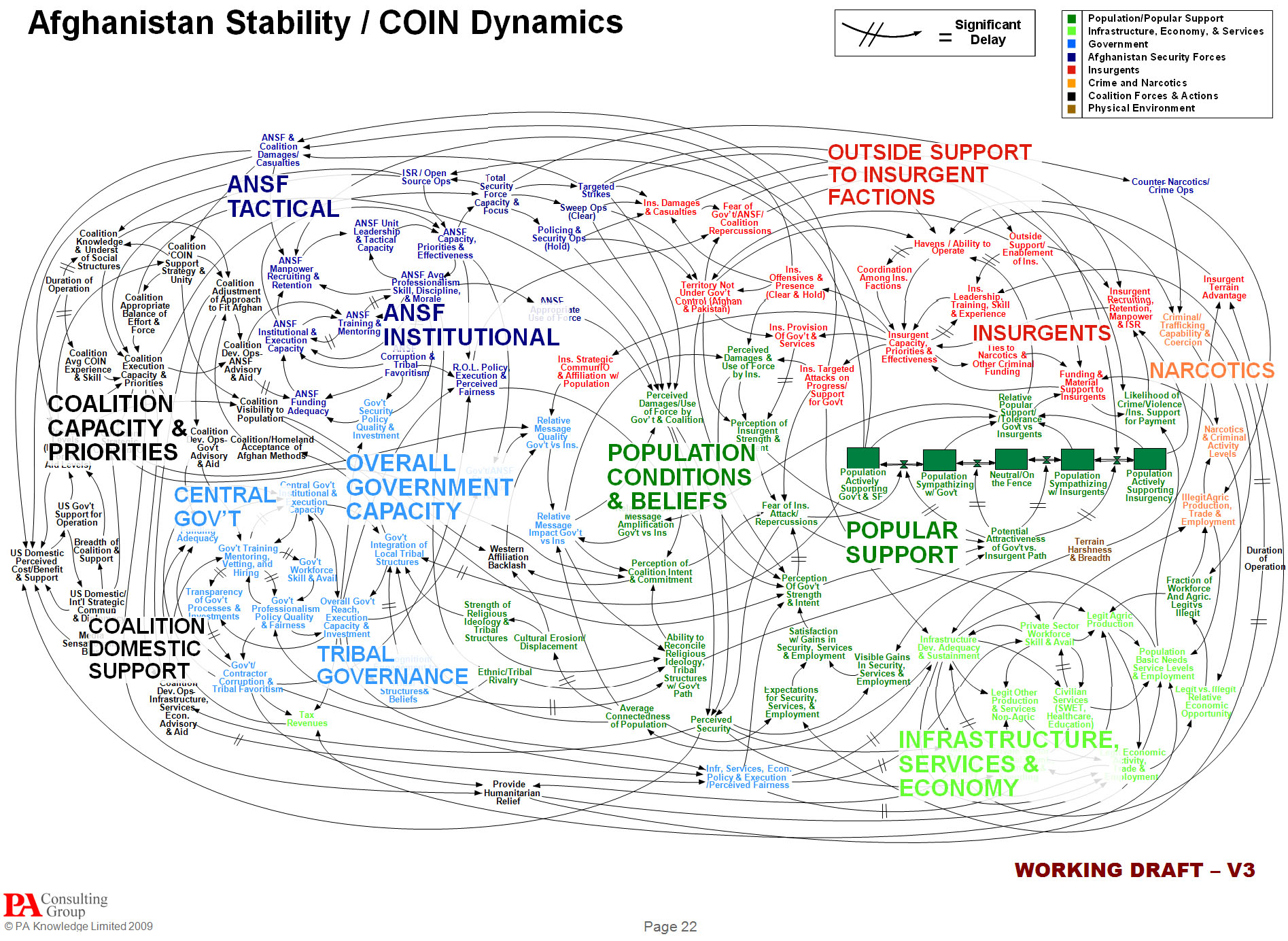
US Military PowerPoint slide designed to explain Afghanistan strategy.

…or not comprehending it, as the case may be. A few years ago, I wrote a paper about people’s ability to comprehend complex visual information such as graphs, charts, diagrams, maps, and so on. Intuitively, we are culturally-trained to believe that it’s much easier to extract information from a picture than from text. But upon testing this belief (p-prim, for those in the know), I found that contrary to the notion “a picture is worth a thousand words,” it’s much more difficult to get data from an illustration than from a story. While emotional impact might be larger with a picture, it’s not true for comprehension. You can read the results of my study at http://www.pipsqueak.com/pages/papers.html “Visual Symbolic Processing in Modern Times” paper presented at AACE ED-MEDIA Conference in 2008. Since then, I’ve collected more data, and the results are similarly aligned: problem-solving requiring higher level visual symbolic processing skills is difficult and results in communication failures. A secondary, and surprising, finding was a gender discrepancy in performance outcome testing of visual symbolic processing skills. Higher level and lower level visual symbolic processing are defined in the paper. And anyone interested in testing their visual processing skills are welcome to…