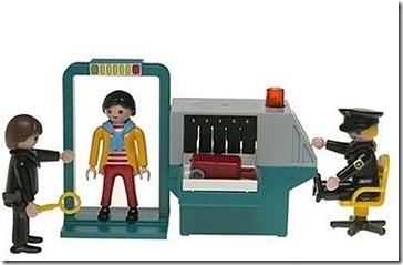
We once had a client who made his secretary drive to our studio with a piece of a carpet from his office to be used as a color swatch for his company’s new logo. And while the final logo looked okay (very logo-like), it did little to represent the company’s brand. The company is no longer around today. Having a client who opines on the color of the background, choice of typeface, thickness of line, or layout mars the design process. It’s easy to get lost in details and personal preferences—who is to say that green is better than orange? A good designer has to be able to manage the client, keep the conversation focused on business goals and user needs. But before we can delve into the design process, we have establish trust. Clients need to feel like they’ve been listened to, they have to know and understand that design is hard work, and they have to buy into our expertise. The First Date The initial group meeting between the design firm and their client tends to feel like a first date: this is a chance for everyone to declare their expertise and expectations of each other. And like a…
Errors
Conceptual Design, Contributor, Errors, Interaction Design, Interface Design
On “Keeping Kids Safe From the Wrong Dangers” by Belkin
by Ketil E. Jensen •
Belkin, L. (2010). “Keeping Kids Safe From the Wrong Dangers” New York Times Online. Retrieved on October 6, 2010: http://www.nytimes.com/2010/09/19/weekinreview/19belkin.html?_r=1 Summary: Belkin puts the spotlight on the somewhat irrational behaviors of parents when it comes to protecting their children. With the best of intentions, they worry about kidnapping, school snipers, terrorist, dangerous strangers and drugs, while the most likely things to cause children harm are car accidents, homicide (usually at the hands of someone they know), child abuse, suicide and drowning. So why are parents constantly overestimating rare dangers while underestimating common ones? The author makes the point that evolution may have something to do with it in that our brains are not designed to process abstract or long-term risk, but rather to react to an immediate dangers for instance represented by a sound and make a determination of whether not it presents a danger. In today’s fast-paced world where we are bombarded with all kinds of worst case scenarios and sensationalism, our sense of proportions gets distorted. So, we end up driving our kids to play-dates, when a walk on their own may have been better both health and safety wise. User Groups: So how can parents make more…
Errors, Ethnographic & User Data, Interface Design, Perception, Pipsqueak Articles, Product Design Strategy, Scaffolding, Users
Accidentally Supergluing an Eye Shut
by Olga Werby •

I hope the mere reading of the title made you queasy—it makes me shudder every time. On October 6th, CNN posted a story about a woman from Phoenix, Arizona, who accidentally put drops of super glue into her eye instead of the eye medication. She called 911, and in the emergency room the doctors had to cut open her eye and peel the hardened layer of super glue from her eye ball. If this doesn’t make you sick, then… One may ask: how stupid does one have to be to glue their eye shut? But, as with many other product-use errors, the woman made a very common mistake. The hospital wasn’t surprised—apparently these accidents happen all the time. Because of poor vision, she couldn’t distinguish between the bottles of her eye medicine and the package of super glue. Take a look at this: If you are relying purely on feel, the woman’s error no longer feels so outlandish. Here’s what she probably could see with her poor vision: And here is what we, the well-sighted, could see: So upon a close examination, the woman’s error is a natural mistake. (Yeah, I know, I know: Why would she keep the bottle…
Autopilot Errors, Background Knowledge Errors, Conceptual Design, Diagnostic Errors, Errors, Interaction Design, Interface Design, Interruptus Errors, Misapplication of Problem Solving Strategies, Mode Errors, Perceptual Blindness, Perceptual Focus Errors, Pipsqueak Articles, Product Design Strategy, Scaffolding, Users, Working Memory
The History of Usability
by Olga Werby •

When did we start being concerned with usability? Some will say that such concern is part of being human: cavemen worked their stone tools to get them just right. Interaction design mattered even then. But the field of usability research really came into being when the tools we used started to run up against our cognitive and physical limitations. And to avoid hitting literal, as well as psychological, walls, it was the aviation engineers who started to think about usability seriously. While cars were becoming ever more sophisticated and trains ever faster, it was the airplanes that were the cause of most usability problems around WWI. Cars were big, but didn’t go very fast or had a lot of roads to travel on at the turn of the century. In the first decade of the 20th century, there were only 8,000 cars total in the U.S. traveling on 10 miles of paved roads. In 1900, there were only 96 deaths caused by the automobile accidents. Planes were more problematic. For one thing, the missing roads weren’t a problem. And a plane falling out of the sky in an urban area caused far more damage than a car ever could. Planes…
Background Knowledge Errors, Conceptual Design, Errors, Ethnographic & User Data, Interaction Design, Interface Design, Mental Model Traps, Mirroring Errors, Pipsqueak Articles, Product Design Strategy, Users
Metacognition Failure: If I find it easy, it must not be important
by Olga Werby •

Making something easy to understand is extremely difficult. A good designer knows this, knows how hard one has to work to make something comprehensible and easy to use. Unfortunately, users and consumers of products (including education) tend not to get it. We live in society ruled by “More is Better” p-prim: more stuff is better, more money is better, more food is good, more medication is great…more, more, more. Movies, television, newspapers, magazines, all reinforce this idea in our minds. We live in a “super-size me” world. But this basic decision-making algorithm leads to very faulty reasoning. There are multiple corollaries to the “more is better” axiom: thick books without graphics are more educationally valuable, more important (this is based on research I did many years ago with 5th graders); longer essays are clearly better and should get higher graders (the students worked harder/longer on them); big words are better than small ones in expressing ideas (thus we get very pretentious writing); work should be judged by the time it took to complete and not by the quality of the results it produces; more expensive clothes (cars, stereos, etc.) are clearly more valuable (this is a true statement, but most…
Anchoring Errors, Diagnostic Errors, Group Decision Errors, Mirroring Errors, Pipsqueak Articles
Jury & Group Dynamics
by Olga Werby •
Cognitive Blindness, Errors, Featured, Interface Design, Perception, Pipsqueak Articles
Color Blind Design
by Olga Werby •

Do you see any difference between these two images? About 10% of the male population (with up to 20% among some ethnic groups) do not. Do differences in the way individuals perceive and process color information matter? Sometimes… Consider this informational graphic: It’s easy to see how the information contained within this chart has been transformed and no longer carries the same meaning. Which is the right one? When designing information for communication, it’s important to consider the totality of the intended audience: What are their strength? What are their limitations? Like cognitive traits, perceptual differences have to be accommodated by good design. Some issues that individuals with deuteranope deficit (red/green confusion) face is inability to tell the difference between colored items that are too thin (lines), point sources, and blinking lights (think traffic lights blinking green or yellow). These problems effect real-life performance and can lead to accidents: think traffic light color confusion. It is the job of a product designer to reduce the difficulties these individuals face. You can use this URL to check your site for color blind usability: http://www.vischeck.com/vischeck/vischeckURL.php