
Sometimes during the design process, there’s a real tension between the audience needs and the client desires. As product designers, it’s our job to resolve this tension in favor of the user (as long as the client’s business needs are still being met by the design). But sometimes, we lose: Enjoy!
Cognitive Blindness
Inability to really know how others think and how their cognitive processes are different from our own.
Anchoring Errors, Causal Net Problems, Cognitive Blindness, Conceptual Design, Cultural Bias, Cultural Differences, Errors, Group Decision Errors, Mental Model Traps, Mirroring Errors, Misapplication of Problem Solving Strategies, Pipsqueak Articles, Product Design Strategy, Scaffolding
TSA: the Good, the Bad, and the Ugly
by Olga Werby •
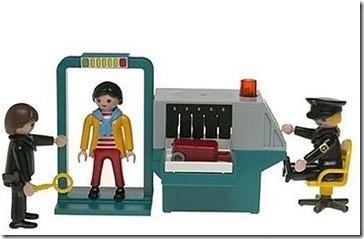
There has been a lot of stories lately about the Transportation Security Administration (TSA), and most have been less than flattering (to say the least). How can an agency that was designed to “serve and protect” the citizens of the United States from harm evoke such wrath from ordinarily shy and non-vocal travelers? This blog is about product design, and so my analysis of the situation will treat this as a failure of product design. Where are the failures? Mistake #1 TSA Conceptual Design: Blocking There are bad guys out there that want to do us—citizen travelers from US—harm. There are the box-cutter carrying terrorists, the shoe-bombers, the liquid explosives bandits, the underwear-bombers, the printer cartridge explosives engineers. TSA installed airport security measures that would counteract each of these threats as they revealed themselves. The basic conceptual design strategy here is blocking: identify a threat and find an effective block. This is a strategy based on hindsight: if we knew that people could sneak bombs in their underwear, then we would have had a way to block it. We didn’t know, but now we do, and so we created systems to block this threat in the future. TSA Game Plan: Escalating…
Cognitive Blindness, Conceptual Design, Contributor, Cultural Bias, Cultural Differences, Ethnographic & User Data, Group Decision Errors, Interaction Design, Interface Design, Product Design Strategy, Users
Lessons to be Learned from the GAP Logo Debacle
by Sheetal Elangovan •
Geoghegan, T. (2010). “Lessons to be learnt from the Gap logo debacle.” BBC News Magazine. Retrieved on October 12, 2010: http://www.bbc.co.uk/news/magazine-11517129 A new logo can brighten up a company’s image or enrage loyal customers. In the case of GAP, the latter was obvious. The release of the new logo led to a huge online backlash from customers on FB and twitter conveying how unhappy they were with the logo. Within a week of release, GAP chose to revert back to the original logo after a slew of criticism. GAP LOGO The importance of being an iconic brand has been severely undervalued. The association of the image and brand is overlaid in the minds of people for the last 20 years. Changing the visual must have pre empted GAP to have tested the logo with focus groups and understand the reactions of the audience. The changed their visual imagery without upsetting customers. The logos below have retained their sense of familiarity which is refreshing and yet without really giving customers the need to process an all together new image to associate with the brand. Companies uniformly moved from serif font to a more elegant Helvetica. MSNBC LOGO GE LOGO Product Positioning:…
Cognitive Blindness, Conceptual Design, Contributor, Cultural Bias, Cultural Differences, Ethnographic & User Data, Interaction Design, Interface Design, Product Design Strategy, Users
Japanese Playing a New Video Game: Catch-Up
by Van Nga •
Tabuchi, H., “Japanese Playing a New Video Game: Catch-Up.” New York Times Online. Visited on October 4, 2010: http://www.nytimes.com/2010/09/20/technology/20game.html?_r=1 This article discuss how Japan is partnering with Westerns in the gaming industry. In the mid 1980s’ through 1990s most game franchises were developed from Japan. Some of Nintendo’s Mario, Pokemon, Sonic the Hedgehog from Sean and Gran Turismo from Sony. Japan is now at least five years behind in the industry. The best selling game was Call of Duty: Modern Warfare 2 which was developed in the United States. Concept Design: Japan use to define the gaming industry. Part of it’s problem is that they need to appeal to players that are located overseas. Interaction Design: Developers want to try and reach out to the West and collaborate. Collaboration in trying to make games have a more global appeal can possibly generate a bigger target audience. Capcom for example developed Take Shadow of Rome. This 2005 action game was made for European and American markets. Instead of designing over sized samurai swordsmen they designed over sized gladiators. Interface Design: The interface design are collaborating with people from overseas and learn their culture in order to appeal in the market. They…
Cognitive Blindness, Contributor, Diagnostic Errors, Errors
Sizing Up Consciousness by Its Bits
by patrickgary •
Zimmer, C., (2010). “Sizing Up Consciousness by Its Bits.” NYTimes.com. Visited on October 3, 2010: http://www.nytimes.com/2010/09/21/science/21consciousness.html Carl Zimmer’s article “Sizing Up Consciousness by Its Bits” for The New York Times seeks to introduce and explore a relatively new area of research into human consciousness. In interviews with the medical researcher Dr. Giulio Tononi, the article discusses current and past conceptions of consciousness and its’ implications for our interactions with each other and with our environment. Given the importance of consciousness in everyday human life, one would reasonably assume that at this time science would have a detailed understanding of consciousness and how it functions. This is not the case, however. Despite centuries of philosophical debate, medical research, and technological development, humans are largely in the dark, so to speak, about what creates and maintains the spark of consciousness. In the context of our currently vague understanding, Dr. Tononi’s research proposes a novel way of conceptualizing consciousness. Dr. Tononi’s goal is to apply the theories of informational networks to the human brain, in a method he terms “Integrated Information Theory.” This theory, hereafter referred to as IIT, seeks to understand the human brain as an integrated network of nodes (neurons in…
Cognitive Blindness, Conceptual Design, Cultural Bias, Ethnographic & User Data, Featured, Flow, Interaction Design, Interface Design, Mental Model Traps, Mirroring Errors, Pipsqueak Articles, Product Design Strategy, Scaffolding, Users
Thinking About the Future of Reading
by Olga Werby •
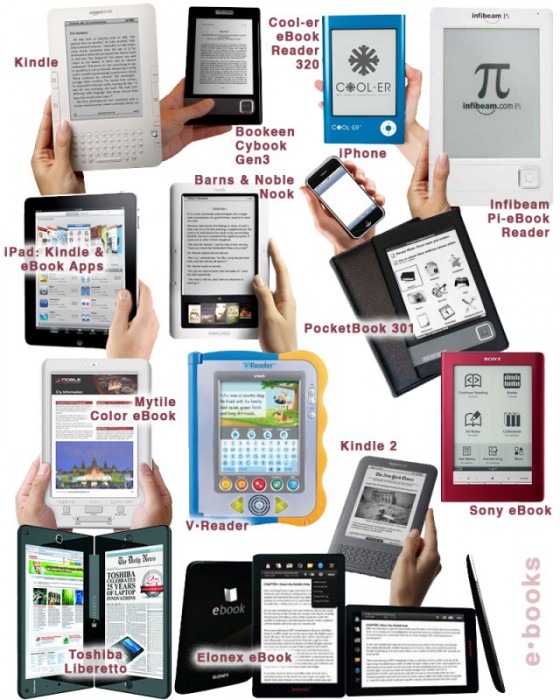
The Taxonomy of Usefulness We are a family with two Kindles, three iPads, two iPods, and an iPhone. We also have a few thousand old-fashioned paper books stored on bookshelves in every nook and cranny of our home: bedrooms, bathrooms, kitchen, stairs, garage, closets, family room, and any other space and surface that might hold a book or two or ten. We are into reading! And we use our Kindles, iPads/Pods/Phone, and computers to read as well. And while statistically speaking, we make just four data points for four family members, I feel we have something interesting to say about using technology to read. To help me understand my own relationship with reading and technology, I’ve come up with a little Taxonomy of Usefulness. If you’ve been reading this blog (or my books and papers), you’d have noticed that I like to slice up the world into groups sorted by a set of variables that I find useful at the time. Forming categories helps me think—the Cognitive Wheel is a prime example. Taxonomy of Usefulness These variables help derive the value of the electronic reading devices. Ergonomics There are many attributes to consider when describing the ergonomics of a device,…
Cognitive Blindness, Conceptual Design, Contributor, Interaction Design, Interface Design, Mental Model Traps, Perception
Re “Wine Study Shows Price Influences Perception”
by Van Nga •
Svitil, K., (2008). “Wine Study Shows Price Influences Perception.” California Institute of Technology. Visited on October 4, 2010: http://media.caltech.edu/press_releases/13091 This article is a research study about how the region of the brain called the medial orbitofrontal cortex showed higher activity when participants drank wines at a higher price. A wine tasting study was conducted at the California Institute of Technology and Stanford University. Twenty volunteers tasted five wine samples at different retail prices: $5, $10, $35, $45 and $90 per bottle. The volunteers tasted and evaluated which wines that they found more pleasurable. Two out of five of the wines were the same but one was priced at $10 and one at $90. In the experiment the subjects rated and preferred the $90 priced wine more than the $10, although they did not know that they tasted the same wine. Cognitive Design What does the product do? In this study the cognitive design was a wine tasting experiment. The concept of the research was to experiment on the perception of price on different wines. The setting was controlled in that the subjects did not know that they tasted the same wine but told that the price was different. While tasting…