The design of the cover can make the book… or so I was told. Certainly, bad covers don’t contribute to sales. But good covers are difficult. And the thought on cover design has changed over the years… just like fashion. Since I tend to design my own covers (and I’m an artist and a designer), I wanted to put together some ideas, if not rules, to follow and some background of how to think about book cover design. Because if you don’t do your own, you still need to communicate what you want with the person that does.
Book Covers Through Time
To appreciate a cover, it helps to understand its roots. I won’t go back far, since my genre is science fiction, just a hundred years or so.
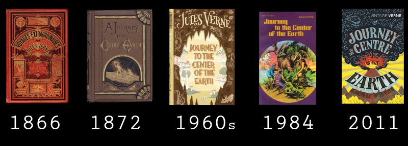
Consider the cover evolution of Jules Verne’s “Journey to the Center of the Earth”:

There is a movement from frills to realism to a strong graphic look of the more modern editions. While for the 1800’s editions, we might find it difficult to identify the genre of this story, by the time we hit 1960s, there is no doubt that this is a science fiction or fantasy novel. The cover alerts the prospective reader to what it’s all about. The cover sells the book.
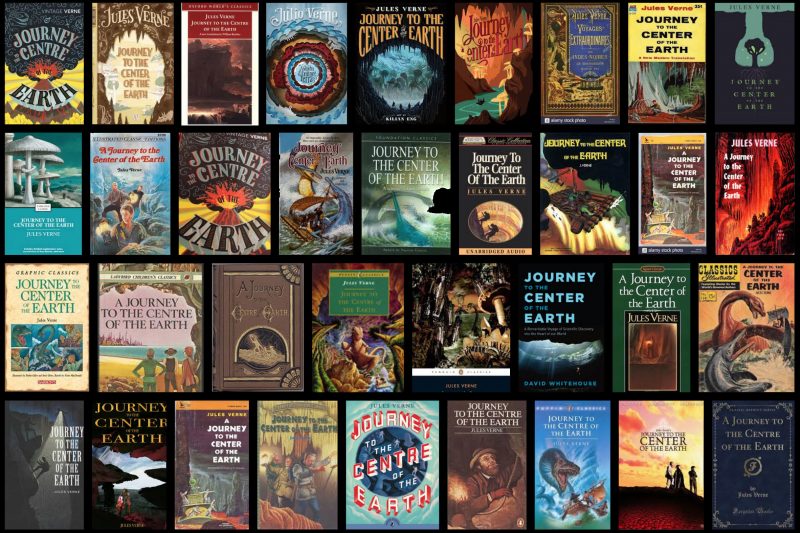
But since this story has been around for a while, there are many book covers, some wonderful, some not so much. Without data, it would be hard to know which covers sold more than others…

Book cover’s job is to make the reader pick up the book; book description’s job is to advance the process to the sale of the book.
Differences by Genre
The book’s cover not only helps sell the book, it needs to give out clear signals as to what the reader should expect from the story.

A quick look at a cover and a reader can make a judgment — is it something I want to read? Is it in the genre I like to read? Just like writing has tropes, so do covers. Fantasy novels have some magical elements on their covers. Science fiction has “science-y” elements — spaceships, planets, scientific instruments, etc. Cyber punk seems to be stuck with “we have the Matix-like number cascades to indicate our digital story elements.” Steam punk has trains of analog gadgets. Humor is more likely to have comic book elements. Military sci-fi has lasers and guns. Space operas broadcast their genre affiliation with spaceship and planets. Just like romance novels, fiction stories have visual ways of telling the readers what they are about.
Differences by Age of the Intended Audience
We can also very quickly tell the age of the intended audience by the style of the cover:

One of the obvious signals is the age of the protagonists on the cover — the younger the child on the cover, the younger the intended audience. That’s not always true, of course. But it is a good rule of thumb that the age of the main character is about the same age as the reader… while the characters are young!
Print versus eBook
Most indie authors rely on selling ebooks — it is very hard to get independently and self-published books into an actual bookstore. And with that comes very strong parameters for book cover design, since most people will only see digital versions. Something to think about:
1. Make the text LARGE! The covers appear just about the size of a postage stamp, both on Amazon AND on most promotional mailings. If the readers can discern the title, they won’t buy it. It is really as simple as that.
2. Make the text LARGE! Yes, I’m saying it again, but this time in relation to the author’s name. As an indie writer myself, I feel very self-conscious about making my name big. But that’s a mistake. We are building a brand — after the first book, we hope the readers will seek us out by name. We shouldn’t make that difficult to do, obviously. Thay said, not only do I see authors insist on a tiny print for their names, I have done same myself… It’s hard to toot one’s own horn.
3. Make sure that the graphical image is strong enough to be understood when shrunk to a small size — too much detail and the idea might be lost.
This is all about visual design, communication, comprehension, and processing. If you search this blog, you will find other articles relating to these issues.
In the meantime, take a look at these two TED videos on book cover design. Keep in mind, that the covers which are discussed are created for well-known authors — this changes the creative brief a lot. The covers are also designed for print — again, what is great on a bookshelf doesn’t necessarily work on a screen. And the other point I wanted to point out is that the book cover designer READ the books! When I was working with a book cover designer, I was told that this was not necessary — WRONG! A book cover is a collaboration between an artist and a writer. If one is ignorant of the story, this simply doesn’t work. [I also recently learned that the cover for which I paid and own a copyright on was reused by the artist! While I’m angry and will never use this person again, there is not much more I really can do. So beware! Here’s a link to her work: Deviant Art link for Elena Dudina and here’s my book on Amazon: Becoming Animals]
These are two hilarious TED talks by Chip Kidd on the art of book design:
and
