Making something easy to understand is extremely difficult. A good designer knows this, knows how hard one has to work to make something comprehensible and easy to use. Unfortunately, users and consumers of products (including education) tend not to get it.
We live in society ruled by “More is Better” p-prim: more stuff is better, more money is better, more food is good, more medication is great…more, more, more. Movies, television, newspapers, magazines, all reinforce this idea in our minds. We live in a “super-size me” world. But this basic decision-making algorithm leads to very faulty reasoning.
There are multiple corollaries to the “more is better” axiom:
And here’s the opposite set of corollaries:
These lists can go on and on. Please feel free to contribute your own examples.
The “more is better” p-prim is so engrained in our culture that in Italy, drivers are punished for violations by having points taken away from them (as opposed to US where points are given for bad driving). The theory is that the loss of points is more conducive to change in behavior than addition of points. Drivers lack metacognitive skills to evaluate their own decisions and regulate their own behavior!
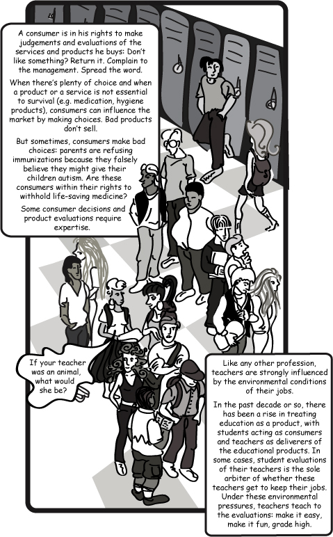
“More is better” is a decision-making tool in situations when the individual has limited knowledge of the subject matter. Few people are expert designers, although most of us are expert users. But an expert user is not a designer. Just like a student—someone who is an expert consumer of education—is not an expert curriculum designer (or a teacher, for that matter). We shouldn’t expect users or students to design products or educational experiences. We could ask them if they were able to accomplish their goals with the product or if they’ve learned the material the course covered.
When users are pushed into position of product designers, we often get a smörgåsbord of buttons and features. In our shop, we call them “Chotchkies”—a nice Yiddish word that the UrbanDictionary.com defines as: “A small piece of worthless crap, a decorative knick knack with little or no purpose. Side note: Chotchkie can be pretty, sentimental, or even occasionally useful though it usually breaks easily if useful.” A good product designer can see past the customer’s temporary desire for yet another web badge and insist on keeping navigation simple for the end-user.
Since ultimately, “the customer is always right,” we see lots of clutter in design and usability suffers. That’s why a good working relationship and trust is so important between product designers and their clients—the client needs to trust that the designer is working in his best interest.
When education is the product, students have to trust their teachers. Some students interpret “clear and simple” ideas as being inferior to “complex and hard-to-understand” concepts. The best teachers are the ones that make the hard-to-understand comprehensible, just like the best designers make the complicated simple.
_____________________
For an interesting discussion on teacher evaluations, please read The New York Times Opinion Blog by Stanley Fish, published on June 28th, 2010. The comments to his article are also very informative.
http://opinionator.blogs.nytimes.com/2010/06/28/student-evaluations-part-two/

