Sometimes failure to communicate happens at the end of the product distribution line. Below are some examples of what happens when sales people don’t pay attention to how their actions alter the message on the product. Enjoy!
“Lost in Translation” was a wonderful movie by Sofia Coppola, starring Bill Murray and Scarlett Johansson. It depicted the delicious confusion of Western tourists in total Japanese cultural emersion. In particular, the scenes where Bill Murray shoots a liquor commercial for the Japanese market are simply priceless. In retrospect, I see where Ms. Coppola got her ideas. Her cousin, Nicholas Cage, have been making wonderfully odd (to our sensibilities) commercials for years. He clearly had stories to share. Here are a few of his gems, courtesy the World Wide Web: and But it’s not only Japan that surprises our/my cultural biases. This morning, my husband and I went to a local grocery store in Rome, Italy. In the cheese section, there was a little paper bottle of parmesan cheese with a mouse of the package. The mouse didn’t work for me at all! So much for cultural differences. Here’s a small collection of ads for McDonalds from all over the world. Please compare it to the packaging and menus for this restaurant chain that I’ve posted here in the past: “Cultural World Domination”. Notice all of the anchoring errors, metaphor mistakes, cultural biases, mirroring errors, and general cognitive and cultural…

We’ve traveled to Rome for our family vacation this year, and aside from a few summer reading books that I couldn’t find in an eBook format, we relied on our two Kindles and 3 iPads for our family reading needs. This is the second summer we brought primarily electronic versions of books—”The Count of Monte Cristo” is much easier to read when it fits into your hand and doesn’t weigh a ton… In the days before the Kindle and iPad, we carried an extra suitcase just for books. But there are drawbacks to buying and reading eBooks. Below are some of my thoughts and experiences—the cogitations of a voracious reader. Time & Progress As I was reading my novels, I found myself repeatedly trying to figure out where in the book I was. How far along was I? When is the next natural break (chapter, section end)? How many pages are there to the end of the chapter, end of the section, end of the book? These were not idle curiosities about my reading accomplishments, although when you do finish reading the book version of “The Count of Monte Cristo”, you do have a sense of having read something. An…

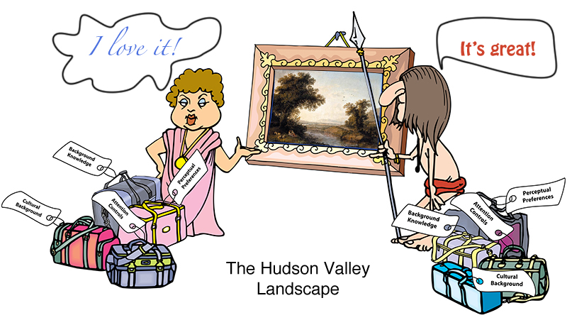
David Brooks: The Social Animal I just finished reading a book by David Brooks, “The Social Animal.” While initially hesitant, I really enjoyed reading it. The book, a fiction, bundles together a lot of interesting information on the latest (and not so latest) advances in our understanding of the workings of the human mind. So it’s easy to see why I would like it! While there are many ideas worth considering in the book, I picked a small detail mentioned in passing: the evolutionary pull towards the love of a “Hudson Valley Landscape.” The Hudson Valley Landscape has the following features: The landscape has lots of open space interspersed with tall vegetation. There’s a far horizon that defines the space: a valley, a glade, a river basin, a farm, etc. There’s a clear evidence of fresh water: a river, a stream, a pond, etc. There are a few large trees in the foreground, offering shade, fruit, safe escape, or all of the above. There’s a path from the foreground to the background. There are people and man-made structures visible somewhere. There are “safe” animals or birds visible: cows, ducks, deer, etc. Amazingly, all cultures respond positively to this genre of…
Harvard Vision Lab created a few experiments that feature Attention Controls Errors and Perceptual Blindness. Below is one of their optical illusions. Directions: concentrate on the central white dot. Did the colors of the outside dots continue to shift throughout the video? If they stopped when the dots were rotating, then you’ve just experienced Silencing—the lab’s vocabulary for individual’s inability to pay attention to both motion and color shift at the same time. Here, we mostly call it Perceptual Blindness. My Personal Experience with this Illusion: The first time I watched the video, I think the colors stopped shifting…but I don’t really remember—I wasn’t paying attention! The second time, I saw the shift. When I showed the illusion to a colorblind individual, he saw the shift from the first viewing. To read about the complete experiment and to view more illusion videos, please visit the lab: http://visionlab.harvard.edu/silencing/

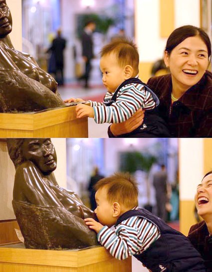
I first came across this image years ago in our pediatrician’s office. It made everyone who saw it laugh. The young boy—less than a year old, probably—has very limited world experience. But somethings he knows well—food comes out of those! The boy recognized the imagery, but with his limited background knowledge of art and contextual experience, his expectations of milk were quickly dashed (to the complete amusement of his mother). While we enjoy the boy’s predicament, it is good to keep in mind that the products we create can put our users at a disadvantage. The product’s audience can similarly have limited background knowledge, misinterpret the context, and be left with unexpected consequences. And a loving mother might not be there to console them…