This month on Instafreebie, a group of women writers organized an ebook giveaway. There are amazing stories in this collection (and even two of mine). I hope you take a look and download a bunch… …and as you do, consider the design of a science fiction book cover! One of the interesting side benefits of these giveaways is the ability to view a bunch of covers all together. What do you see? Which books jump out at you? Can you spot problems with book design? I can — a lot of the typography doesn’t work in this size — too small or too convoluted in font selection, making either the name of the book or the name of the author unreadable. Another problem is color — some covers are too muted and lack contrast to stand out in a group. Others have too much detail and are hard to take in at a glance. First impressions matter — readers (as all humans) take in visual information quickly and make judgments based on emotion first (and then come up with reasoned justifications for those feelings). The job of a book cover designer is to make a good first impression, to allow…
Tag Archive for visual comprehension
Anchoring Errors, Background Knowledge, Book, book promotion, Conceptual Design, Interaction Design, Interface Design, Newsletter, Pipsqueak Articles, Product Design Strategy, Users
What’s in a Cover?
by Olga Werby •
The design of the cover can make the book… or so I was told. Certainly, bad covers don’t contribute to sales. But good covers are difficult. And the thought on cover design has changed over the years… just like fashion. Since I tend to design my own covers (and I’m an artist and a designer), I wanted to put together some ideas, if not rules, to follow and some background of how to think about book cover design. Because if you don’t do your own, you still need to communicate what you want with the person that does. Book Covers Through Time To appreciate a cover, it helps to understand its roots. I won’t go back far, since my genre is science fiction, just a hundred years or so. Consider the cover evolution of Jules Verne’s “Journey to the Center of the Earth”: There is a movement from frills to realism to a strong graphic look of the more modern editions. While for the 1800’s editions, we might find it difficult to identify the genre of this story, by the time we hit 1960s, there is no doubt that this is a science fiction or fantasy novel. The cover alerts…
Interface Design, Product Design Strategy
Fashion and Interface Design
by Olga Werby •
Fashion Design shows have started up again: Fall 2014. I confess to a guilty pleasure of paging through photo after photo of the latest styles. There is something like a cross between artistic exuberance and freak show, all rolled into one insane media blitz. How can one not look? But there’s more to my looking than pure perverse curiosity. It’s true, I don’t really care what men will be instructed to wear and to like in the next season (or women, for that matter). But I do look for trends and patterns. And I also find something akin to Interface Design sensibility in the fashion industry — which way are we heading? What will be the next thing? What are these designers trying to say with their work? Product Design and Fashion Conceptual Design: What is it? What does this piece of clothing design to do? Keep the person warm? Cool? Modest? Allow them to get a job? Which job? Convey their personality? Cover up scars? Reveal tattoos? Make a political statement? Be cheap? Show off wealth? Last a long time? Be practical? Protect from the elements? Arm against hostiles? Depending on the purpose, clothing can take very different forms.…
Conceptual Design, Contributor, Personality, Product Design Strategy
Flat or 3D?
by Natesh Daniel •
Recently, on a LinkedIn discussion board, a designer asked if logo design was following the flat trend in UI design. The original post cited an article on DesignTaxi, “Top 10 Most-Talked-About Logo Redesigns Of 2013.” Most designers who responded to the discussion favored the idea that “All good logos can be written in sand with a stick.” The concept being: simplicity is better than complexity and one-color flat design is better than multi-colored three-dimensional design. I disagreed with a lot of the discussion. Though the UI design trend is flat and less skeuomorphic, logos are increasingly becoming three dimensional in look. This started with AT&T’s logo in 2005 and continues with Autodesk’s new logo from this year. Not many people favored this point of view and one comment indicated that the examples I shared were “exceptions, not the rule.” My point is that technology has changed and logos must be designed to look good in a variety of contexts and resolutions. Looking at the Autodesk logo, it has a three-dimensional color version, a flat color version, a black and white version like a stencil, and specs for literally reproducing it in three dimensions for signage. The key here is that logos are…
Attention, Attention Controls Errors, Perceptual Blindness, Pipsqueak Articles
Perceptual Focus Error
by Olga Werby •
Early on in my academic career, I did research in a middle school classroom. Computers were just introduced to a bunch of kids that never experienced them directly before. There were very few computers in schools at the time, and students were bunched up in groups around each one. One kid got to sit and control the keyboard, another student controlled the mouse. (I bet you know the genders of these two kids.) Most kids just focused their attention on the screen. The task was to familiarize with how the desktop computer interface worked. At the end of the activity, I got to interview the kids. One of the surprises was how many of the kids didn’t associate the movement of the mouse with the action on the screen. To connect the two actions together, a kid would have had to know that mouse movements and a pointer were related. It was not an obvious observation, especially in a tight crowd of a student group around the computer screen. And to this day, this required double focus is difficult for kids on the Autistic spectrum (iPads are much more intuitive for this population). One of the conclusions of my study…
Featured, Perception, Pipsqueak Articles, Product Design Strategy, Reference
Colorblindness Test on iPhone Google Traffic Map
by Olga Werby •
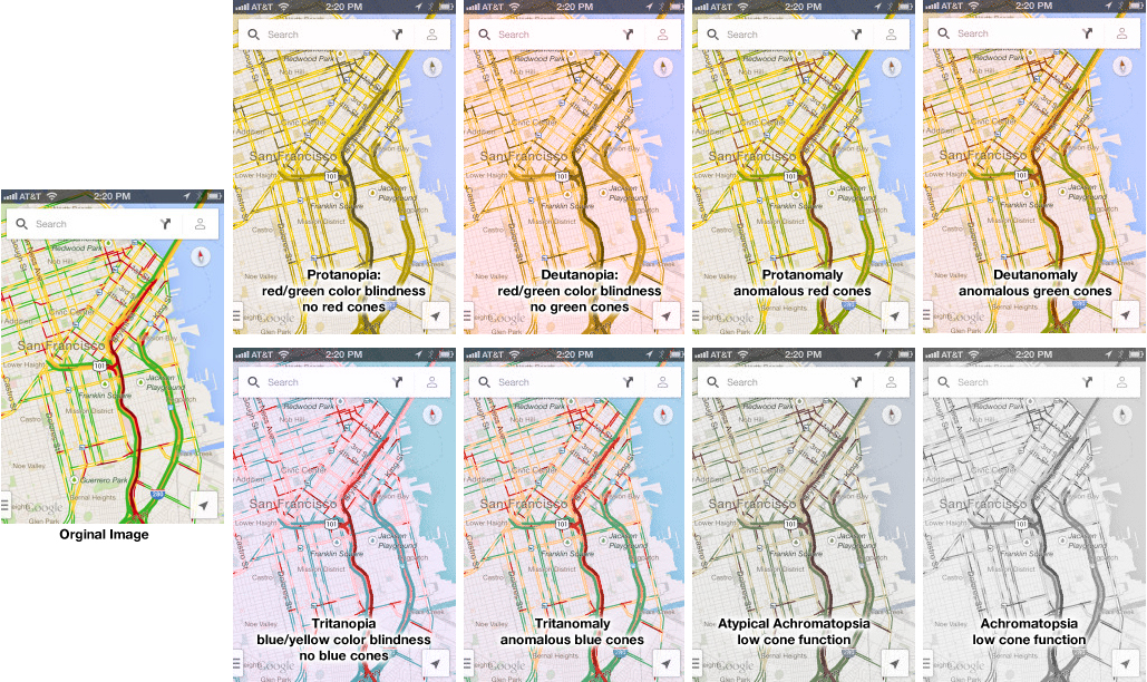
Google Traffic Map on an iPhone (or any other mobile device) is a great product… unless you are colorblind. Then, it’s a nightmare! 5% to 20% of the population has some kind of color processing disorder. Here is a simple test if you are one of those. Which of the following look the same to you? Click on the image above to enlarge. Red/green confusion — Protanopia: red/green color blindness, no red cones; Deutanopia: red/green color blindness, no green cones; Protanomaly: anomalous red cones; Deutanomaly: anomalous green cones — are the most common visual processing problems. But there is also blue blindness — Tritanopia: blue/yellow color blindness, no blue cones; and Tritanomaly: anomalous blue cones. The most rare cases are the monochrome colorblindness, the true loss of color — Achromatopsia: low cone function; and Atypical Achromatopsia: low cone function with some color. As designers, we have to be aware of our audiences’ limitations and strength. And visual processing and comprehension is no exception. In the past, I’ve written about colorblindness: . But unfortunately, the site that helped identify problems with design doesn’t seem to work. Here’s a new sit e for your reference: Colorblind Web Page Filter If you are…