I had this idea for writing a post about mothers and their children, but then I’ve decided that I’m too close to that subject at the moment and moved on to writing about sex. Sex sells, right? So here it goes: women, sex, and plotlines. Per statistica.com, 84% of romance readers are women. Obviously, that’s not a big surprise. I remember listening to a woman who was rhapsodizing about ebooks because she no longer needed to make covers to hide the fact she was reading romances on her subway rides to work. Ebooks hide lots of unique reading preferences behind their bland consumer electronics facades. And what people say they read and what they actually buy is quite revealing. The most popular answer to what genre you like to read is mystery/crime/thriller. And yet romance/erotica is by far the most profitable category at $1.44 billion, while crime/mystery came a distant second at $728.2 million. You’d be shocked, shocked to learn that people lie about what they love to read (or do). And while we are focusing a bit on statistics, here’s an interesting tidbit: engineers did research on what kinds of search relating to sex do women do as opposed…
Tag Archive for Kindle
Conceptual Design, Errors, Featured, Interaction Design, Interface Design, Perception, Perceptual Blindness, Perceptual Focus Errors, Pipsqueak Articles, Product Design Strategy
Where to post the “OK” Button on the Screen?
by Olga Werby •
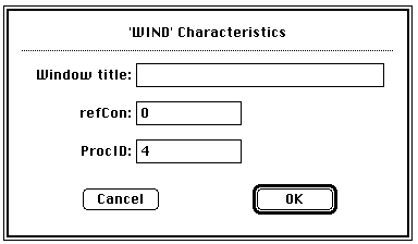
I have very strong opinions about where on the screen the OK or NEXT or SUBMIT buttons go in relation to CANCEL. Without giving it away, I’m going to walk through the design decision tree and provide a lot of references for both sides of the issue — yes, there are strong feelings about the right versus the left position choice. I’m not alone! Passive versus Active Buttons Active Buttons are the ones that advance the action to the next level. Passive ones return the users to previous state, negate the action sequence. OKAY, OK, NEXT, SUBMIT, ACCEPT, GO are all active buttons. CANCEL, BACK, PREVIOUS are action that reverse forward momentum and push the user to places they’ve been before. HELP and INFO sidetrack the user and distract from forward thrust of activity. In general, product designers want to move the users toward their goals — thus we want the perceptual focus to be on the action buttons. We want to make sure that users fist see the way forward, and then click on the right button that propels them forward to completion of the task. All distractions and side movements should be downplayed with Interface Design with the…
Cognitive Blindness, Conceptual Design, Cultural Bias, Ethnographic & User Data, Featured, Flow, Interaction Design, Interface Design, Mental Model Traps, Mirroring Errors, Pipsqueak Articles, Product Design Strategy, Scaffolding, Users
Thinking About the Future of Reading
by Olga Werby •
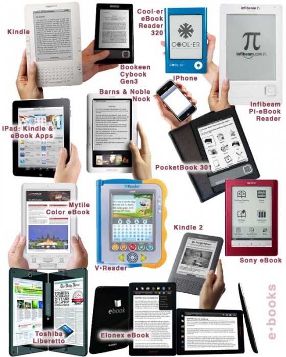
The Taxonomy of Usefulness We are a family with two Kindles, three iPads, two iPods, and an iPhone. We also have a few thousand old-fashioned paper books stored on bookshelves in every nook and cranny of our home: bedrooms, bathrooms, kitchen, stairs, garage, closets, family room, and any other space and surface that might hold a book or two or ten. We are into reading! And we use our Kindles, iPads/Pods/Phone, and computers to read as well. And while statistically speaking, we make just four data points for four family members, I feel we have something interesting to say about using technology to read. To help me understand my own relationship with reading and technology, I’ve come up with a little Taxonomy of Usefulness. If you’ve been reading this blog (or my books and papers), you’d have noticed that I like to slice up the world into groups sorted by a set of variables that I find useful at the time. Forming categories helps me think—the Cognitive Wheel is a prime example. Taxonomy of Usefulness These variables help derive the value of the electronic reading devices. Ergonomics There are many attributes to consider when describing the ergonomics of a device,…