Product Design Strategy

Separate Mobile Website Vs. Responsive Website

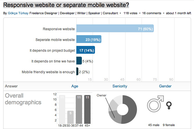
2012-10-30 LinkedIn Poll on responsive design

Frost, B. (2012). “Separate Mobile Website Vs. Responsive Website.” smashingmagazine.com. Visited on October 25, 2012: http://mobile.smashingmagazine.com/2012/08/22/separate-mobile-responsive-website-presidential-smackdown/ This article is about how to address the challenges of the mobile web by either creating a separate mobile website or creating a website that is responsive to different screen sizes. These two approaches are illustrated by the websites of the 2012 presidential candidates: Mitt Romney’s campaign has created a dedicated mobile website, while Barack Obama’s campaign has created a responsive website. The article looks at two use cases for these sites (someone looking for information and someone looking to take action) and how each of the different mobile approaches addresses them. Conceptual Design The article examines two mobile design approaches using Kristofer Layon’s model, which is based on Maslow’s hierarch of needs pyramid. Primary access and navigation are the most essential aspects of the mobile experience while enhancements like HTML 5 features are the least essential. How each method addresses the two mobile approaches is important for any product designer. Interaction Design Access to website content is the most import function of a mobile site. The Obama site is responsive, so all the content of the full-featured site is available to a mobile…

RE: Perfectionism May Not Be Optimum

Tugend, A., (2011). “It’s Just Fine to Make Mistakes.” NYTimes.com. Visited on October 8, 2012: http://www.nytimes.com/2011/03/12/your-money/12shortcuts.html Experiment: A study was conducted comparing the productive abilities of participants testing high and low in “perfectionism”. The task was to rephrase a passage without interpretation for a panel of judges who were unaware of the status of the participants. The Outcome: Those rating high in perfectionism were judged to have passages “significantly poorer in quality”. This surprising finding can be attributed to a shortened process of learning in perfectionists, due to fear of failure and the loss of respect should a mistake be found. This isolation from feedback inhibits development. Additionally, the stress of perfectionism can be psychologically detrimental, further inhibiting learning especially in the face of failure. Interaction Design: For products with a high learning curve, built-in feedback could be considered when the product is not used as designed, and alternately when ideal conditions of usage are met. This would perhaps encourage experimentation and calibrate use. Interface Design: Friendly tone or customizable interface might also help to attract continued use. This could give perfectionists and non-perfectionists a positive working arena.

RE: Is Pink Necessary?

How many different ways can someone describe a color? There is a delightful video titled “Luscious” by the Sappi paper company Off Register. In it, the main character attempts to describe the exact shade of “luscious” she wants printed on paper. “It’s like the inside of a baby polar bear’s ear,” she tells the printer. “It’s a nuclear accident, but there’s no problem with it,” she insists. “It’s like King Kong French kissed you … stop it Kong!” All of the metaphors from “Luscious” have another thing in common: They link disparate ideas, a seductive idea with a dangerous one. This is the problem encountered with Annie Paul’s article “Is Pink Necessary?,” which is a review of the book Cinderella Ate My Daughter by Peggy Orenstein. What color best describes a little girl’s sexuality? But little girls have no sexuality, one may protest. Research indicates they do, that children identify with external signs to determine their sex. What then is the hue of sparkly tulle and chiffon? What is the color of a kiss blown from the palm of your hand or a coyly twirled finger in softly dimpled cheek? From the viewpoint of product design, the article is better contemplated as a…

BRIDGE to Health

This week, I was invited to attend a BRIDGE Summit at Stanford. I was there to represent Ushahidi’s work and wasn’t particularly sure what to expect… But it turned out to be a very interesting brainstorming session for a new product/service in the health space: BRIDGE. Dr. Stephen Friend (M.D. and PH.D., president/co-founder/director of Sage Bionetworks) ran the show. What you will read below are just my notes, ideas, and understanding of what we were trying to do. I’m sure others at this summit came away with a whole different set thoughts, but, in the interest of advancing my own understanding and sharing of ideas in general, it seemed worth putting together a narrative of the product we were designing. So what is BRIDGE? After a two day discussion, we settled that BRIDGE is a platform (rather than an app) that will strive to: help gather medical information; crowdsource algorithms that would act on collected data with an aim to make medical advances; provide services to patients (information, education, support); facilitate research and make it easier for scientists to get access to data and to post requests for crowdsourcing projects; ease communication between all individuals and organizations working to advance…

Words, Language, Influence, & Design

I’ve been thinking a lot lately about the power of language. Sure, there have been a lot of news relating to language (election, after all, is only a few months away): legitimate rape is one example of powerful words/phrases in the news. But I would like to briefly explore how words and language can influence the design and use of a product. Language Development It might be interesting to start really early (or to look to unusual cases of individuals without language). The following program by RadioLab does a wonderful job of introducing language and the development of comprehension: Words that Change the World. This half-hour audio show presents the work of Susan Schaller, Charles Fernyhough, Elizabeth Spelke, and James Shapiro. Susan describes a case of a deaf 27 year old man who was never taught language and his journey to comprehension. Charles describes an experiment where babies, kids, and rats are asked to find items in a blank room after a brief disorientation. He discovers that language is essential to linking concepts in our brain. Elizabeth explores the benefits of language farther. And James, a Shakespeare scholar at Columbia University, talks about the use of language to communicate complex…

Design and the Olympic Games

Aerial Shot of the London Olympic Stadium

The Olympic Games are coming to a close and there are some interesting design decisions that seem worth mentioning. But let’s start with a cursory set of design requirements: safety, transportation, visibility and observability of events, entertainment, fairness, cultural sensitivity and appropriateness, and so much more. As with all design problems, divide and concur is a good approach: who are the audiences; what are their needs; what are the time, budget, and personal resources of the project; and what are the considerations (goals) of the sponsoring country. These are the basics of product design. From these variables, we can set priorities and deduce probabilities of errors and failures and how to accommodate them with design. Clearly, this is too much to cover in one blog, but here are a few thoughts… Safety There are many safety concerns in staging big, multinational events. Let’s first consider the different groups of individuals: safety for the participants, organizers, audience, supporting staff. We can break this down even more (by country, by sex, by religion, by location, by celebrity, etc.), but these are the large categories. It’s important to consider the safety for each group separately and provide supports as necessary. There are different…

Designing an Optimum Nudge

Tornado Exhibit at the Exploratorium

I’m sitting by a window looking out at a rainy Paris street, thinking of cultural differences between Paris and San Francisco, taking advantage of bad weather to do some writing. Over two decades ago, I did some ethnographic research a Exploratorium, looking at how different visitors interacted with the museum’s hands-on exhibits. I was looking for ways to improve the visitors’ experience, raise understanding of the phenomena they were observing. What I saw was different ways in which visitors experienced failure: p-prims that got in a way; folksy wisdom that caused confusion; lack of affordances that led to bottlenecks; permission giving that set up strange expectations; etc. The results of this study turned into a Master Thesis for UC Berkeley. Now, I would like to explore some of the ideas that surfaced during my Exploratorium research and apply them to design of nudging — carefully crafted affordances and perceptual cues that manipulated users into acting a certain way while maintaining the illusion of freedom of action. Let me start with a bit of history — a quick summary of some of the results of Exploratorium study. Permission Giving Two decades ago, “hands-on” exhibits were still novel in the museum world.…