Of Doctors, Babies, Kings, and Zombies Before starting my journey as science fiction writer, I got a few degrees under my belt — astrophysics, mathematics, cognitive science, education, etc. It took a few decades (I’ve gotten married and had a family in there somewhere), but I got my doctorate and have used and still use it to help people think through complicated problems, mostly in product design. How is this relevant to writing, you might ask? Well, in addition to witnessing and surviving some amazing situations — always a good experience for a writer — I’ve acquired a few tools on how to think about situations and people. I would like to share one such tool with you: Us versus Them, a cognitive perspective. What people (and other animals) are very good at is dividing themselves into Us’es and Them’s. It’s a useful tool when we live in a divided world — how else do we keep clear of our allegiances to countries, sports teams, and political parties? But these divisions have neurological and psychological underpinnings. Consider a four square graph that charts competency versus likability (emotional warmth and approachability): We perceive (our) doctors as warm, personable, and able. We…
Product Design Strategy
Background Knowledge, Background Knowledge Errors, Interface Design, Mirroring Errors, Pipsqueak Articles, Product Design Strategy, Users
Users Making Fun of Interface Icon Designers
by Olga Werby •
You know you failed as an icon designer when users exchange humor forwards on Facebook based on your work. We’ve all done it — we’ve all looked at the little labels on our clothing and tried to figure out what those iconic instructions mean. The icons are so bad that manufacturers themselves are making fun of them! There is not a huge downside for in this case failure, though, in this case. At worst, the piece of clothing would be ruined. Painful, but in the scheme of things not that bad. But other circumstances are more troubling. Last night, an alert lit up on my car’s dashboard. It was a strange symbol, a bit rounded, some waves on top. I had no guess as to what it was. It was accompanied with a bright red glowing triangle with an exclamation sign inside — the universal sign for warning, pay attention! Should I pull off the road? Is this bad? It’s dark and raining outside. Thankfully, my car manual was in the glovebox — I could look this up. In took a few minutes but I figured out that the strange symbol means low pressure in one of my tires (no…
Cognitive Blindness, Cultural Differences, Diagnostic Errors, Product Design Strategy, Uncategorized, Users
“Thanks for choosing Apple”…not!
by Olga Werby •
This last month, we had a bizarre customer service experience with Apple iTunes. It started on September 13th with a simple purchase that wasn’t fulfilled. It ended with us angry and frustrated for no reason. Apple was having a one-day promotion where they were selling movie bundles of 10 movies for $10 each. My husband couldn’t resist and purchased three of the six bundles on Apple TV. But the movies didn’t show up in our list of purchased movies. It’s not the first time we’ve bought movies; our credit card was up-to-date. Something technical had just gone wrong. So the next day, my husband submitted a customer service request with Apple iTunes. The Apple Customer Service rep said that he could see that the purchases had been made and said that other customers were having the same problem getting their purchases. He said that he would resolve the issue. But then, another strangely hostile customer service rep took over. He recanted what the previous rep had said, implied that my husband was a liar and said that he could tell that we had never purchased anything, and effectively told us to go get bent. The customer service interaction with Apple…
Interface Design, My Books, Perception, Pipsqueak Articles, Product Design Strategy
What’s in the Cover Art?
by Olga Werby •
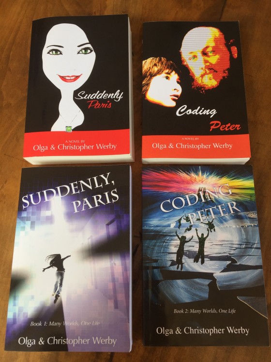
This month we have released a sequel to Suddenly, Paris — Coding Peter — AND changed the covers of both books! Above is photo of before and after for the cover art of both books. Can a cover make a difference in the sales of these books? These products? Yes! Cover art makes a huge impact on how a book is perceived by its audience. Or to put it even stronger, the art on the cover of the book helps the potential reader recognize the book as something that they would like to read. Personally, I thought the original covers with strong black, red, and white design were striking. But that design didn’t communicate the genre of the books to its audience. We needed to come up with illustrations that made it clear that these stories were science fiction, and action adventure, and aimed at a new adult readers. We needed to covey a sense of mystery and danger. We wanted people to stop and notice the books based on their covers. And so we made it change. The new covers are a lot more narrative. And hopefully it would make a difference as the potential readers browse pages of…
Background Knowledge, Featured, Language, Pipsqueak Articles, Product Design Strategy, Scaffolding
Treasure Trove of Creative Writing Online Classes
by Olga Werby •
I discovered Brandon Sanderson a few years back, introduced him to my son, and we basically read all that he has ever written (that we could buy). He is a very talented fiction writer. And now I discovered that he is a great teacher: good at explaining, generous with ideas, and easy with advice. He doesn’t shy away from talking about his own experiences, thus making his classes gain a very concrete dimension. I have enjoyed his online lectures so much, that I am now posting his classes in sequence and adding additional links to similar lectures that are still worth scanning through. I hope these are as useful to you as they were to me. Happy writing! Very Grateful: Thank you writeaboutdragons for adding careful notes and creating 2012 BYU videos! Very grateful to the Camera Panda team, Jon Deering and Earl Cahill, for filming, editing, and providing careful annotations (shown here in quotes). Excellent work! Another shout out to zmunk who posted videos of Brandon’s presentations at JordonCon. Brandon Sanderson’s 2012 Semester at BYU: 1. Creative Writing — Ideas & Outlining 0:12 / Introduction to being a writer – Writing is not about inspiration, ideas, or luck –…
Anchoring Errors, Conceptual Design, Interaction Design, Interface Design, Mirroring Errors, Pipsqueak Articles, Product Design Strategy, Scaffolding
Thoughts on An Event Apart San Francisco
by Olga Werby •
We just returned from An Event Apart San Francisco and I am trying to put down notes and ideas while they are fresh in my mind. It was three full intense days of information — some great, some good, some not so much. But overall, it was a valuable experience (and they do conference right — great food, comfortable location, endless supply of coffee and sugar). My take is always unique — I overheard some people who were ecstatic over the presentations that I felt were completely off — but I have been in the business for over three decades now and I want ideas that are new to me. So here are my notes from the presentations. “The Fault, Dear Brutus (or: Career Advice From a Cranky Old Man)” by Jeffrey Zeldman A lot of what Jeffery spoke about resonated strongly: the need to force ourselves to get rid of disdain for our clients that just “don’t get it” — mutual respect is the foundation of designer-client relationship in conversation about design, focus on purpose and use and stay away from esthetics — every person has their own sometimes, people (clients, bosses) are incapable of seeing our growth as…
Conceptual Design, Product Design Strategy
Sage Mentors and Scholars
by Olga Werby •
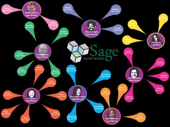
One of the goals of the Sage Assembly was to facilitate opportunities for groups whose members rarely have a chance to make their voices and opinions heard at such events, whose members could benefit from the exposure to the ideas and people at the Sage Assembly, and who can take those ideas and projects and connections back to their own social networks and help them grow. To achieve this goal, Sage Bionetworks had set up a scholarship fund — Open Innovator Awards — to assist ten recipients with travel and living expenses in Paris. The recipients of the Open Innovator Awards were pulled from a pool of applicants, Sage Scholars, who have been nominated by Sage Mentors. Each Sage Mentor was responsible for selecting no less than 2 and no more than 10 Sage Scholars. Sage Mentors had complete freedom to choose those who they believe would have benefited from participating and who could contribute in a positive way to the Assembly. Sage Scholars had to be 18 years of age or older. Sage Mentors were expected to help their Sage Scholars with their applications and the final Poster Presentations: “Instances of Open Practice”. The presentations were be on display…