The Taxonomy of Usefulness We are a family with two Kindles, three iPads, two iPods, and an iPhone. We also have a few thousand old-fashioned paper books stored on bookshelves in every nook and cranny of our home: bedrooms, bathrooms, kitchen, stairs, garage, closets, family room, and any other space and surface that might hold a book or two or ten. We are into reading! And we use our Kindles, iPads/Pods/Phone, and computers to read as well. And while statistically speaking, we make just four data points for four family members, I feel we have something interesting to say about using technology to read. To help me understand my own relationship with reading and technology, I’ve come up with a little Taxonomy of Usefulness. If you’ve been reading this blog (or my books and papers), you’d have noticed that I like to slice up the world into groups sorted by a set of variables that I find useful at the time. Forming categories helps me think—the Cognitive Wheel is a prime example. Taxonomy of Usefulness These variables help derive the value of the electronic reading devices. Ergonomics There are many attributes to consider when describing the ergonomics of a device,…
Conceptual Design
What does the product do?
Conceptual Design, Cultural Bias, Cultural Differences, Ethnographic & User Data, Flow, Personality, Pipsqueak Articles, Product Design Strategy, Users
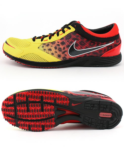
Branding & Emotional Design: The Culture of Sneakers
by Olga Werby •
How do we spend our money? Well, the first cut goes to survival: essential goods and services that are absolutely necessary to our survival. Food, housing, medical care are all part of the basic necessities of life. Some, of course, are more necessary than others (we might postpone going to a dentist…but not for long), but there’s a core of stuff that we need to live. The next tier up from survival is comfort. This is a very large tier—what’s comfort to some is a necessity to others and visa versa. People use their income to increase their general comfort level. This might mean a large house, more comfortable beds, larger selection of clothing. But generally, when we talk of comfort, we don’t include jet setting to Paris for a nice date out on the town. Comfort is about everyday life needs, but more comfortable. The top tier of our income is the disposable income and it is spent on luxury—the money we have left over from dealing with our needs and comforts; the money we can chose to spend in an extravagant and even wasteful manner. When economists make predictions about the average size of the available disposable income,…
Conceptual Design, Contributor, Cultural Bias, Interaction Design, Product Design Strategy
How to brand a disease — and sell a cure
by Sheetal Elangovan •
Elliot, C. (2010). “How to brand a disease—and sell a cure .” CNN. Retrieved on 11 October, 2010: http://www.cnn.com/2010/OPINION/10/11/elliott.branding.disease/index.html?hpt=C2 Carl Elliott in his article for CNN cites examples of how pharmaceutical companies sell a cure by disease branding. Drug companies today are embracing the ideology that Edward Bernays’, the father of PR proposed—The public relations business was less about selling things than about creating the conditions for things to sell themselves. Why disease branding works? As Carl Elliott states in his article, disease branding is particularly effective in two types of situations. Let us consider the first situation, a shameful condition that can be de-stigmatized through disease branding. If a condition, however shameful, is prevalent enough in the common population then a ready market exists for the cure. It is the rare shameful condition for which a market typically does not exist where disease branding will help ‘create’ a market. Individuals with this rare condition would need to overcome the stigma attached with such conditions and discuss them with their health care providers. By branding a disease and de-stigmatizing the condition, the pharmaceutical companies act as catalysts and enablers to the process of individuals coming forward and discussing the condition…
Conceptual Design, Contributor, Cultural Differences, Interaction Design, Interface Design
Chinese companies ‘rent’ white foreigners
by Roman Shumikhin •
Farrar, L. (2010). “Chinese companies ‘rent’ white foreigners.” CNN. Retrieved on 3 October, 2010: http://www.cnn.com/2010/BUSINESS/06/29/china.rent.white.people/index.html In China, white people can be rented. Chinese companies are willing to pay high prices for fair-faced foreigners to join them as fake employees or business partners. To have a few foreigners hanging around means a company has prestige, money and the increasingly crucial connections — real or not — to businesses abroad. The requirements for these jobs are simple: Be white. Do not speak any Chinese, or really speak at all, unless asked. Pretend like you just got off of an airplane yesterday. Those who go for such gigs tend to be unemployed actors or models, part-time English teachers or other expats looking to earn a few extra bucks. Often they are jobs at a second- or third-tier city, where the presence of pale-faced foreigners is needed to impress local officials, secure a contract or simply to fulfill a claim of being international. Occasionally, these jobs can go awry. A company can hire a white foreigner, swindle millions of yuan out of their clients , and after police shows up tell that the white guy was the one really in charge, White women are…
Conceptual Design, Contributor, Ethnographic & User Data
Intention over Outcome
by Mallika •
BBC Staff, (2010). “Morality is modified in the lab.” BBC Online. Visited on October 02, 2010: http://news.bbc.co.uk/2/hi/health/8593748.stm. This article highlights a study that proves that human moral judgment can be modified by disrupting a specific area of the brain by applying magnetic pulses. For example, most of us would agree that it is morally unacceptable for a man to let his girlfriend walk across a bridge he knew to be unsafe. If he did not know it was unsafe, and the girlfriend did not make it safely across the bridge, we would not hold the man responsible for letting her cross the bridge. After a magnetic pulse is applied to a certain area of our brains we would think differently—Whether or not the man knew it to be unsafe, we would think it was morally acceptable for the man to let his girlfriend cross the bridge if she made it safely across. If she didn’t, we would feel it was morally unacceptable, regardless of whether or not he knew it to be unsafe. This shows how the judgment can be influenced to become outcome based rather than intention based. On Concept: If the reverse were possible, that is morally questionable…
Cognitive Blindness, Conceptual Design, Contributor, Interaction Design, Interface Design, Mental Model Traps, Perception
Re “Wine Study Shows Price Influences Perception”
by Van Nga •
Svitil, K., (2008). “Wine Study Shows Price Influences Perception.” California Institute of Technology. Visited on October 4, 2010: http://media.caltech.edu/press_releases/13091 This article is a research study about how the region of the brain called the medial orbitofrontal cortex showed higher activity when participants drank wines at a higher price. A wine tasting study was conducted at the California Institute of Technology and Stanford University. Twenty volunteers tasted five wine samples at different retail prices: $5, $10, $35, $45 and $90 per bottle. The volunteers tasted and evaluated which wines that they found more pleasurable. Two out of five of the wines were the same but one was priced at $10 and one at $90. In the experiment the subjects rated and preferred the $90 priced wine more than the $10, although they did not know that they tasted the same wine. Cognitive Design What does the product do? In this study the cognitive design was a wine tasting experiment. The concept of the research was to experiment on the perception of price on different wines. The setting was controlled in that the subjects did not know that they tasted the same wine but told that the price was different. While tasting…
Cognitive Blindness, Conceptual Design, Group Decision Errors, Interface Design, Mirroring Errors, Pipsqueak Articles, Product Design Strategy, Scaffolding
Working with Clients
by Olga Werby •
We once had a client who made his secretary drive to our studio with a piece of a carpet from his office to be used as a color swatch for his company’s new logo. And while the final logo looked okay (very logo-like), it did little to represent the company’s brand. The company is no longer around today. Having a client who opines on the color of the background, choice of typeface, thickness of line, or layout mars the design process. It’s easy to get lost in details and personal preferences—who is to say that green is better than orange? A good designer has to be able to manage the client, keep the conversation focused on business goals and user needs. But before we can delve into the design process, we have establish trust. Clients need to feel like they’ve been listened to, they have to know and understand that design is hard work, and they have to buy into our expertise. The First Date The initial group meeting between the design firm and their client tends to feel like a first date: this is a chance for everyone to declare their expertise and expectations of each other. And like a…