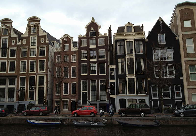
A couple of months ago, I went on the business trip to The Hague and Amsterdam. There are always cultural differences, especially when a person visits a previously unfamiliar place. And so it was with me. Here are two quirky examples.
The Room with a View
 I’m not particularly prudish or modest, especially when staying alone in a hotel room. But this feature of my room in The Hague was a bit puzzling. The shower and toilet were connected to the room not only by a door (with lock), but also by a picture window. The window coverings were controlled from the OUTSIDE of the bathroom — so effectively, if you were sharing a room, you were at a whim of your roommate when it came to your toilet privacy. But perhaps that’s how they roll in The Hague…
I should also add that directly opposite of the toilet window was the window to the outside — if you haven’t considered what internal lighting does to your visibility to the outside world in time, you are out of luck.
The Double Action
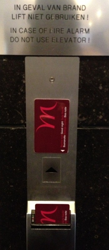
 As a designer, most of my work in web-based. But this doesn’t stop me from being annoyed at interaction design failures in other parts of life. The elevator controls at our hotel had a double action interface — not only was it necessary to insert the key card, but the user had to press the button as well. This caused endless delays — people inserted their cards and waited … and waited — no elevator! Why is this a failure? Why is two step action a bad interaction for an elevator call button? Because most users don’t think about calling elevators — most don’t pay that much attention. Once the initial action is done (insert card), most users move on with their conversations and other business. Only when the elevator doesn’t show up, the error is noticed. Does this dual action provide extra security? No. But it is annoying and I’ve spent endless (or what felt as endless) time waiting for people to complete the call.
After noticing this dual action failure, I took time to watch just how many users screw up. It was about 60% of the time! This is clearly a failure of interaction design. Notably, other hotels with similar card-calling elevator features do NOT require a second action.
Little things is design mean a lot. In fact, it is all about little things.

1 comment for “Cultural Differences in Interaction Design, a few observations”