Interaction-Design.org is doing an amazing job of developing a textbook for Human-Computer Interaction (HCI) Design. This newest chapter, Visual Aesthetics in human-computer interaction and interaction design by Noam Tractinsky works to tease out the aspects of design that make products appealing, memorable, culturally-appropriate, emotionally satisfying, and beautiful.
Beauty & Aesthetics Evolve in Time
It’s good to remember that what we find beautiful and appealing changes and evolves in time as well as across cultures. Here’s a wonderful demonstration: 500 Years of Female Portraits in Western Art.
What Makes Design Beautiful?
In the Interaction-Design.org chapter, Tractinsky starts with Vitruvius’ design principles. Vitruvius lived in the 1st century BC and develop a set of standard criteria by which to evaluate architecture: Firmitas — durability or life-span of the building in relation to its purpose; Utilitas — usability of the building by its intended audience; and Venustas — the beauty of the building (this would be culturally-specific). 2,000 years on and we still talk about durability, usability, and aesthetics of products.
Since this chapter discusses architecture, I would like to talk about weapons. Weapons pre-date architecture, but they still follow the same rules for design: durability and reusability, usability, and beauty. If you’ve ever been to an armory museum, you have seen the amount of design energy that has been spent of weapons over the human history. We polish, we decorate, we fine-tune these objects. We admire the detail, the craftsmanship, the emotion that was invested into an object destined to kill. We can tell the rank of the soldier by comparing how beautiful his uniform and weapons are to those of his comrades.
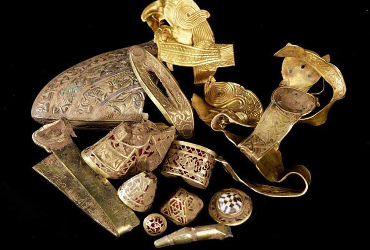
But beauty alone is not enough to be aesthetically pleasing. In 200 B.C., Emperor Qin Shihuangdi insisted that his warriors used standardized weapons. All arrows were made the same length and with interchangeable tips. If a soldier died, his arrows could be used by his fellow soldiers. Prior to that (and among other Chinese tribes), each soldier made his own weapons. No two were the same. Reusability of weapons extended their Firmitas and Utilitas.
And yet, the quality of a sword is judged not only on its strength, performance, and durability. A weapon is an extension of a warrior’s skill. It’s a very personal item. Each soldier forms an emotional bond with his weapon. Each sword in The Lord of the Rings books and movies is named and easily recognized by sight. As the audience, we can tell if the user is evil or good based on the weapon. The look communicates the emotional state of the user.
Even in this day and age, American soldiers decorate their standardized uniforms and weapons to reflect the personal nature of their spirit and experience.
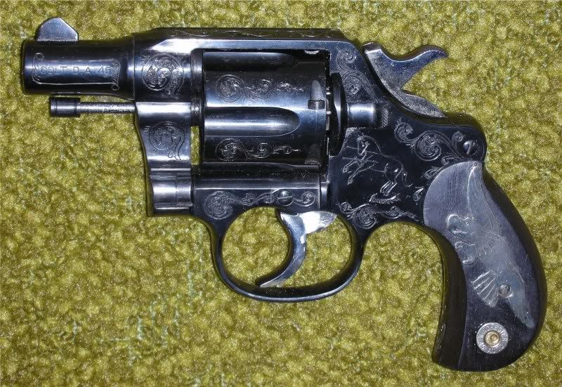
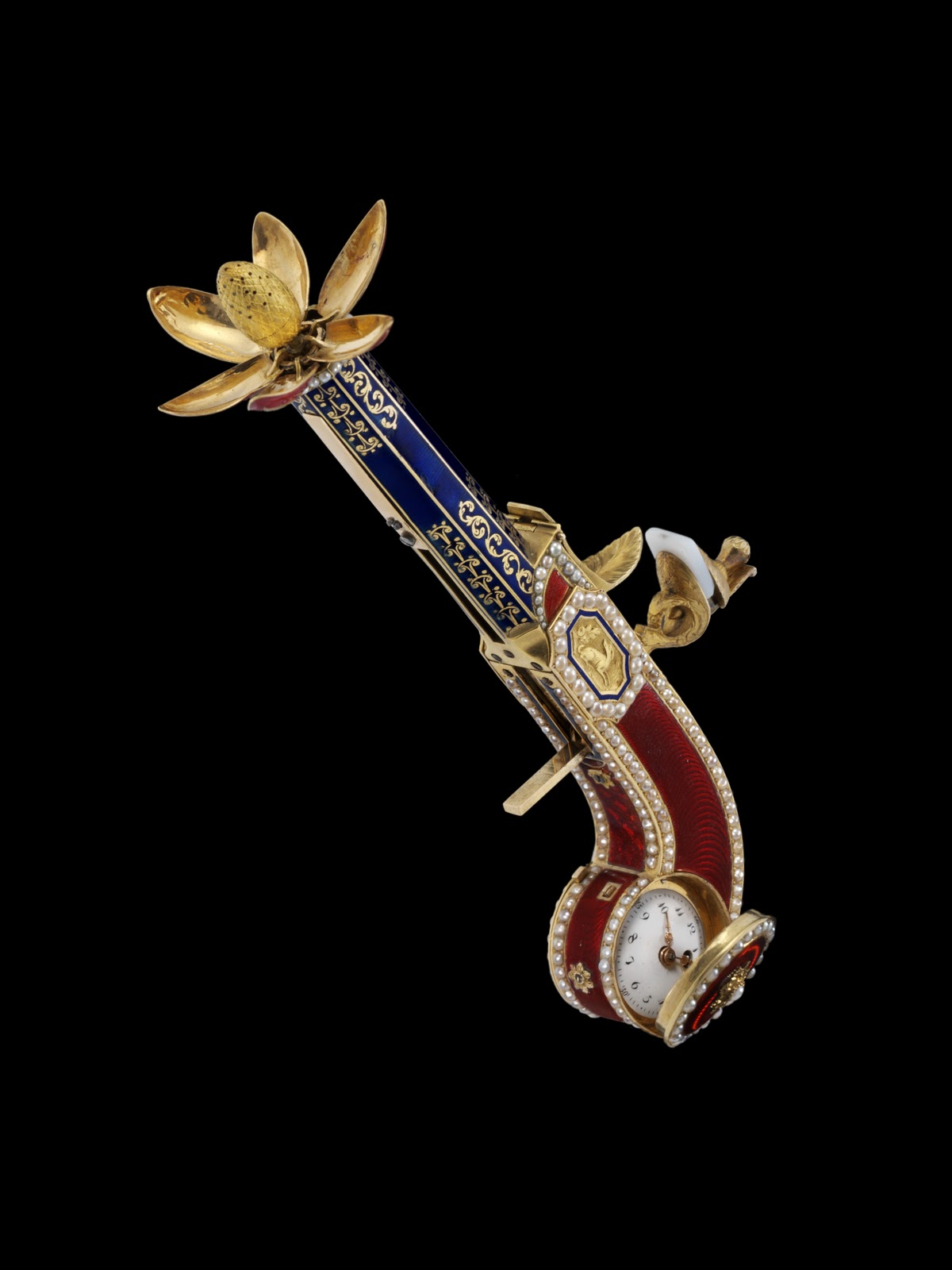

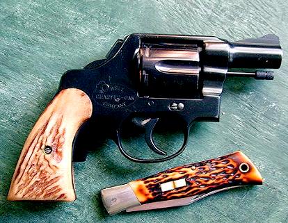
And yet, as different as these may be in their aesthetics, all these pistols use standard bullets — usability is not sacrificed for personal expression.
Another example is a screw. The idea of a screw goes back to 200 B.C., which seems to be a very productive decade. But it took almost 2,000 years to create a standard screw. Before then, all craftsmen made their own and no two were alike. In fact, making all screws different guaranteed that the customers had to go back to the original design to get ones that fit — a locked-in audience. But each screw was beautifully made, lovely to hold and feel. Each screw demonstrated the skill of the maker, but didn’t say much about the final user — the screw was concealed in the artifact it held together.
Today, our technology is increasingly personal. While our desktop computers can easily be shared, our portable devices are, by their very nature, attached to the person who is porting them around. And just like weapons, these devices sport personals modifications. From different backgrounds, to stickers, to cases, we want our cell phones, our iPads, and our laptops to reflect who we think we are.
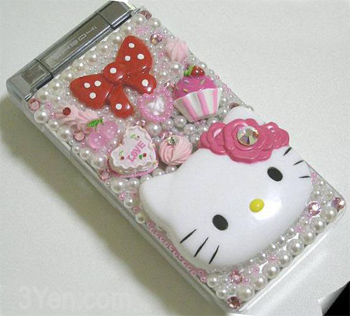
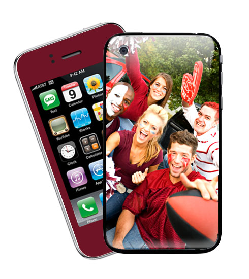
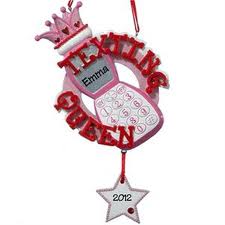
No wonder ringtones are such big business — we crave individuality and self-expression above uniformity.
Aesthetics in HCI
In our design shop, we constantly talk about how “prettier buttons won’t solve interaction design failures.” A pistol that won’t shoot — that won’t perform its essential function well — won’t be much improved by making it purple or adding intricate designs or jewels. So we have to keep in mind that beauty is not a substitute for functionality, but it is an essential part of it.
We can talk about some general ideas of what makes a design pleasing. We are programmed through evolution to like symmetry. We look for symmetry in bodies and facial features — symmetry implies health. So we look for symmetry in HCI design as well and find well-balanced design more pleasing. We equate symmetry with beauty and attribute symmetrical designs with added “goodness” and “health”.
We find familiar to be more acceptable and comfortable. We look to recognize certain aspects of a design that help us orient the product to its purpose, function, audience. Recognition triggers the amygdala — our first level of response to any product. What we recognize depends on our culture — in time and in space — thus designs have to be culture-specific to be found aesthetically pleasing. Think how shocking Picasso’s portraits felt to his first audience. Recognition is a factor of categorization: What is this? How do I fit this amongst things I know?
We are also particularly attuned to motion — we can’t avoid looking at something that moves. I’m sure that in the dawn of our history, this attribute of our perception saved quite a few humans from predators big and small. I might have bad vision and require glasses, but I can instantly spot a spider crawling up the wall. Thus motion in HCI is powerful — it can either help or completely obscure the necessary action the user needs to take to succeed with an interface.
With the arrival of haptic interfaces, aesthetics now includes not only visual or audio components but movement and touch. We like symmetry in texture as well. Silky, smooth, soft, sliding, gliding, polished — all are appealing. Spiky, rough, angular, sharp, uneven — all signal unfinished or even dangerous products, they catch our “eye”. We can use this to draw attention to an HCI feature — people spot even minute changes in texture.
In this chapter, Tractinsky discusses Outcome Variables — Trustworthiness, Usability, Brand Personality or Character, Performance — and Moderating Variables — Type of System, Context of Use, Cultural Differences (big and small). These are very interesting ways at looking and parsing the design of HCI.
Conclusion
The chapter does a great job of exploring the lay of the land of aesthetics in HCI design. For those wanting more, there’s a very extensive bibliography. There are also extensive commentaries by Gitte Lindgaard, Marc Hassenzahl, Antonella De Angeli, Dianne Cyr, Alistair G. Sutcliffe, Jinwoo Kim, and Masaaki Kurosu.
Bibliogrphy
Rawsthorn, A. (2008). “What is good design?” The New York Times. Visited on March 22, 2012. http://www.nytimes.com/2008/06/09/arts/09iht-design9.1.13525567.html
