David Brooks: The Social Animal
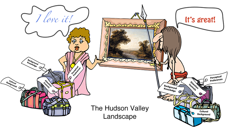
I just finished reading a book by David Brooks, “The Social Animal.” While initially hesitant, I really enjoyed reading it. The book, a fiction, bundles together a lot of interesting information on the latest (and not so latest) advances in our understanding of the workings of the human mind. So it’s easy to see why I would like it! While there are many ideas worth considering in the book, I picked a small detail mentioned in passing: the evolutionary pull towards the love of a “Hudson Valley Landscape.”

The Hudson Valley Landscape has the following features:
- The landscape has lots of open space interspersed with tall vegetation.
- There’s a far horizon that defines the space: a valley, a glade, a river basin, a farm, etc.
- There’s a clear evidence of fresh water: a river, a stream, a pond, etc.
- There are a few large trees in the foreground, offering shade, fruit, safe escape, or all of the above.
- There’s a path from the foreground to the background.
- There are people and man-made structures visible somewhere.
- There are “safe” animals or birds visible: cows, ducks, deer, etc.
Amazingly, all cultures respond positively to this genre of landscape! It’s appeal is universal, even for people who live in environments that mostly lack these features: tundra, desert, rainforest. What’s up? For an answer, please watch a TED presentation by Denis Dutton.
Denis Dutton: A Darwinian Theory of Beauty
Landscape Layout
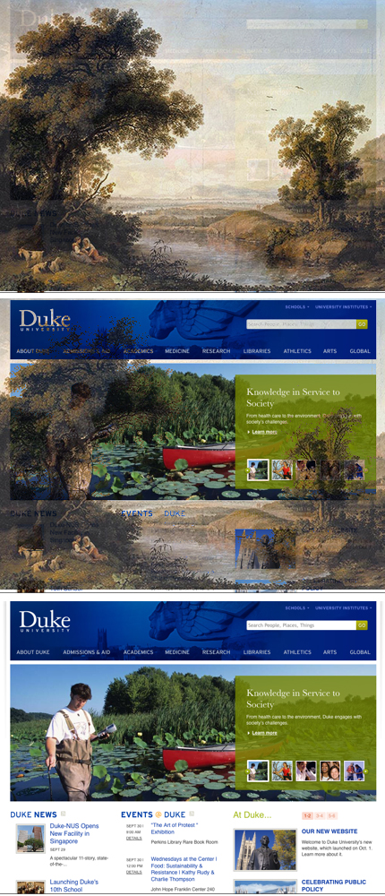
As with David Brooks’ novel, Denis Dutton presentation is stuffed with interesting insights and cool information. But I would like to focus on its implication to web design and, in particular, to home page layout of a web site.
Think about what you like in a design of a web page:
- Most would say: “I hate crowded design.” Just like the view from inside a dense rainforest, it’s difficult to catch where one item begins and another ends. Such designs make us tense—we have to work too hard to process visual information. We want lot’s of open space between content.
- Web sites tend to have a logo on the top left corner with a bar of navigation going across the top—like a far horizon, orienting the visitor to the virtual layout of the space.
- While there’s no “clear evidence of water”, most web sites try to break up the “boxy” design with a flow of a curve.
- Some large piece of content is always prominently featured on the home page: a rotating graphic, a featured article, a summary of the business proposition. The idea is to relate the web site’s offerings to a visitor’s needs, to help a visitor recognize some feature that parallels her own experience: “I belong here” feeling.
- There are usually some links to deeper content that are featured on the home page. Like a path into the landscape, these links draw the visitors into the site.
- Human faces are now part of most home page web design. Again, this is about making visitors comfortable, allowing them to recognize themselves and their problems and relate them to the solution the site offers. (We like photographs with people, too.)
- While I love Picasso’s Guernica, I wouldn’t want it hanging on my bedroom walls. Jarring images are great, but most corporate sites at least are not looking to evoke a strong negative emotion. Most home pages are filled with safe and pleasant images (although perhaps not cows).
May be it’s just me, but when I read about the evolutionary predisposition to Hudson Valley Landscapes, corporate web pages immediately leapt to mind. Here was a collection of safe, easy to look at, pleasant and non-threatening, easy to follow collection of images…

