…or not comprehending it, as the case may be.
A few years ago, I wrote a paper about people’s ability to comprehend complex visual information such as graphs, charts, diagrams, maps, and so on. Intuitively, we are culturally-trained to believe that it’s much easier to extract information from a picture than from text. But upon testing this belief (p-prim, for those in the know), I found that contrary to the notion “a picture is worth a thousand words,” it’s much more difficult to get data from an illustration than from a story. While emotional impact might be larger with a picture, it’s not true for comprehension.
You can read the results of my study at http://www.pipsqueak.com/pages/papers.html “Visual Symbolic Processing in Modern Times” paper presented at AACE ED-MEDIA Conference in 2008. Since then, I’ve collected more data, and the results are similarly aligned: problem-solving requiring higher level visual symbolic processing skills is difficult and results in communication failures. A secondary, and surprising, finding was a gender discrepancy in performance outcome testing of visual symbolic processing skills. Higher level and lower level visual symbolic processing are defined in the paper. And anyone interested in testing their visual processing skills are welcome to take the test at: http://www.edevaluation.com/moodle/
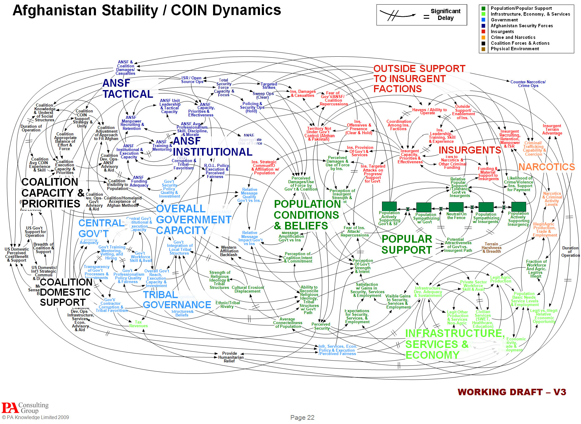
Today, New York Times published an article: “We Have Met the Enemy and He is PowerPoint,” discussing the extensive use of PowerPoint by the US Military. The article started with the famous slide that was designed to explain visually the complexity of American strategy in Afghanistan. Click on the image of the slide below to get a high-resolution version.
Even on a casual inspection, it is clear that it is not so clear—it would be difficult to understand the information presented in this illustration enough to make well-reasoned decisions. Most people describe a visceral reaction to the graph—an emotional reaction rather than an intellectual one. Following the arrows to comprehend connections illustrated in the slide is difficult. Thus reaching erroneous conclusions, easy.


I saw the same article:
http://www.nytimes.com/2010/04/27/world/27powerpoint.html?no_interstitial
Yes, I myself have been witness to many contorted ppt slides – either simple 2D that tells the audience nothing. Or, something so cumbersome like this one that it leads to massive confusion & incorrect conclusions.
Less ppt, better 🙂 in fact, i have effectively used photographs/metaphors to tell a story, vs some elaborate graphic that does not 🙂
The Web is Dead! or is simply a bad case of data representation?
http://www.boingboing.net/2010/08/17/is-the-web-really-de.html
An Interesting little post in Scientific American:
“We have to start from the beginning. Who is the audience for our graphic? What part of the broader wine-making story should we strive to communicate? How can we organize the information in the most engaging, elegant, and efficient way to best tell that story? These are familiar questions that help shape all of the information graphics you see in Scientific American. But sitting at a table with visual journalists with such a wide range of cultural, philosophical, and aesthetic backgrounds reminds me that those questions are absolutely critical. No amount of polish, style or color can mask a failure to consider the fundamentals. In any language.”
http://www.scientificamerican.com/blog/post.cfm?id=the-science-of-information-graphics-2011-03-25