Tag Archive for cognitive scaffolding

Rewired Brain

Our kids have grown up in the world where computers were always present and always on. They can’t conceive of a time when they can be cut off from the Internet (vacations in the Internet-dead zones are definite no go). Our kids are the generation of fully-connected always-on Internet users. What about the kids that are born right now? Not the Millennials, as they are being called, but these babies born in the age of the iPad? The iTouch Babies? How are their brains being rewired from the experience of having the iPad as their first toy? Check out this video of a baby girl growing in the iTouch World.

Community of Practice and Knowledge Propagation Circle

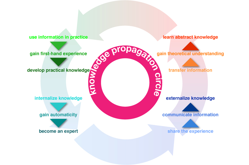
This summer my family and I travelled to Rome. While the temperatures didn’t reach the usual astronomic heights, it was rather warm. But we, and other visitors, didn’t have to worry about thirst. Rome has the best network of public drinking fountains that I have ever seen. Every few blocks, there’s a beautifully-designed basin with a spigot of continuously running water (I know, being from California, the never-ending stream made us very uncomfortable, too). There are two bits of information that have to be passed on to the first-time visitors of Rome: the water is potable—safe to drink, and how to use the fountain—there’s a bit of a trick to them. Above is my son demonstrating a little secret interaction. There’s a small hole on the top of the pipe that can serve as drinking fountain if the main hole at the end is plugged up (with a finger). While we learned about the great drinking water in Rome from many traveling guides (books, online sites, etc.), we obviously didn’t know about the trick until we watched a pro do it. Knowledge Propagation Circle Information propagates through communities. When we first encounter a novel bit of data, it tends to…

Fun, Functionality, Flow: the 3 F’s of Product Design

Good product design—design that solves a real need; design that considers the strengths and weaknesses of the user; design that stands the test of time and cultural fads—always incorporates the the 3 F’s: Fun, Functionality, and Flow. It’s easy to talk about the 3 F’s in abstract, but I thought taking a concrete example of a bicycle would be more productive. A bicycle is a designed object that satisfies a real need, does so in way that brings joy to its users, and the act of riding results in flow experience for many. The old “Liberator” poster tries to communicate all 3 F’s to the potential buyers of its products: liberator means freedom to move, real functionality; the woman warrior communicates power and fun—you will feel the way she looks! It’s exhilarating! Notice the high heels and the beautiful vista (with a rough terrain) and a kid pointing at the riders with envy. These posters, old advertising ads for bicycles, try to communicate the same: it’s fun, functional, and exciting to ride a bike. Ride, and look good. Ride, and be the center of attention. Design for Fun So what makes a particular design fun? It seems that one of…

The Haptic Feel of Books versus eBooks

We’ve traveled to Rome for our family vacation this year, and aside from a few summer reading books that I couldn’t find in an eBook format, we relied on our two Kindles and 3 iPads for our family reading needs. This is the second summer we brought primarily electronic versions of books—”The Count of Monte Cristo” is much easier to read when it fits into your hand and doesn’t weigh a ton… In the days before the Kindle and iPad, we carried an extra suitcase just for books. But there are drawbacks to buying and reading eBooks. Below are some of my thoughts and experiences—the cogitations of a voracious reader. Time & Progress As I was reading my novels, I found myself repeatedly trying to figure out where in the book I was. How far along was I? When is the next natural break (chapter, section end)? How many pages are there to the end of the chapter, end of the section, end of the book? These were not idle curiosities about my reading accomplishments, although when you do finish reading the book version of “The Count of Monte Cristo”, you do have a sense of having read something. An…

Information Scaffolding

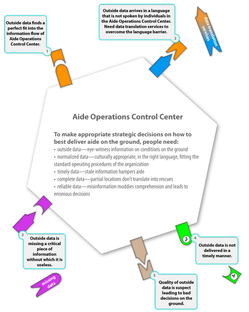
Here’s another way of thinking about crisis mapping as an ecosystem or a cell with a membrane allowing certain information to enter while keeping other out. Some data has data “receptors” in the organization and thus “gets in”. But some information doesn’t and some just doesn’t have the right format: wrong language, incomplete information, time delay, low quality, etc. Please let me know your thoughts on the communicative value of this illustration. Thank you! And here’s how Ushahidi can help.

Decision Scaffolding and Crisis Mapping

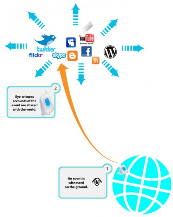
I’m working on a series of illustrations to highlight the need for decision scaffolding during an aide mission. The ideas are based on the Ushahidi deployment experience in Haiti after the 2009 earthquake. But the idea is to make this more general. I would love ideas and recommendations on how to make this visualization better and more communicative. (read more about crisis mapping here) Crisis: Smoke Signals from Eye-Witnesses Let’s start with a crisis—a natural disaster or a political upheaval leaves thousands of people in desperate need of help. The people on the ground witness the suffering and use ICT (Information Communication Technology) to send up the spoke signals. Please not that Internet services might be compromised (due to deliberate actions taken by the authorities; infrastructure failures; chaotic conditions on the ground), but people tend to be very creative and use phone lines, radios, satellite links, and just person to person communication to get the information out there. During the current Libyan crisis, people were very creative: “To avoid detection by Libyan secret police, who monitor Facebook and Twitter, Mahmoudi, the leader of the Ekhtalef (“Difference”) Movement, used what’s considered the Match.com of the Middle East to send coded love…