Interface Design

What does the product feel and look like?

Special Preview: Activity Theory

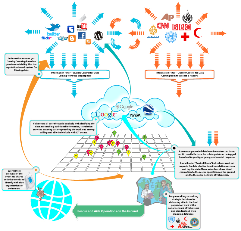
Crisis Mapping Illustration

Once again, we get an early preview of the next chapter of Interaction-Design.org textbook: Activity Theory. The author of the chapter, Victor Kaptelinin, did a wonderful job of summarizing decades of research in educational psychology, cognitive science, and HCI — from Vygotsky to Moran. If you’re unfamiliar with the theories, research, and thinking that brought us to present day HCI design, this is a great place to start (and includes all of the references to the relevant literature). Adopting an activity-theoretical perspective has an immediate implication for design: it suggests that the primary concern of designers of interactive systems should be supporting meaningful human activities in everyday contexts, rather than striving for logical consistency and technological sophistication. While this chapter focuses mainly on human computer interaction (HCI), I would argue that we need to be broader: we need to focus on product design. And as always, I mean product to be interpreted in a very broad sense. We are moving rapidly into a world where everything we touch is a computing device. Today, I Twitted that my washing machine is an ICT device — the new ARM chip is small, requires very little power, and will be incorporated into everything.…

How Do We Think of Brands

I found this video by Adam Ladd — he made a video of an interview with his 5 year old daughter talking about brands. He showed her some very famous logos, and she told him what she thought they were. Naturally, this is a girl from a middle class background, from America. The answers would be very different from a 5 year old brought up in Russia or Papua New Guinea. Notice how she is able to quickly identify a Nike logo. And Disney’s D. And what’s really amazing is that she knows what a logo is in the first place! This little kid has developed a brand p-prim! And she has a well-developed comprehension of visual symbols. I wonder how the same interview would play out in a different culture…

Special Preview: Affective Computing

Pong Interface

Some 25 years ago, I came up with tiny application: each day, a person picks a color that represents his or her predominant emotional state; the collection of color moods are mapped onto a calendar and displayed as an animated film, summarizing the emotional life of person. It was simple and easy and very effective. And in some way, this was also part of the affective computing — computers that use emotion as part of HCI. [Note: This could and was done with watercolors as flip book some 40 years ago when I played in my art class in school.] Affective Computing, I feel, is only recently became part of the “vocabulary” of computer-based developers. When I first started working in this field, graphics were non-existent, thus Pong. In the early nineties, my business partner and I met with the president of Organic, a web design firm in San Francisco, who promptly informed us that his business had no need for Interaction or Interface Designers, that’s what graphic artists were for. Now, psychologists, sociologists, and sociologists are routinely hired by creative firms to help solve design problems. Times change! There are a lot of posts on emotional design on this…

Creativity, Perception, and Public Art

Coming Unzipped

Art or craft? Creativity or public nuisance? Sometimes, the line between these is so fine, so complex, so fractal, that it’s simply doesn’t matter. The images below span thousands of years in dates of creation. The artists used light and shadow, perspective, and clever geometry of space to add meaning to their work. All showed an amazing amount of imagination, all provide commentary on current events or a point of view. Happy holidays to all! Enjoy! [flagallery gid=3 name=”Gallery”]

End-User Development (EUD) Educational Preview

This is an interesting collection of videos and background materials on End-User Development — situations when end users design and develop software for their own use. If you’re old enough, you would remember BASIC and HyperCard — tools that let anyone develop simple games and applications. A great example is “Spelunking” game totally developed in HyperCard (these guys when on to develop “Myst”!). I’ve made a few games like this myself. And of course FileMaker is another system that allows application development by the end users — we have one for time tracking. There have been many many others, and unfortunately, many of them are now gone. The discussion on what happens when end users develop for themselves is fascinating. Most times, these users are experts in their own fields and are not software developers (some have no and some have little formal training). Thus there are cultural differences between “real” programmers and end users that take up programming to achieve their own goals, often because they can’t find what they need out in the world. These end-user designed products have strengths and they also have many weakness. In particular, these products are tightly focused on the needs of those…