Twenty years ago, I’ve started to collect news articles that I found relevant in some way to expanding my understanding of users and usability, interaction and interface designs, and product design in general. For each article I saved, I created a complete bibliographical reference, a brief summary, and a few quotes that I found particularly interesting. I also noted how I felt about the information: “that was particularly stupid” or “what an interesting way to think about this problem.” This collection proved invaluable to me as I wrote my dissertation, and I recommend this technique to all my students. I also require that my students find, analyze, record, and share article notes with their peers as part of the homework assignment for the classes I teach.
I hope this online collection of notes would prove valuable not only to me but to all students and colleagues looking to develop innovating and interesting products. News is a source of data. And every once in a while, I will post a short article on product design as well, starting with the iPad story.
For a musician, every object she touches is a musical instrument. For product designers, every news story is a well of information about products and users.
Contributors: All individuals who have taken one of my classes are welcome to contribute to this blog. Please contact me for credentials.
To learn more about my work and my company, Pipsqueak Productions, please visit our site:
Distilling Information is Hard
When it comes to my students’ participation in this blog, it’s all about distilling information found in the news to something product designers in our midst would find useful, on a practical level.
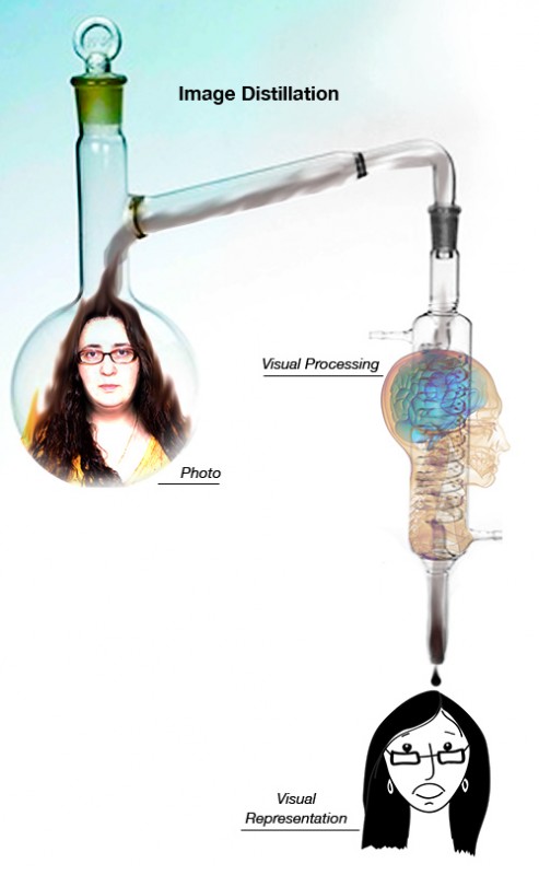
Consider the illustration below.
 We see a person’s face (mine in this case). We can describe some of the features. But what do we actually remember? Remembering complex visual information is hard—too many details. Recalling a drawing is easier. That’s because an artist already distilled the complexity into its essential parts—only those details that are required to remind us of a particular individual are included in the rendering.
We are all pretty good at judging wether a portrait looks like the person it was intended to represent. We can quickly say if it does or if it doesn’t. But it would be difficult to explain what details in the illustration make the likeness or what’s missing from the drawing that didn’t hit its mark.
Distillation of information is hard. Some people are good at it, some are not. It’s an acquired skill. And each category (e.g. sensory like visual, audio, tactile or knowledge-based like physics, economics, biology) requires its own training and its own set of talents.
When we make mistakes based on data we reviewed, it’s often because we weren’t good at distilling the mass of information into its essential parts relevant to the problem solving at hand.

