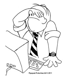
 I often encounter the Blank Page Syndrome among our clients. They have an IDEA, but find it difficult to translate the nebulous desires into plans and actions that become a business. I hear a lot: “I know what I want, I just don’t know how that gets translated into something tangible.”
The problem though is that most times, these individuals don’t know what they really want. And my job as a designer is to do product design therapy to uncover the real needs and separate them from vague desires.
There are a few strategies for this (cognitive scaffolding for the design process). From the point of view of the final product, it is important that the client buys into the ideas and makes them their own. When I hear my words spoken back to me a few weeks into the process, I feel more confidant that the final result will be the practical manifestation of my client’s desires.
Define the Categories of Product Users
When one runs a business, selling products or providing services, it’s important to keep in mind that in most cases it’s not about you (typical mirroring error). The products and services have to appeal to end users. But how can we know what’s appealing? Well, it all starts by listing who these potential users are and trying to sort them into categories.

Creating a list of users and specifying their identifying characteristics is one of the great ways of breaking the cycle of the Blank Page Syndrome. Just by thinking about these people — what makes them unique; their physical and cognitive characteristics; their wants and desires — can be an inspiration. And it provides a set of constraints — one of the most necessary components of great product design.
Story Time
Another useful strategy for breaking the Blank Page Syndrome is writing an imaginary story of how a particular product or service would be used by their intended audience. This should be an inspirational story — no need to focus on failure here, but rather on optimal scenario of use. What would make our users happy? When will they be using our product (time of day, location, alone or in a group, etc.)? What would they want to accomplish with our product (i.e. user goals)?
This exercise places the designers into the mind set of their users — a way of developing empathy for their problems.

Ideally, different stories are written for the different user categories. But it is important to write these stories for a particular person — pick an imaginary user, give her a name and job, assign goals, etc. So while the category is a group, a story is an example of a particular individual under a particular set of circumstance — a well-defined use scenario.
As humans, we are great story-generating machines. We tell stories all the time and we remember stories better than other types of data. We are also very good at spotting differences in stories, especially concerning tone. That’s why it is useful to have multiple people write the scenarios of use stories. By seeing the differences in these stories, it is easy to spot divergent ideas about the design of the product within the company.
Brainstorm Failure Scenarios
I find it fun to think of ways things could fail. Thinking about failure is not the same as experiencing failure — it’s better to fail in an imaginary way than experience failure in practicality.
Since failure can be such a personal thing, it’s better to focus on failure of the competing businesses: What the different ways you believe your competitors are crewing up? What do you think is hurting them the most? What would you do differently? Why do you think they made those decisions? Do you think they are aware that these decisions are costing them business?
Again, this is a great starting point to creating a list of design criteria based on experience of others. It won’t be a complete list, but it’s a good start.
Fukuppy is a cute example of failure — a marketing mascot for Fukushima Industries. I’m sure it works great in Japan, but in a global business environment, one has to think about translation issues…

Focus on Details
Sometimes the overall design doesn’t come together until details are explored. When a client says she has a vision, it usually means small fragments of ideas — a flash of logo, a vision of color or shape, a piece of marketing text, an example from another project or business… While these bits won’t necessarily jell into a full design spec, they are useful in finding the tone and highlighting the need for a full design exploration to the client. These flashes of inspiration are also valuable and they break the cycle of the Blank Page Syndrome.
Discuss Resources
Doability — this is the key the design kingdom: the art of what’s possible given the constraints of the design problem. While creative issues might be difficult to state in a clear way, business constraints are easily articulable. You can use the following set of questions to get started.
- How much time do we have? Do we have a schedule or a hard deadline for the project? Sometimes, the deadlines are invented as “motivational” incentives. It’s better to motivate people in other ways. Fake deadlines are recognized and people act accordingly…
- What human resources do we have to bring to the problem? It’s important to understand the availability of talent that can be applied to the problem.
- What is the budget for the project? It’s important to count “inside” resources as well as outside help. On many projects, we found that inside resources were counted as free, as if the company doesn’t have to pay salaries… This kind of calculations lead to errors — it’s not the right mental model for resource allocation.
- Can the project be divided into phases — can we roll out the project in some strategic way given our people and budget resources? Sometimes, it makes sense to tackle the problem in phases and reevaluate priorities after the completion of each deliverable. Divide and concur is a common strategy for a large problem.
- Is there a point person who can make decisions? The power of a single point person can’t be overstated. Decisions by committee can drag the whole project into oblivion (especially if there’s no internal agreement on design goals.)
Wrap Up
Basically, the point of this article is that Blank Page Syndrome tends to be a result of poorly defined design problem. By tackling different aspects of design specification — budgeting, staffing, business goals, users — we can always find a path to success.

