 The Universal Remote Control Story
A few years ago, we got a Star Trek phaser universal remote control as a gag gift for the holidays. As any universal remote control (URC), it was supposed to control any and all devices that were hooked up to our TV and do it with a flair of shooting a phaser at the general direction of our equipment. A few days later, it was relegated to our sons’ toy box, and now I wouldn’t even know where to look for the thing.
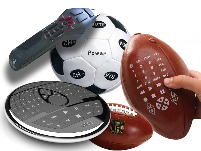
Big buttons, footballs, phasers, UFOs, futuristic control centers—the makers of universal remote controls have tried them all. But consumers still buy one URC after another in the hope of finding something that would work for them. Why are these things so darn hard to use? Manufacturers seem to believe that by giving their products a friendly, toy-like appearances, these devices would seem more user-friendly and easier to use. But, personally, I don’t want a giant ball in middle of my kitchen table or rolling around my living room floor. I don’t want the kids to toss footballs to control the channels or fire phasers to lower the sound. I just want something unobtrusive and easy to use. The device shouldn’t stand in the way of its function.
Providing Technical Support to Your Elderly Relative Over the Phone
Like most people, I assume you have parents. Have you ever tried talking your grandmother through changing the channel settings on her TV to get it into the right mode for viewing her VCR? Using one of these universal remotes? If you had such an experience, I know that you probably carefully put away that remote control so she would never find it again and then carefully labeled (in big bold type) each of her four remotes as: TV, VCR, DVD, and CABLE. Why do I know this? Because one of the hardest thing to diagnose over the phone is the MODE to which the universal remote is set to, making it difficult to know which device your grandmother is actually controlling.
Mode errors—a type of attention control error where the person is not aware or can’t find out the mode of the device they are operating—are one of the most common human errors that creep up in operation of complex and compact devices. If the same button controls the “on” and “off” switch on several devices, then the chances are high that people will press the button hoping to control one piece of equipment while in reality operating another. These errors are hard to spot, especially on the phone, while talking with your grandmother, who is hoping to watch her favorite show, which has already started, making her attention span even shorter and her anxiety even higher. Good luck with that!
Spray-on Interfaces
What does it really take to make a universal remote control user-friendly? Why doesn’t it work to wrap the electronics into a huggable plush toy to improve interaction?
In 2004, John Gruber wrote a nice article—Ronco Spray-on Usability. The article focused on poor usability performance of LINUX. His main point was that great design is hard and requires, a lot of hard work, a lot of time, and a lot of talent. And, most importantly, it’s not something you can “spray-on” after the fact. There has never been a piece of software (or hardware, or any other product) that has been moved on the usability continuum from poor to exceptional by virtue of adding pretty buttons. Interaction problems don’t get solved with graphic design or plushy cases.
To create a great, usable product, we have to start thinking about usability at the conceptual design meeting. Continue thinking about it all through interaction design. And don’t let up during the interface phase of the process. And at each stage of design, we have to continuously ask: Does this make sense for our users? Are we helping advance our users’ goals? What do they need? What do they want?
To provide a bit of clarity into the product design process, we created a little worksheet—not too scary or overwhelming—that our clients can use to help them think about the products they want to make. You can download it at Pipsqueak Productions’ web site.
