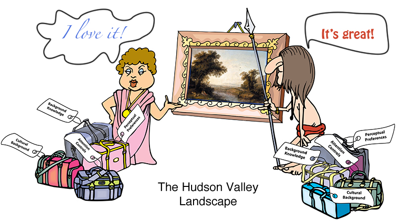
David Brooks: The Social Animal I just finished reading a book by David Brooks, “The Social Animal.” While initially hesitant, I really enjoyed reading it. The book, a fiction, bundles together a lot of interesting information on the latest (and not so latest) advances in our understanding of the workings of the human mind. So it’s easy to see why I would like it! While there are many ideas worth considering in the book, I picked a small detail mentioned in passing: the evolutionary pull towards the love of a “Hudson Valley Landscape.” The Hudson Valley Landscape has the following features: The landscape has lots of open space interspersed with tall vegetation. There’s a far horizon that defines the space: a valley, a glade, a river basin, a farm, etc. There’s a clear evidence of fresh water: a river, a stream, a pond, etc. There are a few large trees in the foreground, offering shade, fruit, safe escape, or all of the above. There’s a path from the foreground to the background. There are people and man-made structures visible somewhere. There are “safe” animals or birds visible: cows, ducks, deer, etc. Amazingly, all cultures respond positively to this genre of…
Tag Archive for emotional design
Group Decision Errors, Pipsqueak Articles, Product Design Strategy, Scaffolding
Entropy & Design
by Olga Werby •
Entropy is the measure of a system’s disorder and it increases with time (as dictated by the Second Law of Thermodynamics). Once the egg is cracked open, it’s impossible to make whole again: “Humpy Dumpy sat on the wall, Humpy Dumpy had a great fall; all the king’s horses and all the king’s men couldn’t put Humpy Dumpy together again!” We are taught the second law of thermodynamics from a very early age! So what about design? Surly, we steadily progress to a better and finer product, right? Unfortunately, in my experience, the steady progress is rarely the case when dealing with big company, large products, or long time frames. Big, large, and long spell out entropy in design. Let me walk you through it. We Need A New Product! It all starts with a call: “MegaCorp needs a new product!” Well, the words are sometimes different, but it is all the same—there’s change in the air. With luck, this means that various departments of the MegaCorp Inc. scramble to do some market and internal research to come up with some ideas: What does the market need? What resources do we have? What can we develop? (given time, people, budget,…
Background Knowledge Errors, Errors, Ethnographic & User Data, Pipsqueak Articles, Product Design Strategy, Users
Knowledge, Context, and Expectation Part II
by Olga Werby •
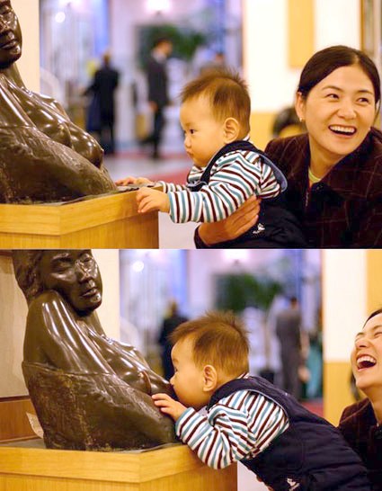
I first came across this image years ago in our pediatrician’s office. It made everyone who saw it laugh. The young boy—less than a year old, probably—has very limited world experience. But somethings he knows well—food comes out of those! The boy recognized the imagery, but with his limited background knowledge of art and contextual experience, his expectations of milk were quickly dashed (to the complete amusement of his mother). While we enjoy the boy’s predicament, it is good to keep in mind that the products we create can put our users at a disadvantage. The product’s audience can similarly have limited background knowledge, misinterpret the context, and be left with unexpected consequences. And a loving mother might not be there to console them…
Background Knowledge, Background Knowledge Errors, Cultural Bias, Cultural Differences, Pipsqueak Articles
Cultural Difference: Kids Stories
by Olga Werby •
I came across this short video: “The White Wolf” by Pierre-Luc Granjon. It is an 8 minute animation short about two brothers living in a small French village. Please pay attention to the story-line (I know it is an obvious thing to pay attention to): would it have been received well in US? Note that it is not more gruesome than “Snow White”… This is why cultural context is so important to product design and why I teach the class!
Conceptual Design, Cultural Bias, Cultural Differences, Ethnographic & User Data, Pipsqueak Articles, Product Design Strategy
Trolls, Dolls, and Poupees
by Olga Werby •
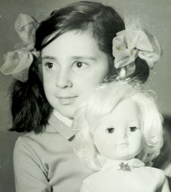
The first time I saw her, she was riding on a bus. Her hair was long and golden. Her eyes were amazing blue. She was stylishly dressed in a mini skirt and had a cool pair of earrings. But what got me—what burned that moment into my memory forever—was that her long slender legs bent without any visible joints. She was amazing. I wouldn’t see another like her until many years later, when my family was emigrating from Russia and living Vienna. Not far from the apartment we stayed in, there was a toy store and it was filled with wonders just like the one I remembered from so many buses ago: Barbie. When I was growing up in Russia, I played with dolls and poupees—all girls did. The dolls were made to resemble little kids, with big eyes, big heads, chubby cheeks, and cute clothes. I used old buttons and odd bits of cloth and lace to make them new clothes and bedding. My play mainly consisted of creating cool things for my dolls—I liked to sew and glue. And I don’t think that my play was all that much different from girls’ 100 years before—my dolls would have…
Cognitive Blindness, Conceptual Design, Cultural Bias, Cultural Differences, Ethnographic & User Data, Mental Model Traps, Pipsqueak Articles
Thinking About Value
by Olga Werby •
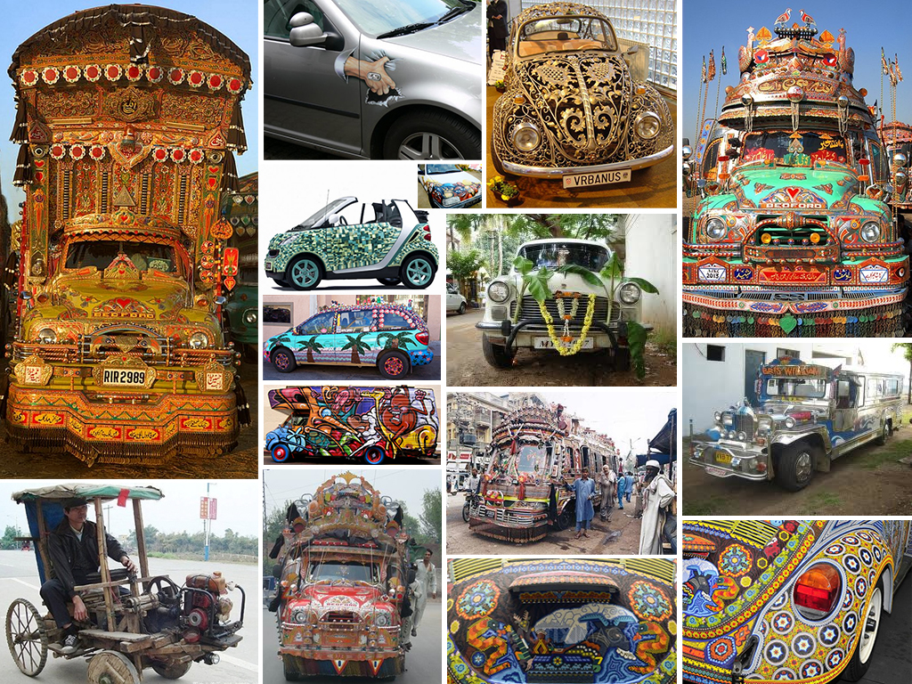
Which car do you find more pleasing? Which car would evoke a feeling of envy? Would you shake your head or starting thinking of how you can improve on the looks of your car? Which car’s origin would you place in the South Asia? Which in South America? Which owner cares about the aerodynamic qualities of the vehicle? Regardless of your personal feelings, the owners of these automobiles have clearly invested a tremendous amount of energy and effort into making them look like this and are very proud of the results! Telling a Story Each of the vehicles above tells a story about its owner and about its culture. The story conveys information: the owner’s goals for the car: utility or status symbol or both cultural value of design cultural symbols owner’s attitude towards possessions (e.g.: How long is the car expected to stay with one owner?) owner’s place in the social hierarchy owner’s unique identity owner’s investment into the vehicle (e.g.: time, money, skill, etc.) the perceived value of the vehicle to its owner These stories of cars and their owners change from culture to culture, from place to place, and of course in time. What we consider beautiful…
Attention, Conceptual Design, Flow, Pipsqueak Articles, Product Design Strategy, Scaffolding
Toilet Games
by Olga Werby •
If you have small children…boys, you are undoubtably familiar with things like: “My Wee Friend”; “Piddlers Toilet Targets for Potty Training”; “Potty Training Targets – Look like real targets!”; “Tinkle Targets for Boys”; “Wee Wee Pals”; or “On Target Infant Toilet Training Balls” from Amazon. Problem: boys have to learn to aim; boys attention span is shorter than the time it takes to empty their bladder; Solution: make going to the bathroom fun; design an activity that extends the attention and improves aim; The conceptual design is pretty straightforward: align the goals of the parents (teaching bathroom skills) with the goals of a toddler (have fun) to improve the toilet experience for all concern–basic goal alignment! Unfortunately, the problem doesn’t seem to go away as these boys grow up. Product design to the rescue! The Urinal Lips design uses the same product design strategy: make aiming fun! What sign on the walls of the bar’s men’s room couldn’t achieve, a playful design did–these men’s room stay clean. One Step Farther… While attention controls might lag during a long bathroom break, video games seem to have a tighter control over attention. So welcome to the future of urinals: These are the…