Product Design Strategy

Compensations and Accommodations

chair from hell

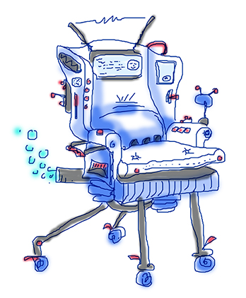
Product design is a careful balance between building accommodations for different users and hoping users would compensate for aspects of design that are not well-suited to them. The power of good design is to know where this balance is located. It’s impossible to accommodate everyone. A chair that is the most comfortable sitting for one person might not work for another at all (some people are short, some are tall, some are wide, some are narrow, some have back problems…). And even a beloved chair only works for in some situations for some particular time in our lives — the rocking chair that we used to read to our kids when they were little… I talk about a chair because we can all relate: my “homework” chair, my “lucky” stool, my “lazy afternoon” stoop, my “theater” lounge, my “reading” nook, my “power” throne… It’s easy to see how my reading nook would be different from your reading divan or surfing seat. I can come up with compensations: I can add pillows or use the little knobs to adjust the hight. But the more things I have to do to make the sitting arrangement more comfortable, the less likely I’m to…

The Trouble with Social Search

Cultural Mix of Search Results

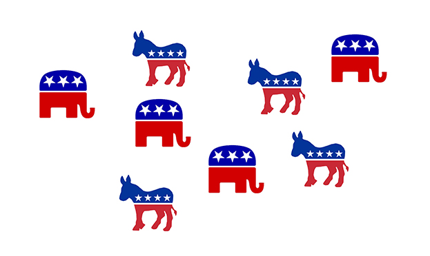
There have been changes in Google search and Google analytics. There have been many discussions on this topics. But there’s one big problem that I see with adding the social dimension to search: community bias or, as we’ve been referring to it in class, cultural bias. Cultural bias is one of the sources of human errors that render problem-solving more difficult. The problem comes from having one’s views on highly charged emotional topics (or social issues) continuously reinforced by the community. I’m writing this blog on Martin Luther King Day — particularly appropriate when discussing cultural bias and the difficulties of overcoming them. In the past, when we googled something, we got results based on the relevance to our query. This relevance had little to do with us personally and focused on the topic of interest. Google results to a politically polarized question looked the same whether one was a Democrat or a Republican: It didn’t matter that Democrats tended to socialize with like-minded individuals — meaning other Democrats. And Republicans preferred other Republicans, creating segregated social circles. In each such circle, people met, talked, and reinforced each other’s beliefs. BUT the Google results were the SAME for each group,…

Emotional Scaffolding

Processing emotions takes time and energy. Part of the working memory is taken up by analyzing the emotional state of others, environmental stresses, personal feelings, and anxiety. Since working memory is an extremely limited resource, anything that takes up space there without our bidding (against our will) takes away from our ability to think through situations, to problem solve, and to make well-reasoned decisions. Instead of thinking, we are using up the working memory for processing emotions. Sometimes, emotions are just the right thing to focus on — to pay attention to. How does this painting makes me feel? Do I like this person? This music feels good… But if you are taking a math test, focusing on how much you really hate test-taking takes away from your ability to take the test. It is very common for individuals to “get” the subject matter, but fail the test. Some people are good at dealing with anxieties and some have trouble controlling their attention controls away from fretting. That’s one of the reason some educators are talking about doing away with summative assessments (final exams) in favor of continuous assessment (assessment as part of learning) — the on-going observation of students’…

Special Preview: Affective Computing

Pong Interface

Some 25 years ago, I came up with tiny application: each day, a person picks a color that represents his or her predominant emotional state; the collection of color moods are mapped onto a calendar and displayed as an animated film, summarizing the emotional life of person. It was simple and easy and very effective. And in some way, this was also part of the affective computing — computers that use emotion as part of HCI. [Note: This could and was done with watercolors as flip book some 40 years ago when I played in my art class in school.] Affective Computing, I feel, is only recently became part of the “vocabulary” of computer-based developers. When I first started working in this field, graphics were non-existent, thus Pong. In the early nineties, my business partner and I met with the president of Organic, a web design firm in San Francisco, who promptly informed us that his business had no need for Interaction or Interface Designers, that’s what graphic artists were for. Now, psychologists, sociologists, and sociologists are routinely hired by creative firms to help solve design problems. Times change! There are a lot of posts on emotional design on this…

Special Preview: Philosophy of Interaction and User Experience

A person uses a piece of software, a Web site, or any other product — “virtual” or “real” — to achieve a goal. The design of interaction with these products can either help or form obstacles that interfere with the realization of that goal. A product is easier to use when its interaction is designed to meet the needs of its intended audience. Product designers who consider those needs produce far more effective interaction solutions than those who base their designs on aesthetics or business needs alone. But how does one go about “considering” user needs and then come up with a design solution that works? Oscar Wilde famously said: The pure and simple truth is rarely pure and never simple. Pure and Simple design is similarly rarely pure and never simple to develop. I my class, Cognitive tools for Product Designers, we explore what users bring to usability. We all arrive at the scene with different baggage — our experiences, education, perception, memory, and so on are unique to each of us. No two individuals interpret an experience in exactly the same way. While this sounds daunting, we shouldn’t give up on design all together. We all have some…

End-User Development (EUD) Educational Preview

This is an interesting collection of videos and background materials on End-User Development — situations when end users design and develop software for their own use. If you’re old enough, you would remember BASIC and HyperCard — tools that let anyone develop simple games and applications. A great example is “Spelunking” game totally developed in HyperCard (these guys when on to develop “Myst”!). I’ve made a few games like this myself. And of course FileMaker is another system that allows application development by the end users — we have one for time tracking. There have been many many others, and unfortunately, many of them are now gone. The discussion on what happens when end users develop for themselves is fascinating. Most times, these users are experts in their own fields and are not software developers (some have no and some have little formal training). Thus there are cultural differences between “real” programmers and end users that take up programming to achieve their own goals, often because they can’t find what they need out in the world. These end-user designed products have strengths and they also have many weakness. In particular, these products are tightly focused on the needs of those…