The Olympic Games are coming to a close and there are some interesting design decisions that seem worth mentioning. But let’s start with a cursory set of design requirements: safety, transportation, visibility and observability of events, entertainment, fairness, cultural sensitivity and appropriateness, and so much more. As with all design problems, divide and concur is a good approach: who are the audiences; what are their needs; what are the time, budget, and personal resources of the project; and what are the considerations (goals) of the sponsoring country. These are the basics of product design. From these variables, we can set priorities and deduce probabilities of errors and failures and how to accommodate them with design. Clearly, this is too much to cover in one blog, but here are a few thoughts…
Safety
- There are many safety concerns in staging big, multinational events. Let’s first consider the different groups of individuals: safety for the participants, organizers, audience, supporting staff. We can break this down even more (by country, by sex, by religion, by location, by celebrity, etc.), but these are the large categories. It’s important to consider the safety for each group separately and provide supports as necessary.
- There are different types of safety concerns: injury of performers on the field [Watch: Olympic Weightlifting accident, Janos Baranyai, 2012], injury to the audience while at the event, injury resulting from transportation to and from events, injury due to faulty equipment, etc. Again, this is a very long list and each category of safety problem needs to be addressed separately.
- There are multiple locations: stadiums, garages, dormitories, food courts, etc. Again, each location has its own issues. And these issues change with time of day and as the event progresses. [Here are few examples: Cyclist killed after collision with London 2012 Olympic Games media bus and Health and Safety Executive FAQ]
- And then there are the severity of safety concerns: a sprained foot is very different from the terrorist attack and different support systems are required for handling these safety issues. For those interested in the official Olympic and Paralympic Safety and Security Strategy report, please download it here.
- And finally, there’s education and communication between those in charge of dealing with safety and everyone else. What’s the best medium for delivery? In how many languages? Who’s responsible for translation…
It’s easy to imagine how large the safety punch list of the designers of the Olympics! And, correspondingly, how many decisions were made. And how difficult it is to track how one decision affects another down the line or in another situation or for another group. The possibility for human error is vast…
Entertainment
In addition to the politics, Olympic Games are about entertainment. So it’s not only important to make the venues work for the athletes, they have to work for the spectators, both on location and at home. The design decision for how to stage the games to bring the maximum entertainment value start very early — way before the host country is chosen.
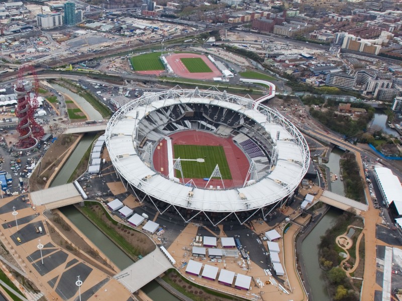
Consider the design of the venues. They have to meet the sports requirements; they have to allow viewers to see the events; they to need to cluster for ease of inter-venue transportation; they need to accommodate the journalists and sports program staff that create the shows for the home audiences…for all the countries! Just generating the optimum scheduling of events is a Herculean task.
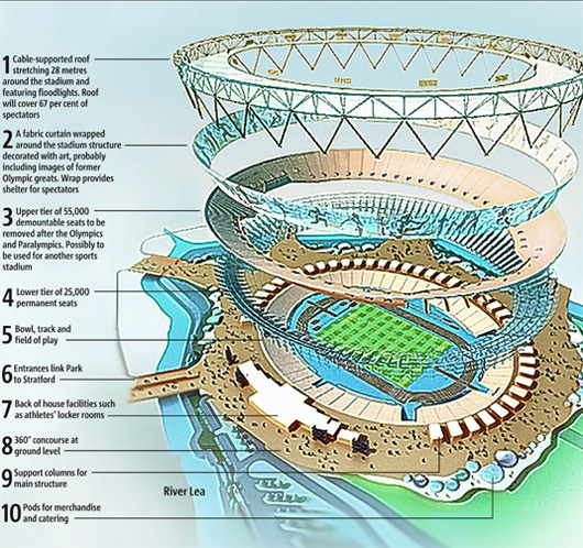
The design considerations of the outside infrastructure are staggering (and well visible in the shot above). But so are the ones for the venue itself. Below is a great fly-out illustration of the London Stadium (click on the illustration to go to the Olympic Games web page with explanations).
There is no way a person sitting at the top of the stadium gets to actually see the show — thus the need for jumbo screens all over the venue.
One of the design decisions for the hockey field was to go with a blue synthetic fiber turf:
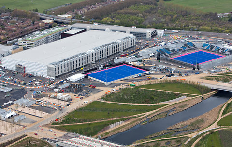
The arial photo above shows not only the two blue stadiums, but the physical relationship between the venues and the supporting infrastructure.
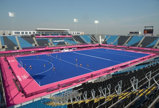
And close up:
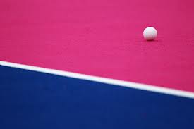
The colors were chosen to improve the viewing for athletes and the audience.
And this is how it looks to the spectators:
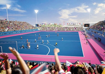
What kind of uniforms would work best? A color-conscious team would avoid blue… Yellow is the smart choice.
The tennis courts are similarly colored:
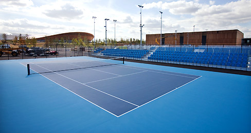
Color of the court and uniforms — the hue, the shade, the contrast, etc. — the is the interface design decision. These decisions are not only important on the field, but for the broadcast success. Most video feeds have been augmented with additional information (e.g. name of the team/athlete, country of origins, scores, etc.), and some colors make this easier than others.
The material from which the court and uniforms are made — the water absorption properties, the life-expectancy, the reflectivity, etc. — is the interaction design choice. Again, we now know just how much performance can be enhanced with the right design:
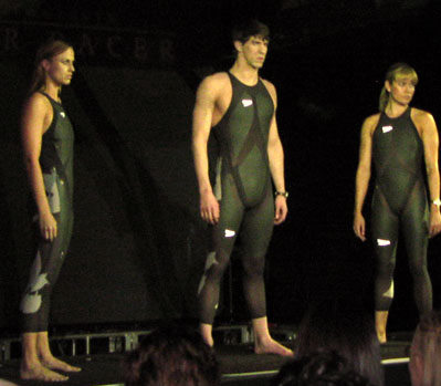
Speedo’s LZR Racer Suit resulted in new world records in swimming!

