 You’ve probably heard: If you have a hammer, everything looks like a nail.
This is a commentary on how our problem solving perspective is influenced by the tools we happen to have in our hands at that moment. The tools, of course, don’t have to be physical. They can be systems, or lists, or a set of approaches that we’ve learned at school or that are enforced at work. And they can also be digital tools that we feel particularly comfortable using. These “tools” constrict our metal models, limiting the possible solutions to the design problems we face at work (or at home).
It’s not a surprise that if we Google “WordPress Templates,” all the results look more or less the same. This is partly because of the tool — WordPress is a great tool, but as any tool, it limits the final creative output to what is easy. (Especially, if the designer is not a programmer.) Here’s a look at Google Image results for “WordPress Screenshots”:
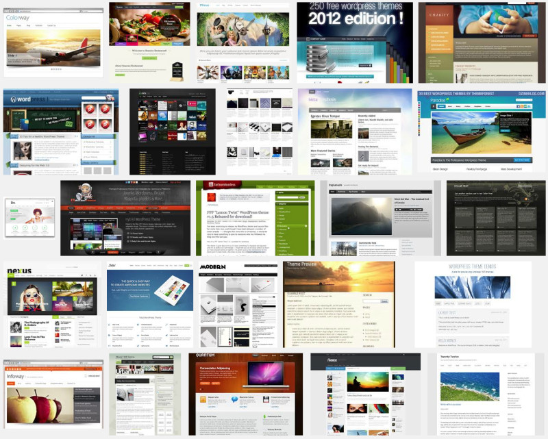
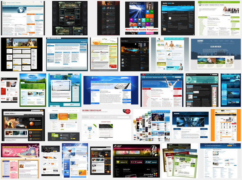
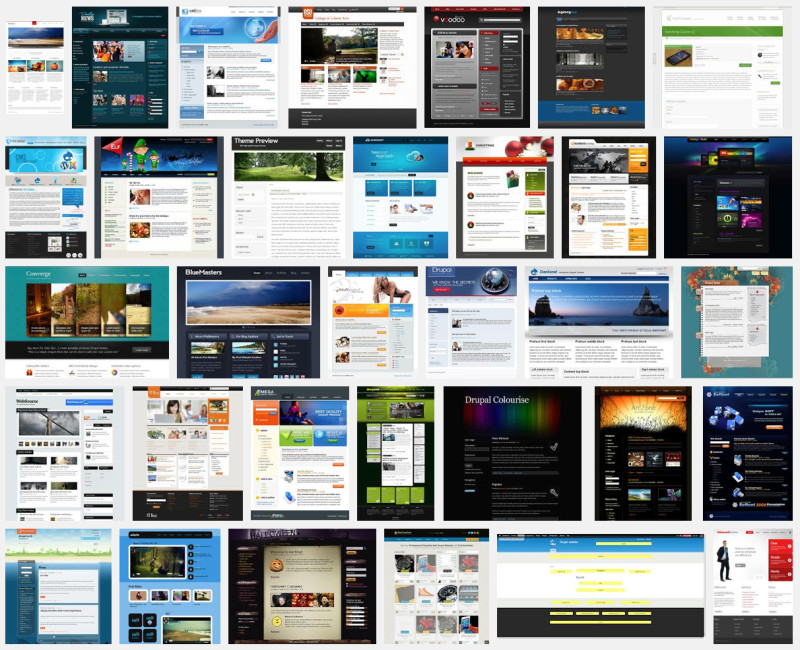
What’s interesting is the flip side of this phenomenon. Once we see a lot of nails, we expect nails as the solution. So it is not a surprise that not only do most WordPress sites look more or less the same, but so do the sites that are built with other tools. Here are examples for Joomla, Drupal, and HTML templates.
Google Image results for “Joomla Templates”:
Google Image results for “Drupal Templates”:
Google Image results for “HTML Templates”:
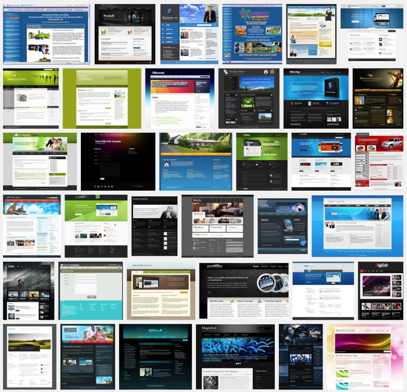
Clients’ expectations of a certain look, homogenized the way the corporate websites look. There are boxes of images and text. A lot of blue and black. Slideshows on top, logos on the top right. Same look, same style, same type face. (Helvetica, anyone?) And frankly that’s a shame.
We humans evolved to get a lot of information from our environment via visual cues. If every website is the same, then how do we find the one? It’s true that most webwork is done fast and cheap and with off the shelf templates and graphics. Original work is expensive! Original thought takes time, and time is money.
When we (product designers) all talk to each other and exchanges tips on the best icons to use or the best places to buy new stock images, we contribute to making the world all look the same.
![]()
The fonts that are in vogue (Helvetica) and the image styles that are most frequently seen in magazines or ads are reflected over and over in the design of new ads and new magazine layout and new websites, all little clones of each other.
During the early years of developing computer software, there were technical limitations on what could be done. Apple II had only 4 colors (for hi-rez): white (11), black (00), magenta (01), and indigo (10). That’s quite a limitation! Take that with no internal memory and 128K floppy disks and the results were … well, not quite as homogeneous as one might think! Necessity is the mother of invention!
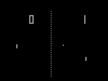 Consider Pong! Here’s a screenshot of the game in black and white (I saw it in green/orange and black). Just a few pixles allow for a lot of engagement form the players. There is an incredible amount of creativity necessary to design a game within a strict set of limitations.
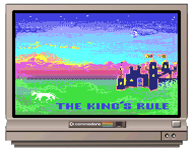
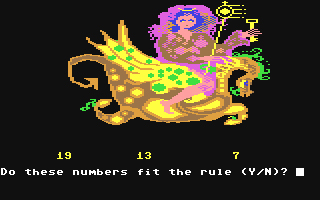
In my time, I worked on Commodore 64. I had a few additional colors at my disposal. My language was Basic, and that was my limitation (in addition to color space and memory). Another limitation was the budget — just as today, companies tried to squeeze the most product for the least investment. Each game sold for around $40, and was created for about $2,000. When compared to $2 prices (or less) per App on the iTunes Store, that was a fortune! And today Apps cost more to develop… But as they say, we can make it up on the volume.
Here are a few screen shots from a game I worked on many years ago:
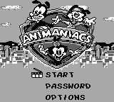
When my kids were growing up, they played with old Macs. The original Mac had black and white as the only color choice, but at least the pixels were square!
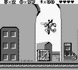
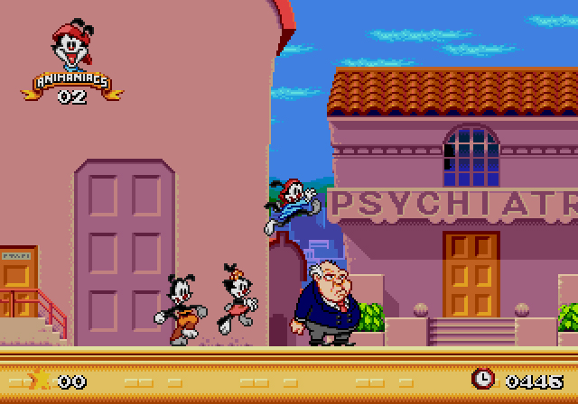
They loved Animaniacs:
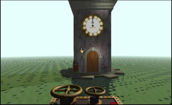
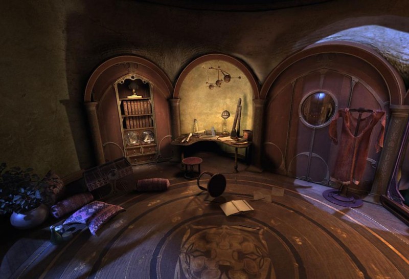
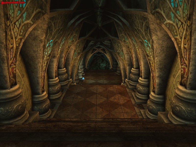
As computers got more and more powerful, the games got more interesting looking. Designers were willing to explore their options. True geographic interfaces became more widespread. Myst was one of our favorite games at that time. Here are several iterations of this game: Myst I, Myst IV, and Myst V — a decade of game design.
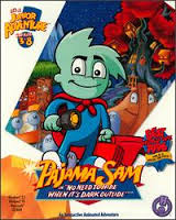 When my kids played alone, the loved Putt-Putt and Pajama Sam and Freddy the Fish. These games were about more or less linear narratives and pretty graphics and goofy characters stranded in fun situations.
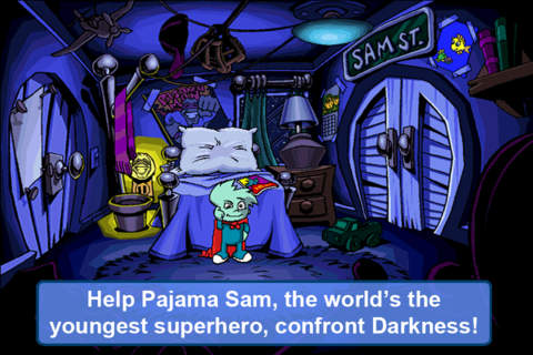
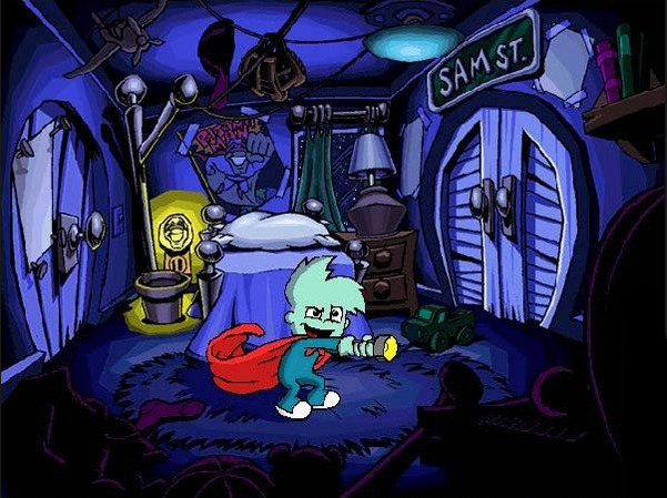
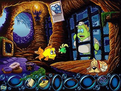
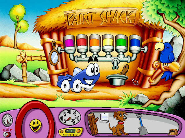
I can still sing the theme song to Putt-Putt saves the Zoo!
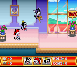
Animaniacs also moved on, but the gameplay stayed the same:
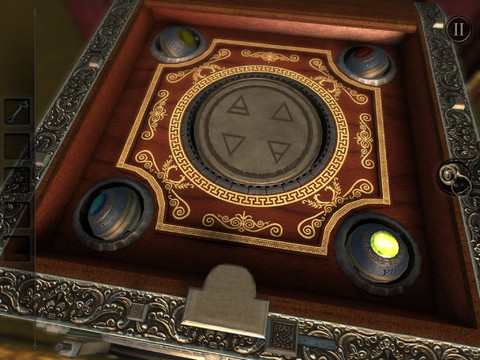
A recent game (bought for two bucks) that my husband and I played at night for a week was The Room (and The Room II). This a beautifully crafted game, lovingly illustrated and carefully worked out. While the story is disappointing, the experience of solving puzzles within puzzels was fun. The designers took the power of iPhone and the advantages (and disadvantages) of gestural interaction and created something worth playing. The Room is not like everything else that is being made and hastily put up on the iTunes Store. The developers took their time, and it shows. There are no off-the-shelf components here and the resulting visual design and gameplay is novel and engaging. (Worth the money!)
Affordances are discussed a lot in design classes when describing possible actions that users can take with a product. (Here’s a link to Don Norman explaining affordances.) But the design process is also driven by affordances — what easily comes to mind and is easily available to the designers during the design process. When we purchase templates and icons and stock images, we want to make the most of our investment and reuse them over and over again. This is especially true of visual designers without real art skills or in situations with real tight budgets.
But it’s not only clip art, or the latest pluggins, or the font of the moment that drive design. Affordances can also come from the design tools themselves. What user questionnaire are you using? If you ask the same questions of all your corporate clients, their answers tend to be similar — the result is homogeneity of design.
And as our clients look around and see the same templates and icons, they start to believe that only those are really “professional” (the rest being “un-professional looking”). There are just nails all over the place (and not a signal screw)!
