Nothing exists in isolation. Design divorced from the context in which the product is used is of little value to its audience. Cognitively, this makes sense—most designers agree that they have to consider the environment, culture, and situation as part of the process of developing a new product (or redesigning an old one). But practically, context and culture get little play in design meetings. This post is aimed at relieving some of designers’ mirroring errors—helping see alternate ways their products might be used in the real world. Enjoy! Cultural Difference in Car Use: livestock Cultural Difference in Car Use: large loads Cultural Difference in Bike Use: large loads Notice the little bike on the left… Cultural Difference: people movers
Product Design Strategy
Background Knowledge, Background Knowledge Errors, Conceptual Design, Cultural Bias, Cultural Differences, Pipsqueak Articles, Product Design Strategy
Cultural and Subject Matter Knowledge
by Olga Werby •
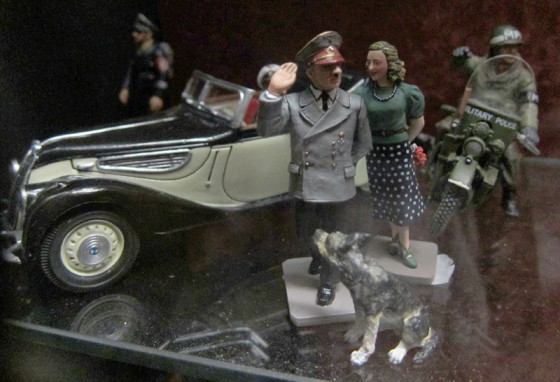
What is that?! Is that what I think it is? These toys were part of a window display in a little store in the center of Rome. I don’t believe a lot of kids play with Nazi toy soldiers…in Italy, today. But if WWII turned out differently, these might have been the coveted toys, not just for a limited set of adult collectors, but for average, everyday kids…who happened to be living in an alternate reality. So this brings me to the main point of this post: products have to have cultural relevance, and this requires designers to have a good grasp on social background knowledge and on the subject matter within which they are working. Consider this little street sign in Rome as another example of cultural and subject matter relevancy: If you click on the image, you can get a larger version—yes, it is a crucifix with Jesus icon. Here in San Francisco, this sign wouldn’t work. But in Rome, it makes perfect sense. It’s culturally relevant and conveys information to the local population. Both of these examples show that it’s not just cultural knowledge that’s important. Without knowing the meaning of a crucifix or being able to…
Background Knowledge, Background Knowledge Errors, Causal Net Problems, Cognitive Blindness, Conceptual Design, Cultural Bias, Cultural Differences, Ethnographic & User Data, Featured, Group Decision Errors, Mental Model Traps, Mirroring Errors, Pipsqueak Articles, Product Design Strategy
Community of Practice and Knowledge Propagation Circle
by Olga Werby •
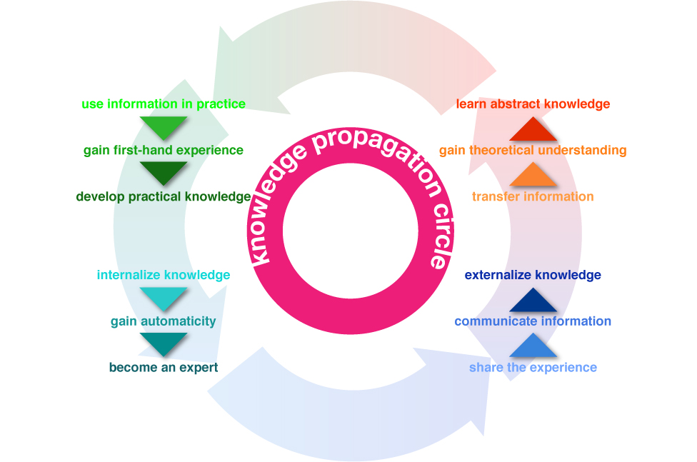
This summer my family and I travelled to Rome. While the temperatures didn’t reach the usual astronomic heights, it was rather warm. But we, and other visitors, didn’t have to worry about thirst. Rome has the best network of public drinking fountains that I have ever seen. Every few blocks, there’s a beautifully-designed basin with a spigot of continuously running water (I know, being from California, the never-ending stream made us very uncomfortable, too). There are two bits of information that have to be passed on to the first-time visitors of Rome: the water is potable—safe to drink, and how to use the fountain—there’s a bit of a trick to them. Above is my son demonstrating a little secret interaction. There’s a small hole on the top of the pipe that can serve as drinking fountain if the main hole at the end is plugged up (with a finger). While we learned about the great drinking water in Rome from many traveling guides (books, online sites, etc.), we obviously didn’t know about the trick until we watched a pro do it. Knowledge Propagation Circle Information propagates through communities. When we first encounter a novel bit of data, it tends to…
Background Knowledge, Conceptual Design, Cultural Bias, Cultural Differences, Ethnographic & User Data, Pipsqueak Articles, Product Design Strategy
Cultural Differences from the 4th Dimension: Time
by Olga Werby •
Some cultural differences are brought to you by geographic distances, but some derive their wonderful exotic qualities from temporal separation. The ads below are all American…just from a different America—America of yesteryore. Role of Women What wives are for? Make her happy this Christmas—make it a hoover! Blow smoke in her face, she’ll love it! Go ahead and cry for it… Housework makes wives cute! Housework makes wives healthy. Healthy Kids Beer for mommies and babies… Give that baby a cola! Give your children the benefit of TV. Healthy You! Give cocaine a chance… Doctors prefer Camels. For a slimmer, flatter, more sinuous you, go with tape worms!
Conceptual Design, Featured, Flow, Pipsqueak Articles, Product Design Strategy, Scaffolding, Users
Fun, Functionality, Flow: the 3 F’s of Product Design
by Olga Werby •
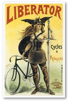
Good product design—design that solves a real need; design that considers the strengths and weaknesses of the user; design that stands the test of time and cultural fads—always incorporates the the 3 F’s: Fun, Functionality, and Flow. It’s easy to talk about the 3 F’s in abstract, but I thought taking a concrete example of a bicycle would be more productive. A bicycle is a designed object that satisfies a real need, does so in way that brings joy to its users, and the act of riding results in flow experience for many. The old “Liberator” poster tries to communicate all 3 F’s to the potential buyers of its products: liberator means freedom to move, real functionality; the woman warrior communicates power and fun—you will feel the way she looks! It’s exhilarating! Notice the high heels and the beautiful vista (with a rough terrain) and a kid pointing at the riders with envy. These posters, old advertising ads for bicycles, try to communicate the same: it’s fun, functional, and exciting to ride a bike. Ride, and look good. Ride, and be the center of attention. Design for Fun So what makes a particular design fun? It seems that one of…
Conceptual Design, Pipsqueak Articles, Product Design Strategy, Users
Media and Fun
by Olga Werby •
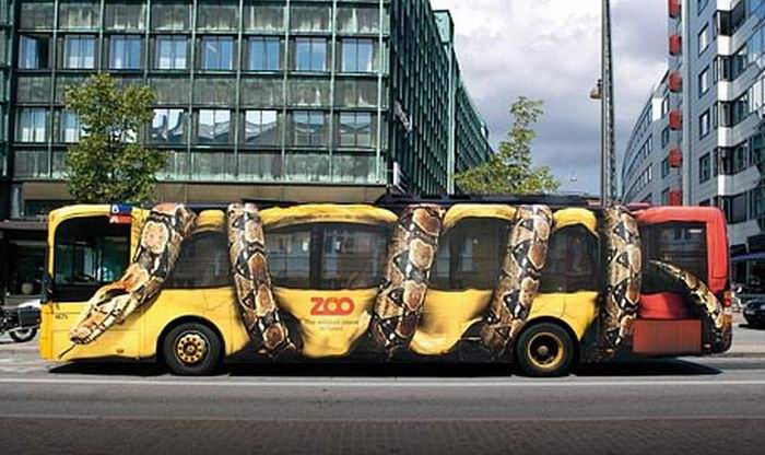
I’ve posted a video on this blog: “Because Product Should Be Fun!” The point is that design should create an emotional reaction in its audience. Here’s a collection of bus wrappings that have a strong emotional component, go amygdala! For another example of emotional design in packaging, please check out these blogs: “Emotional Design” and “Creative Use of Media to Advance a Message” for more bus fun.