Stout, H. (2010). “Antisocial Networking?” New York Times Online. Retrieved on 3 October, 2010: http://www.nytimes.com/2010/05/02/fashion/02BEST.html The main topic of this article is that technology may be changing the very nature of kid’s friendships. Children used to actually talk to their friends. But now, even chatting on cellphones or via e-mail is becoming rare. Today’s teenagers and preteens, prefer to make friends and communicate using cellphone texts and instant messages, or through the very public forum of Facebook walls and MySpace bulletins. People now are more likely to use their cellphones to text friends than to call them. The article shows two opposite points of view on the topic. The author believes the quality of human interactions is becoming worse without the intimacy and emotional component of regular face-to-face communications (hence the title of this article). The ease of electronic communication may be making teens less interested in face-to-face communication with their friends, but close childhood friendships help kids build trust in people outside their families, develop empathy, understand emotional nuances and read social cues like facial expressions and body language, and consequently help lay the groundwork for healthy adult relationships. On the other hand, online social networking allows children to become…
Conceptual Design
What does the product do?
Conceptual Design, Contributor, Interface Design, Language, Product Design Strategy, Users
Using Menu Psychology to Entice Diners
by Mallika •
Kershaw, S., (2009). “Using Menu Psychology to Entice Diners.” New York Times Online. Visited on October 02, 2010: http://www.nytimes.com/2009/12/23/dining/23menus.html. This article discusses how an understanding of human psychology is being applied to sculpt a restaurant menu into a lucrative tool for the restaurateur. Restaurateurs play down the importance of the cost figure by eliminating the dollar sign and decimals. Adding a personal touch to an item (‘Grandma Mary’s cake’) or a descriptive menu label (‘buttery pasta’) draws more attention to the dish. Other decoys include using a description that glorifies a more profitable dish compared to others. During the tough economic times in the last year, some restaurants were reinventing their restaurants through such menu design techniques, and were hoping that would make the difference they needed. Conceptual design: When you go to a restaurant, good food is not the only thing you seek; you are looking for a good experience. Of course sometimes, great food can make us turn a blind eye to any other inadequacy and draw us back into the restaurant. Nevertheless, a good experience overall manifests itself as a stronger loyalty. If your overall experience has made a lasting positive impression, you may recommend the restaurant…
Attention Controls Errors, Cognitive Blindness, Conceptual Design, Featured, Interaction Design, Mode Errors, Pipsqueak Articles, Users
Skin-deep Usability
by Olga Werby •

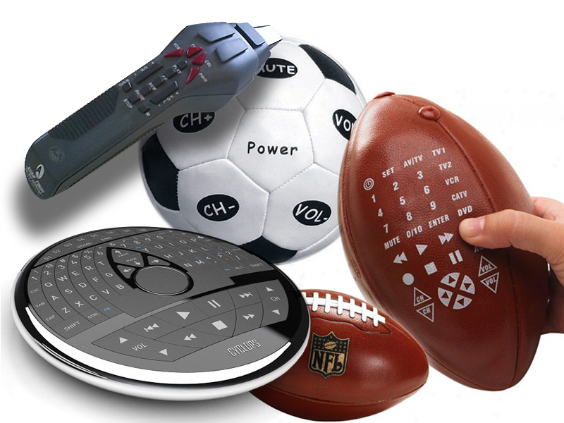
The Universal Remote Control Story A few years ago, we got a Star Trek phaser universal remote control as a gag gift for the holidays. As any universal remote control (URC), it was supposed to control any and all devices that were hooked up to our TV and do it with a flair of shooting a phaser at the general direction of our equipment. A few days later, it was relegated to our sons’ toy box, and now I wouldn’t even know where to look for the thing. Big buttons, footballs, phasers, UFOs, futuristic control centers—the makers of universal remote controls have tried them all. But consumers still buy one URC after another in the hope of finding something that would work for them. Why are these things so darn hard to use? Manufacturers seem to believe that by giving their products a friendly, toy-like appearances, these devices would seem more user-friendly and easier to use. But, personally, I don’t want a giant ball in middle of my kitchen table or rolling around my living room floor. I don’t want the kids to toss footballs to control the channels or fire phasers to lower the sound. I just want something…
Autopilot Errors, Background Knowledge Errors, Conceptual Design, Diagnostic Errors, Errors, Interaction Design, Interface Design, Interruptus Errors, Misapplication of Problem Solving Strategies, Mode Errors, Perceptual Blindness, Perceptual Focus Errors, Pipsqueak Articles, Product Design Strategy, Scaffolding, Users, Working Memory
The History of Usability
by Olga Werby •

When did we start being concerned with usability? Some will say that such concern is part of being human: cavemen worked their stone tools to get them just right. Interaction design mattered even then. But the field of usability research really came into being when the tools we used started to run up against our cognitive and physical limitations. And to avoid hitting literal, as well as psychological, walls, it was the aviation engineers who started to think about usability seriously. While cars were becoming ever more sophisticated and trains ever faster, it was the airplanes that were the cause of most usability problems around WWI. Cars were big, but didn’t go very fast or had a lot of roads to travel on at the turn of the century. In the first decade of the 20th century, there were only 8,000 cars total in the U.S. traveling on 10 miles of paved roads. In 1900, there were only 96 deaths caused by the automobile accidents. Planes were more problematic. For one thing, the missing roads weren’t a problem. And a plane falling out of the sky in an urban area caused far more damage than a car ever could. Planes…
Cognitive Blindness, Conceptual Design, Cultural Bias, Cultural Differences, Ethnographic & User Data, Featured, Interaction Design, Interface Design, Mirroring Errors, Pipsqueak Articles, Users
Be the Customer
by Olga Werby •

By our very nature, humans are an “us versus them” kind of mammal. We are quick to judge and categorize: “he’s our kind’a people” or “she’s management.” We adapt and root for our favorite sports teams, sometimes even resorting to violence to “defend our guys.” We peg an art department against the engineers; we side with nurses over doctors; we fight with democrats against republicans; we wave our flags in a spirit of nationalism. And it doesn’t matter if we all work for the same company, heal the same patients, want the same basic rights, or live on a very small planet—we tend to take sides. So it’s no surprise that when product designers develop products the feeling of “us against the users” creeps up into the process. To protect the design process from these “us versus them” impulses, we can create a well-realized user personas based on the the audience taxonomy developed during the conceptual design stage of product design. For each major category in the audience taxonomy, a sample fictional user is created which embodies all of the traits in that audience category: age, profession, socio-economic background, culture and sub-culture, interests and dislikes, family status, education level, etc.…
Background Knowledge Errors, Conceptual Design, Errors, Ethnographic & User Data, Interaction Design, Interface Design, Mental Model Traps, Mirroring Errors, Pipsqueak Articles, Product Design Strategy, Users
Metacognition Failure: If I find it easy, it must not be important
by Olga Werby •

Making something easy to understand is extremely difficult. A good designer knows this, knows how hard one has to work to make something comprehensible and easy to use. Unfortunately, users and consumers of products (including education) tend not to get it. We live in society ruled by “More is Better” p-prim: more stuff is better, more money is better, more food is good, more medication is great…more, more, more. Movies, television, newspapers, magazines, all reinforce this idea in our minds. We live in a “super-size me” world. But this basic decision-making algorithm leads to very faulty reasoning. There are multiple corollaries to the “more is better” axiom: thick books without graphics are more educationally valuable, more important (this is based on research I did many years ago with 5th graders); longer essays are clearly better and should get higher graders (the students worked harder/longer on them); big words are better than small ones in expressing ideas (thus we get very pretentious writing); work should be judged by the time it took to complete and not by the quality of the results it produces; more expensive clothes (cars, stereos, etc.) are clearly more valuable (this is a true statement, but most…
Background Knowledge, Conceptual Design, Pipsqueak Articles, Product Design Strategy
Great Design = Technique + Ideation
by Olga Werby •

How do we get great design? Most of us can recognize it, but creating it is another matter. I spend a lot of time thinking about product design: How can Apple come up with product after product that’s beloved by their users? Why does Microsoft have difficulty achieving the same? I think the key is in combination of two necessary components of greatness: mastery of technique and richness of ideation. Let me explain. Consider art. What makes Picasso great? During his lifetime, the man was incredibly prolific. He worked in many different mediums from paint, to metal, to charcoal. He excelled at Analytical Cubism, easily surpassing Braques in both quantity and quality of work. Picasso borrowed from African art and from impressionists. He followed Matisse until Matisse’s students started to follow him. Picasso dived into an art form and explored with fury until he transformed it into something his own. He borrowed from everyone and bent it and molded it into a unique creation. Picasso was rich in ideation. But ideation is not enough. What good is an idea when it lacks execution? Picasso was an art prodigy. He was able to draw amazingly mature life drawings at age fifteen that most…
