Frost, B. (2012). “Separate Mobile Website Vs. Responsive Website.” smashingmagazine.com. Visited on October 25, 2012: http://mobile.smashingmagazine.com/2012/08/22/separate-mobile-responsive-website-presidential-smackdown/
This article is about how to address the challenges of the mobile web by either creating a separate mobile website or creating a website that is responsive to different screen sizes. These two approaches are illustrated by the websites of the 2012 presidential candidates: Mitt Romney’s campaign has created a dedicated mobile website, while Barack Obama’s campaign has created a responsive website. The article looks at two use cases for these sites (someone looking for information and someone looking to take action) and how each of the different mobile approaches addresses them.
Conceptual Design
The article examines two mobile design approaches using Kristofer Layon’s model, which is based on Maslow’s hierarch of needs pyramid. Primary access and navigation are the most essential aspects of the mobile experience while enhancements like HTML 5 features are the least essential. How each method addresses the two mobile approaches is important for any product designer.
Interaction Design
Access to website content is the most import function of a mobile site. The Obama site is responsive, so all the content of the full-featured site is available to a mobile user. Romney’s mobile site is tailored to mobile uses but has less content than the full version of the site. It also has difficulty managing URLs between the full version of the site and the mobile version; this creates problems for people who try to share content from a mobile device to desktop computer and vice versa.
While Obama’s responsive site displays all the content, it creates very long pages for a mobile device user to read through. Finding relevant content becomes challenging. The article recommends using progressive content loading and subtracting supplemental content so the user can focus on what is important and increase the site’s performance. Long pages lead to lengthy download times for users.
Interface Design
Obama’s site has a complex Facebook-style fly-out navigation for smaller screen resolutions that has known issues with lots of mobile devices. This presents a major roadblock to mobile users’ ability to access content. Romney’s simple dashboard style of navigation is easy to use but requires a full-page refresh to navigate to a different section of the site.
Obama’s site does feature one notable enhancement for the mobile user: the ability to initiate a call on a campaign’s behalf so the user can take action. The designer realized the ability to create enhancements that take advantage of the mobile platform.
The article goes on to note how difficult it is to create mobile experiences and recommends that each site should take advantage of unique design opportunities that are available only to mobile: geolocation, using more touch events in features like photo galleries, and different virtual keyboards to ease data input.
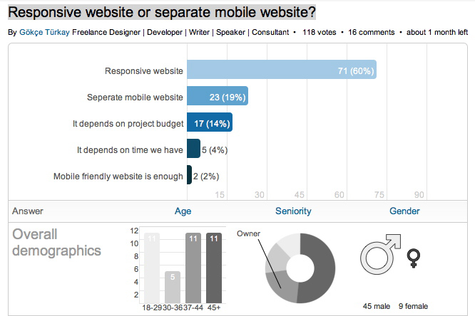
Responsive website or separate mobile website?
LinkedIn did a poll, asking its users to rate the business strategy of each solution. Please take the poll or see the results as off October 30th, 2012.


1 comment for “Separate Mobile Website Vs. Responsive Website”